PROJECT SCREENSInside the design
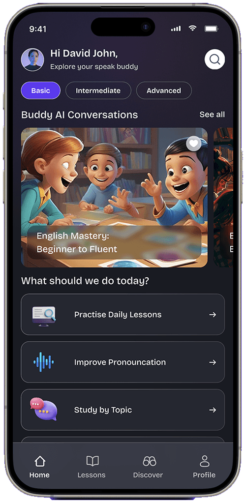
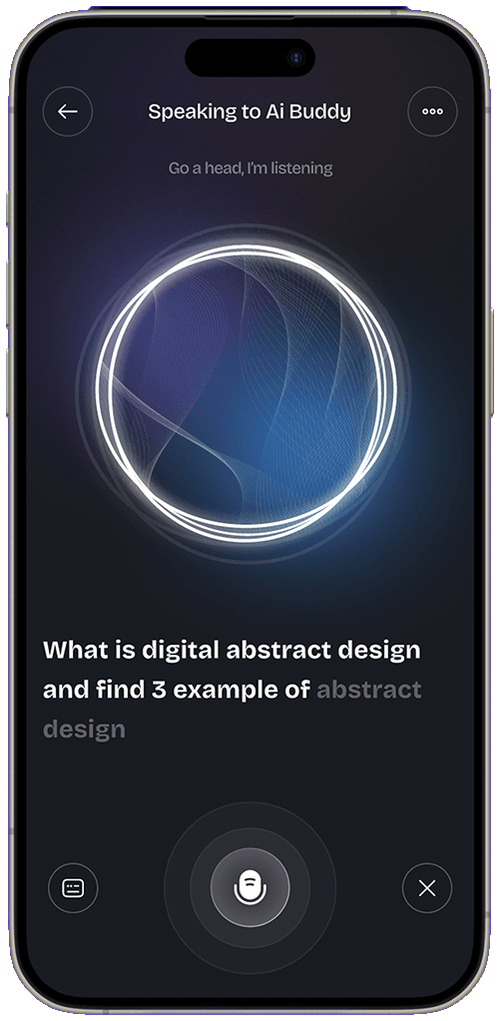
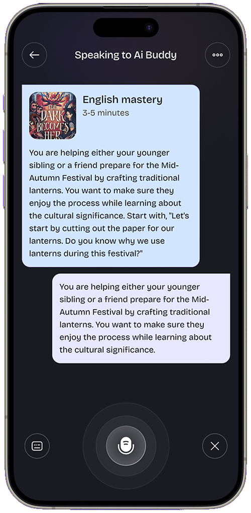
Auto-scrolling — hover any screen to pause & lift
Intuitive interfaces for an AI-powered speaking and language app built around voice recognition and conversational practice.
An AI speaking companion that helps users practice a language by talking. The design challenge: make voice-first interaction feel natural for non-tech-savvy users.
Voice UIs fail when users don’t know when to speak, what to say, or whether the app heard them. Onboarding and feedback states carry the entire experience.
Designed onboarding, conversation and feedback screens; contributed to AI prompt structuring and voice-feedback UX patterns.
Listening, thinking and responding are visually unmistakable.
Three screens to first conversation — no forms, no lectures.
Mistakes surfaced as encouragement, not red error text.
Streaks and fluency scores that motivate daily practice.
Mobile-first discovery: where is this app used, one-handed or two, in what moments of the day? Session mapping and competitor teardowns showed that onboarding and first-minute experience decide retention long before feature depth matters.
If users don’t reach value in the first session, there is no second session. Onboarding was designed as the product, not a tour of it.
Primary actions live in the natural thumb arc; anything above the fold’s reach is for reading, not tapping.
Every notification and interruption spends trust. The design asks for attention only when it returns value.
Downloaded on a recommendation, gives the app ninety seconds to prove itself. Needs instant value, zero forms and a reason to return tomorrow.
Opens the app daily and wants friction gone: remembered context, one-tap resumption and progress made visible.
A friendly, high-contrast mobile language: large touch targets, one primary action per screen, motion used to explain rather than decorate. The palette stays calm so content and progress cues stand out, and dark mode is a first-class citizen rather than an inverted afterthought.
Prototype tests focused on the first-run experience: where do new users hesitate, misread or bail? Each round shortened onboarding and moved value earlier, while returning-user flows were tuned for one-handed speed.
Auto-scrolling — hover any screen to pause & lift
A voice experience that feels like talking to a patient tutor — full flows on Behance.
View full project on Behance