Project card leads with the house, then the facts
Component 01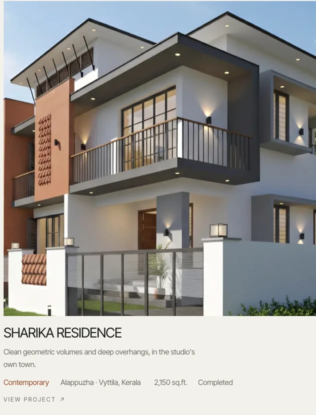
A website for an architecture studio in Kerala that designs traditional, courtyard and contemporary homes. I designed the UX and UI and built the front end.
ILLAM, by Nila Design Collective, is an architecture and design studio in Alappuzha and Vyttila, Kerala. It designs Naalukettu courtyard houses, traditional Kerala homes, contemporary residences, interiors and renovations.
The website has to do two jobs: show families what living in an ILLAM house would be like, and make it easy to start a conversation about their own plot. I designed it end to end and wrote the front-end code, so the live site is the design.
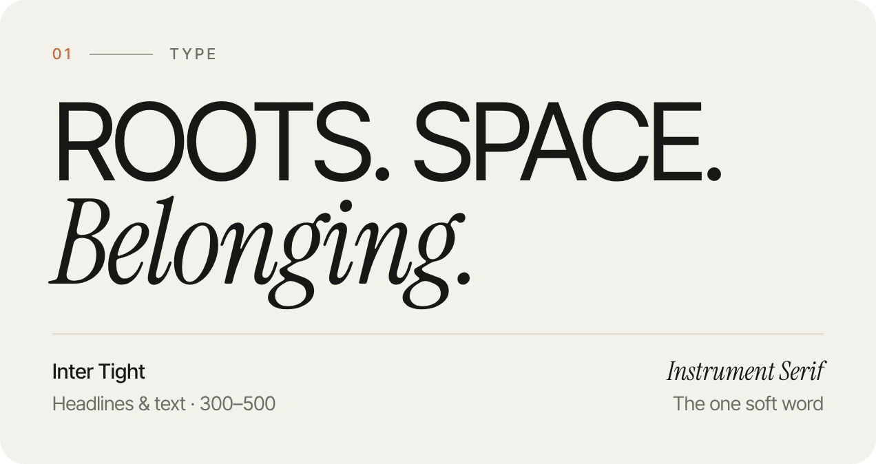
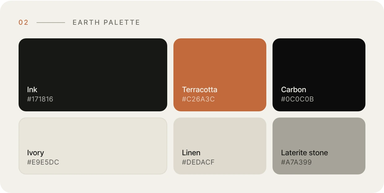
The visual language comes from the buildings themselves: laterite, terracotta tile, lime plaster and the dark of a monsoon evening. One grotesk carries the structure, and a single italic serif word in each headline adds the warmth.
Every page is built from the same small set of parts below, taken from the live website.

Families looking for an architect in Kerala usually already have a plot and a picture in their head: a courtyard, a sloping tiled roof, or something clean and modern. They want to know whether a studio builds that kind of house, whether it works near them, and what the first step is.
Most studio websites answer with a photo gallery. The site needed to show the thinking behind the houses too: how they deal with rain, heat and light, and how the work moves from first visit to finished home.
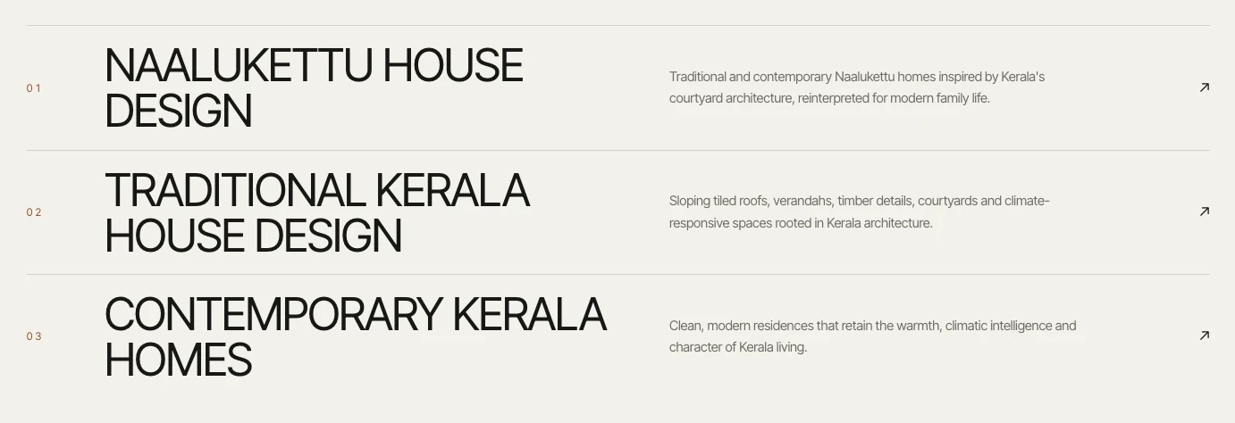
Six services, each with a one-line answer, and a guide page for each house type: Naalukettu, traditional Kerala and contemporary.
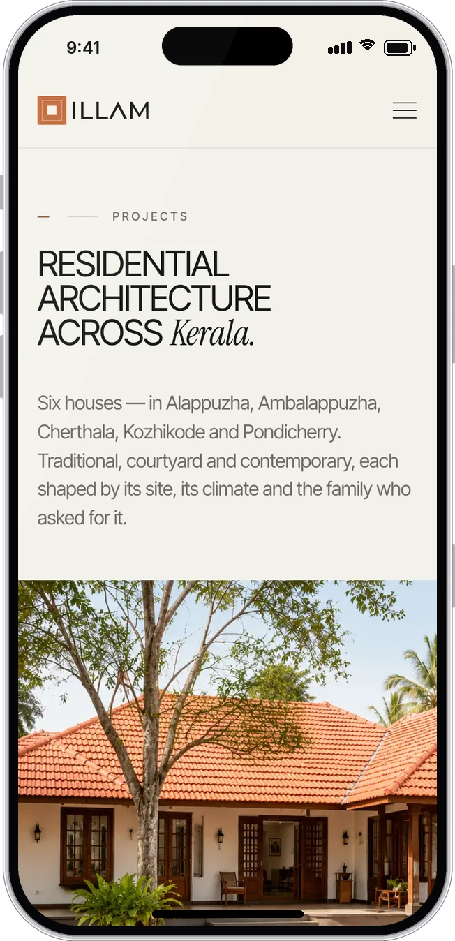
Every project card shows the town, the floor area, the style and whether the house is finished or still on site.
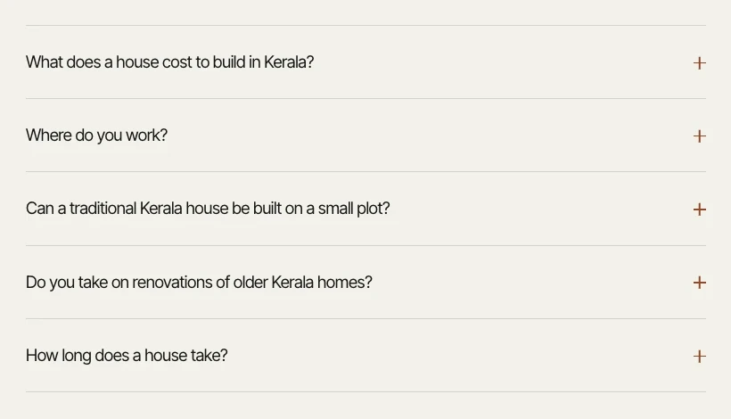
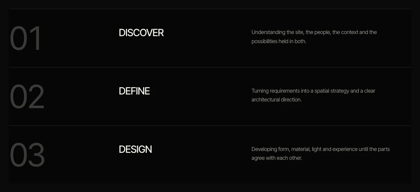
A five-step process on the home page, a short FAQ, and a contact form that asks about the site, not just a name and email.
Below are the wireframes next to the finished pages. Drag the handle to compare.
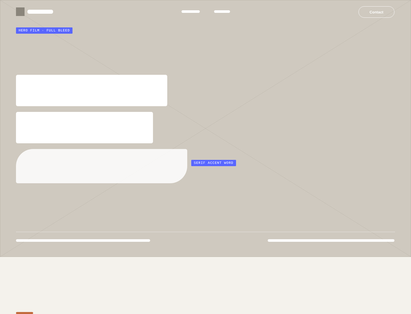 WireframeFinal design
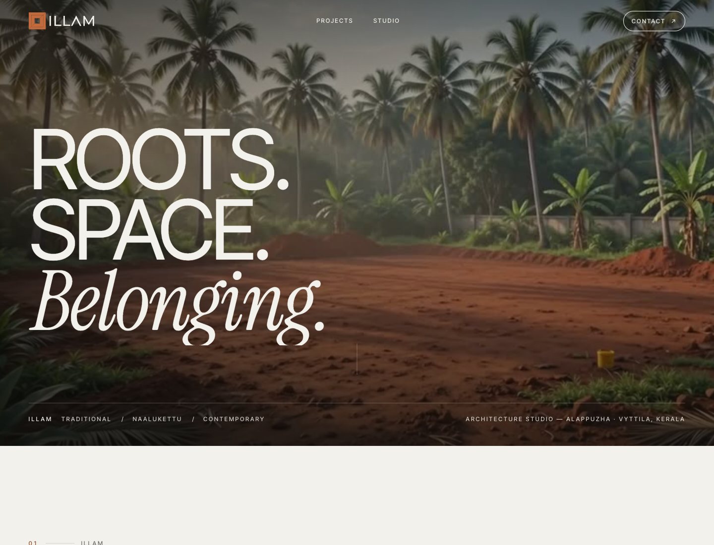
The home page opens on a slow film of a red-earth plot under coconut palms, with three words: Roots. Space. Belonging. It sets the mood before any text has to.
A section on rain, heat and light explains roof pitch, overhangs and materials. Families see why the houses look the way they do.
Style, town, floor area and status sit under each photo, and filters sort the work by house type. Each card opens a full project story.
Project type, location, budget and a free-text note about the plot. The first conversation starts with useful details instead of a bare email.
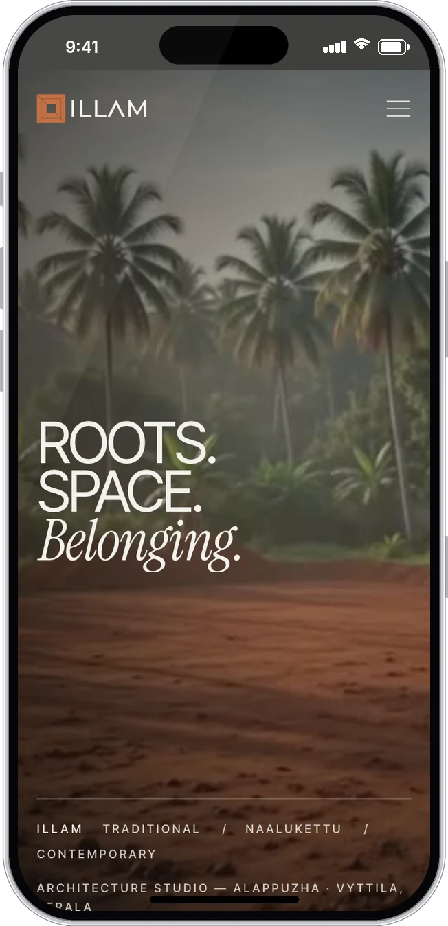
Many families will first open the site on a phone. On small screens the hero film still leads, the menu folds into a full-screen panel, project cards stack in one column, and the type scales down without losing its rhythm.
Both sizes were designed together, so nothing had to be squeezed down at the end.
The website is live at illamdesign.in with six project stories, guide pages for Naalukettu, traditional and contemporary homes, and an enquiry form. Each house type has its own page, so families searching for that kind of home in Kerala land on the right one.
Visit the live websiteor write directly: vasudevsra1995@gmail.com