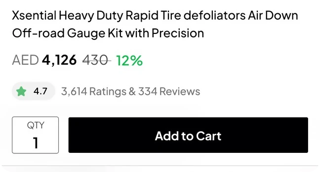
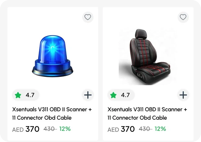
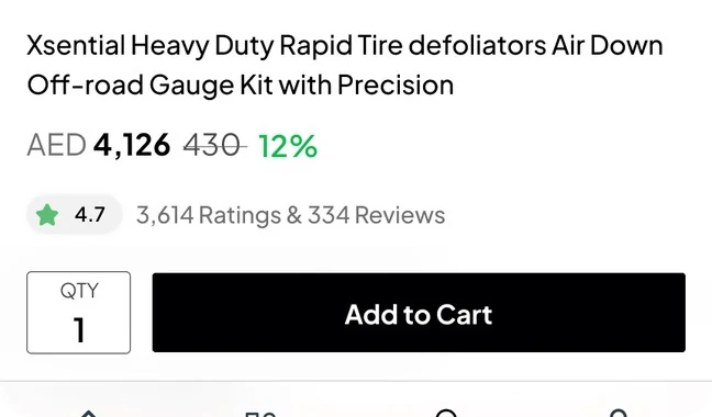
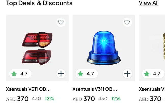
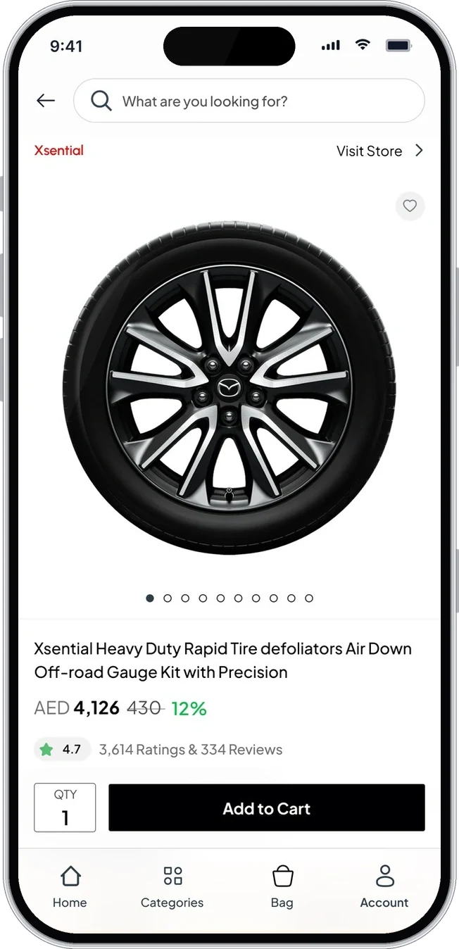
Product cards show rating, price, saving and a quick add
Component 01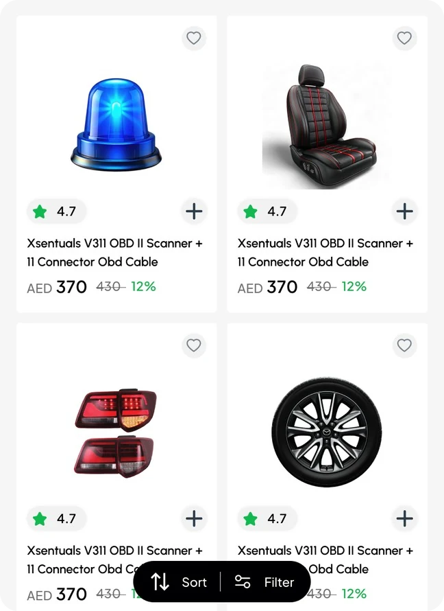
Automarto is an automotive e-commerce app for the UAE: spare parts and vehicles from many sellers in one store. I designed the buyer app end to end, from email sign-in to returns and reviews, plus a companion seller dashboard.
Automarto sells spare parts and vehicles from many stores in one app: maintenance parts, air conditioning, belts, bearings, lighting, wheels and more. Prices are in AED and delivery covers the UAE.
I designed the whole buyer journey and the seller dashboard as one product family, with one shared design system across both.
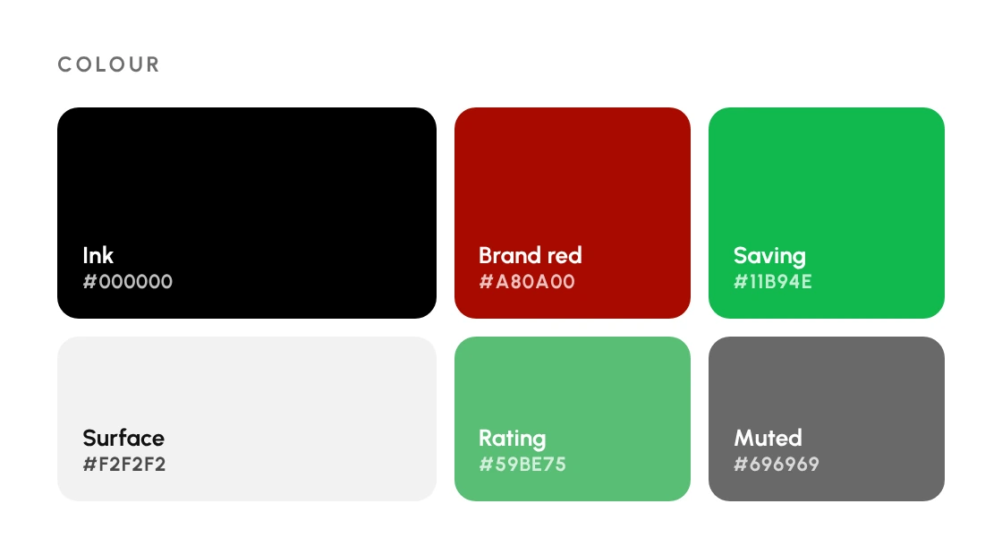
Black does the heavy lifting: primary buttons, prices and the bottom bar. Green is kept for ratings and savings, and the brand red only appears in the logo, so nothing competes with the product photos.
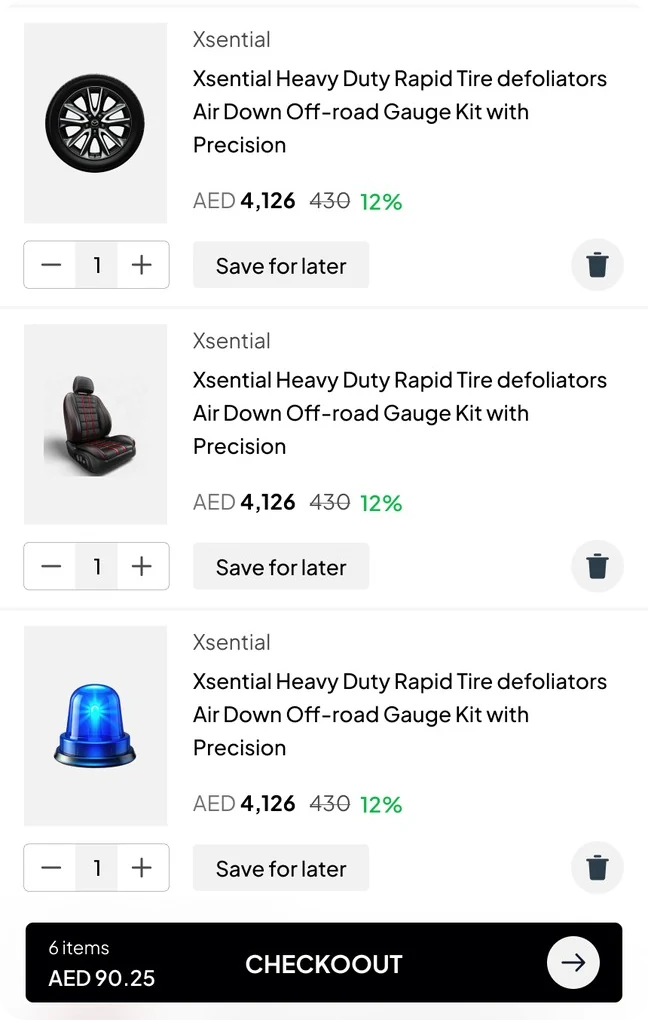
Every card below is taken from the Figma file, as it appears in the app.

A parts catalogue is huge and many items look alike: two tail lights or two sensors can differ only in the model they fit. Buyers want to narrow down fast, see the real price and saving, and know when the part will arrive.
After the order, the questions keep coming: where is it, how do I return it, and how do I get my money back. Those flows mattered as much as the store itself.
They know the car, not always the part number. They need categories, filters and clear prices, and an easy way to reorder or return.
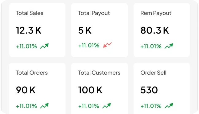
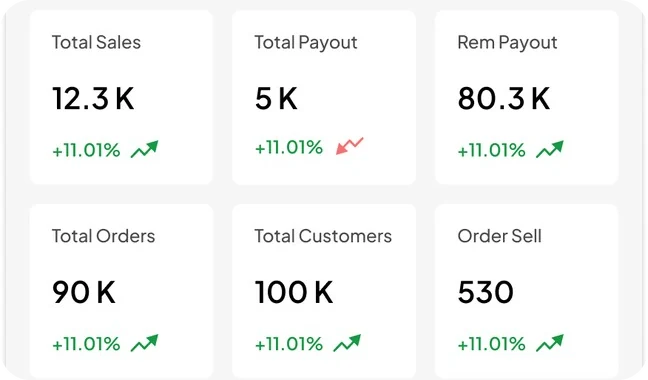
They need sales, payouts, orders and stock at a glance, without a desktop.
The buyer app has four tabs: Home, Categories, Bag and Account. Browsing and the product page lead to one bag and one checkout, and everything after the order lives in Account.
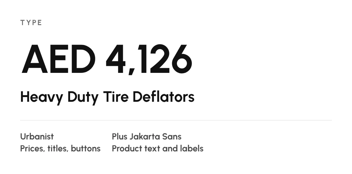
Every screen is built from the same parts: product cards, filter rows, list rows, steppers and buttons. Below is a selection from across the app.
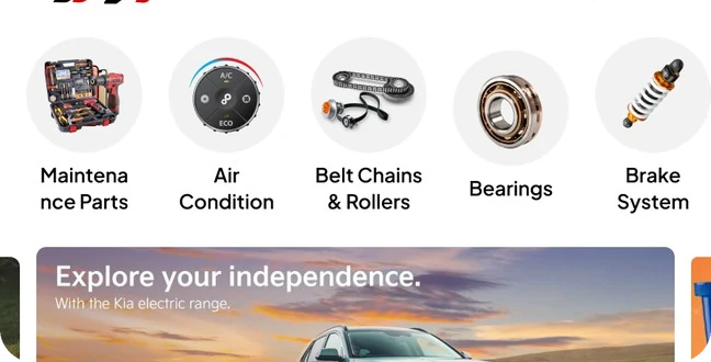
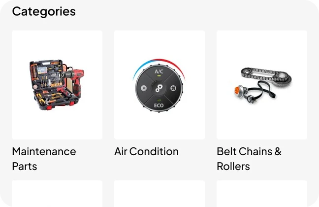

A two-way switch at the top changes the whole catalogue, so the same screens serve both without a second app.
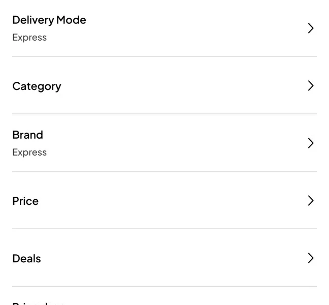
Delivery mode, category, brand, price, deals, rating, new arrivals and colour sit in one list, with the live item count on the Apply button.
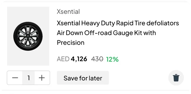
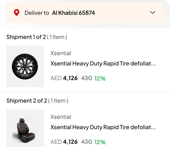
Every card shows the price in AED, the old price and the discount in green, so deals stand out without banners.
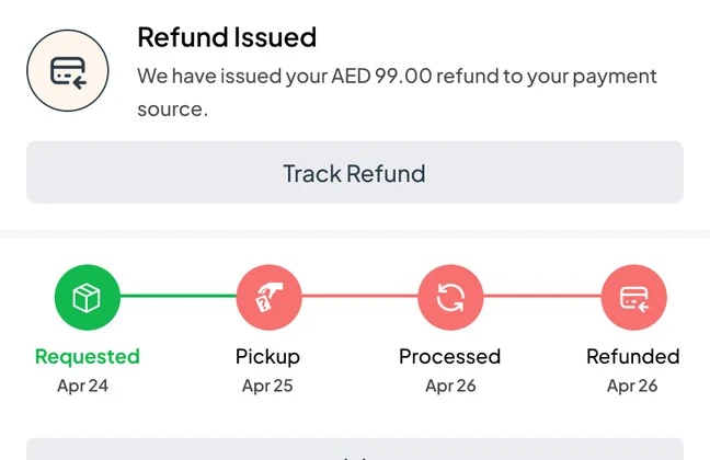
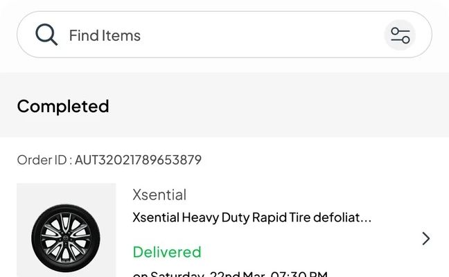
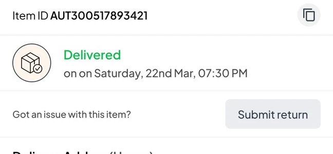
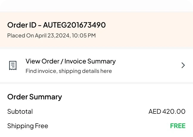
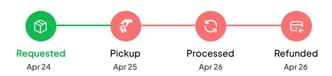
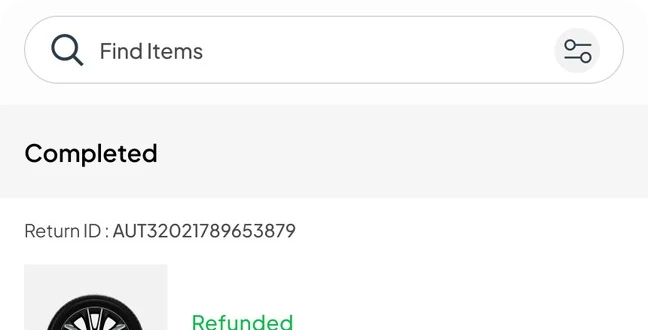
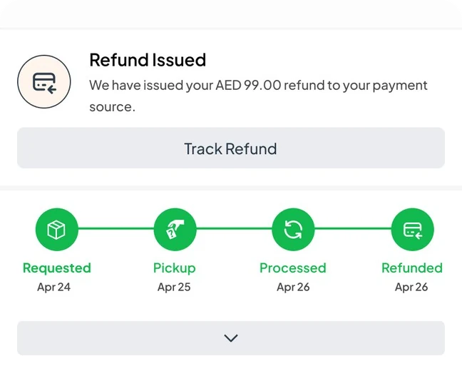
Orders, tracking, returns and refunds each have a status timeline, and reviews for the seller, product and delivery are one tap away.
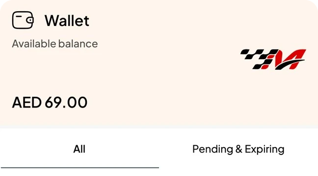
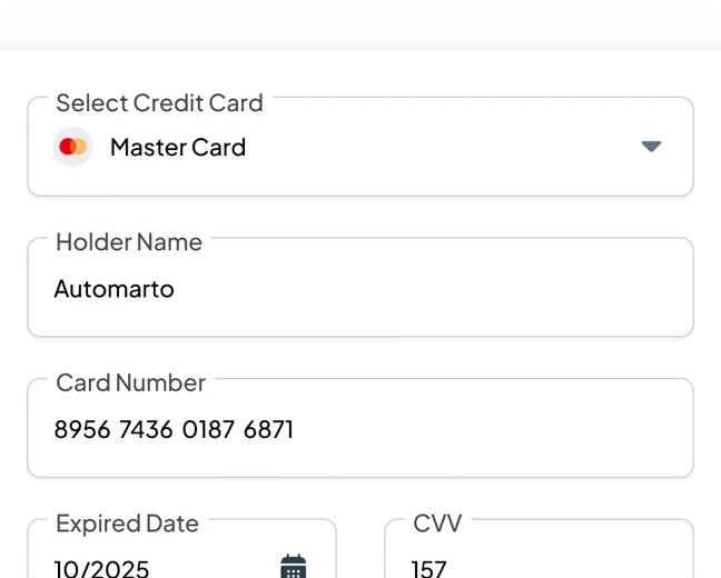
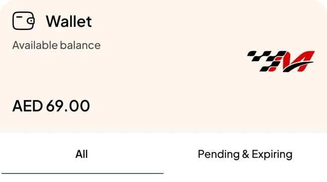
The work after the order got the same care as the store: checkout with split shipments, delivery tracking, returns with a refund timeline, a wallet with cashback, and reviews for the seller, the product and the delivery.
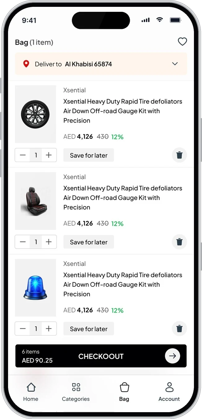
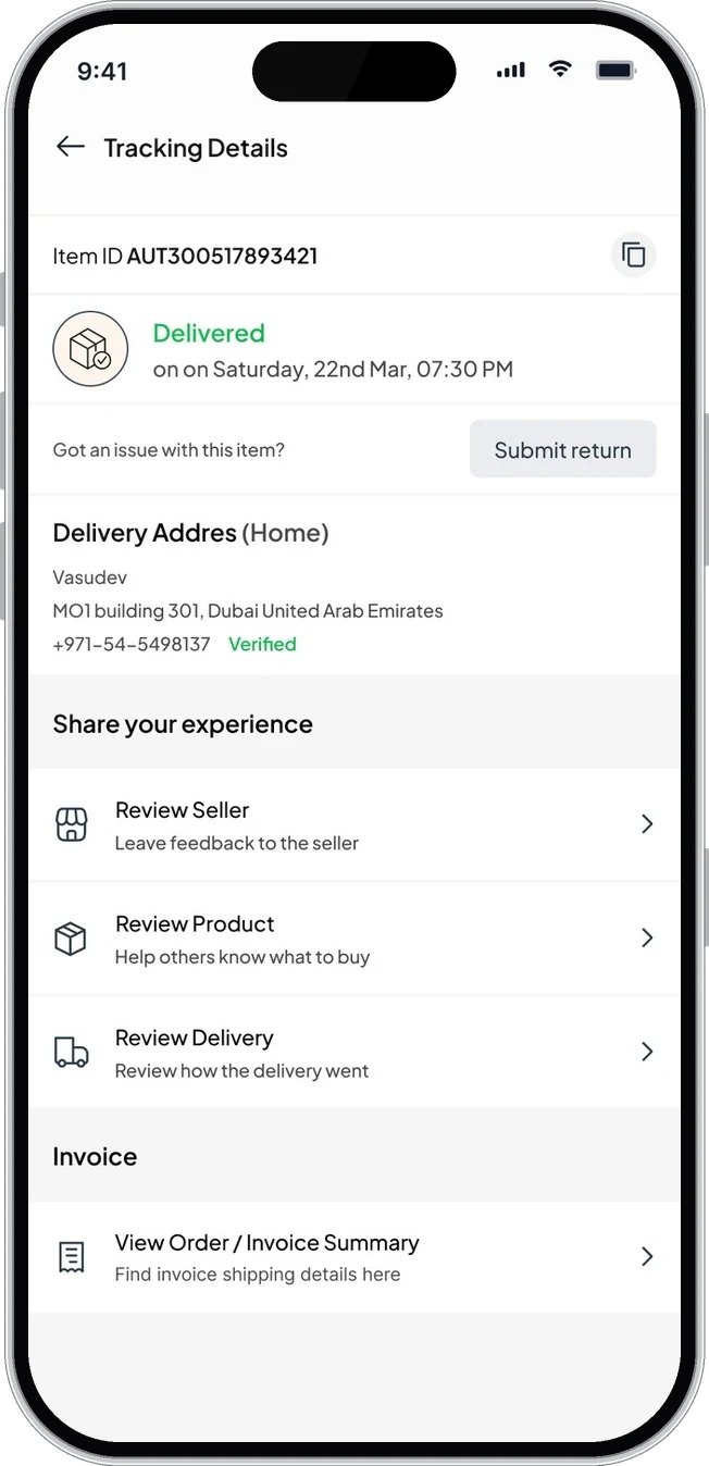
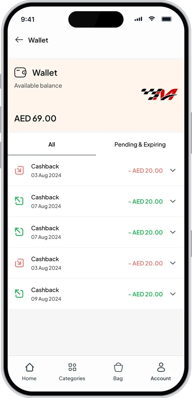
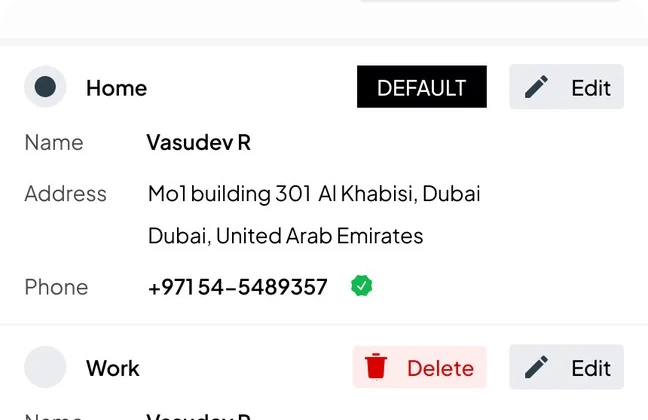
The Figma file covers the full buyer journey, sign in, home, categories, filters, product, bag, checkout, orders, tracking, returns, refunds, reviews, wallet, wishlist, addresses and cards, plus the seller dashboard.
Everything is built from one library, so new categories, offers or seller tools can be added without new patterns.
or write directly: vasudevsra1995@gmail.com