Work  /  Case study 08  /  Social app

Voizzit App Chat, share, give

Voizzit is a social app that puts chat, calls, status, a feed and crowdfunding in one place. I designed the first release for mobile, from sign-in to group video calls, with a full style guide and wireframes.

CategorySocial · messaging
My roleUI/UX designer
PlatformiOS & Android, light & dark
ToolsFigma

What I did

WireframesInformation architectureUI designStyle guideLight & dark themesPrototyping

Messaging and social in one calm app

Voizzit brings together private and group chats, voice and video calls, 24-hour status, a feed with posts and reels, and crowdfunding for causes such as education, healthcare and food.

For the first release I designed the mobile app end to end: wireframes, the style guide, light and dark themes and every core screen.

Product
Voizzit App
Type
Social messaging app
Release
First release, 2024
Scope
100+ screens, style guide, wireframes, light & dark
Tools
Figma
Google Play
Open the app
Design system

One green, one typeface

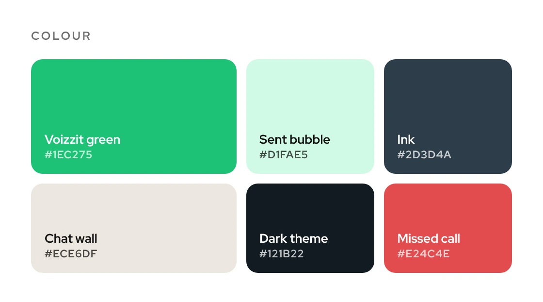
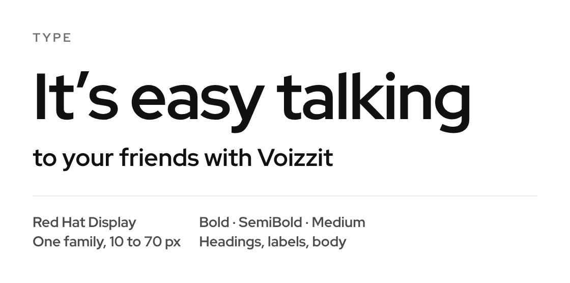
The style guide keeps it simple: Voizzit green for actions and sent messages, a soft mint header, a warm chat wall and a full dark theme. Red Hat Display covers every size, from 10 px labels to 70 px headings.

Every card below is taken from the Figma file, as it appears in the app.

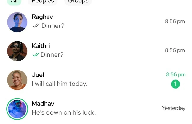
Chat list shows who, the last message, ticks and unread count

Component 01
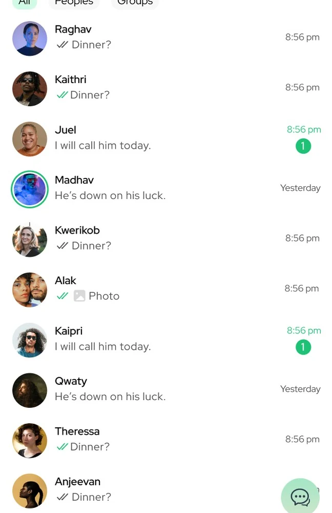
Chat list with All, People and Groups tabs, avatars, last messages, read ticks, times and unread badges

Colour one green, mint for sent, a warm chat wall

Component 02
Colour palette: Voizzit green, sent bubble mint, ink, chat wall, dark theme and missed-call red

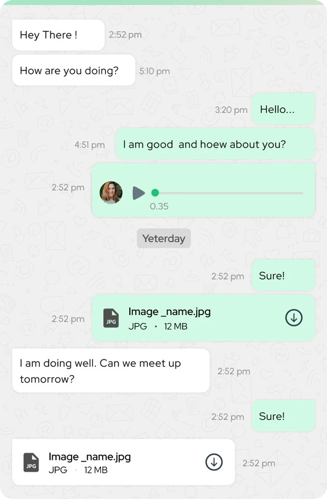
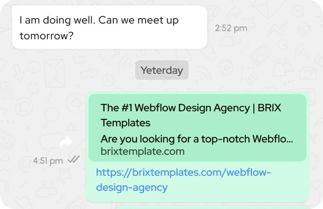
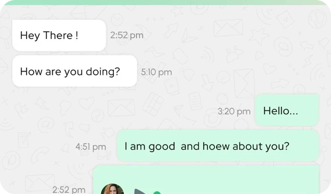
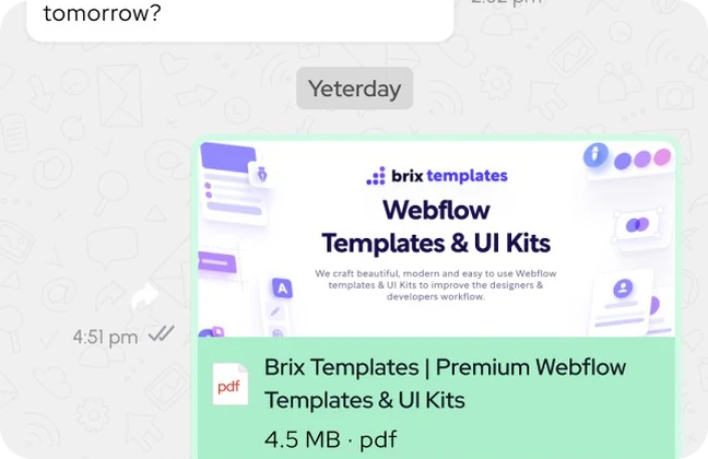
Messages text, voice notes and files share one bubble

Component 03
Conversation with received and sent messages, a voice note and file messages

Red Hat Display from 10 to 70 px

Component 04
Type card: Red Hat Display headline and weights

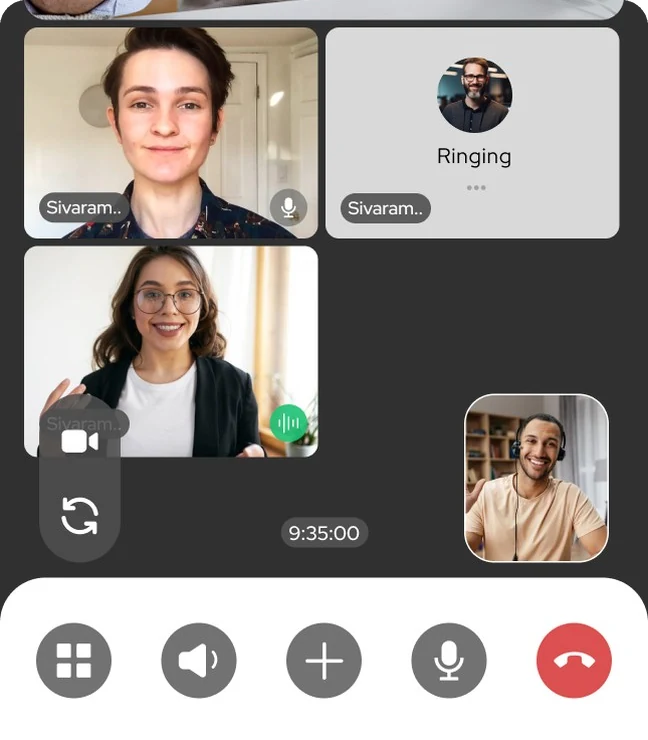
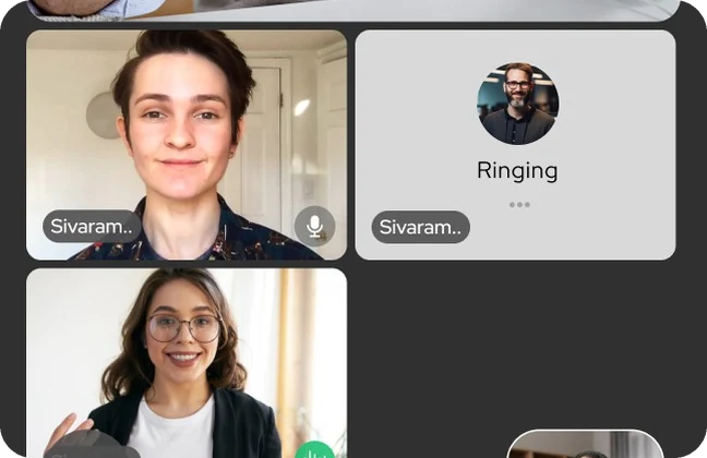
Group calls one tile per person, controls in one bar

Component 05
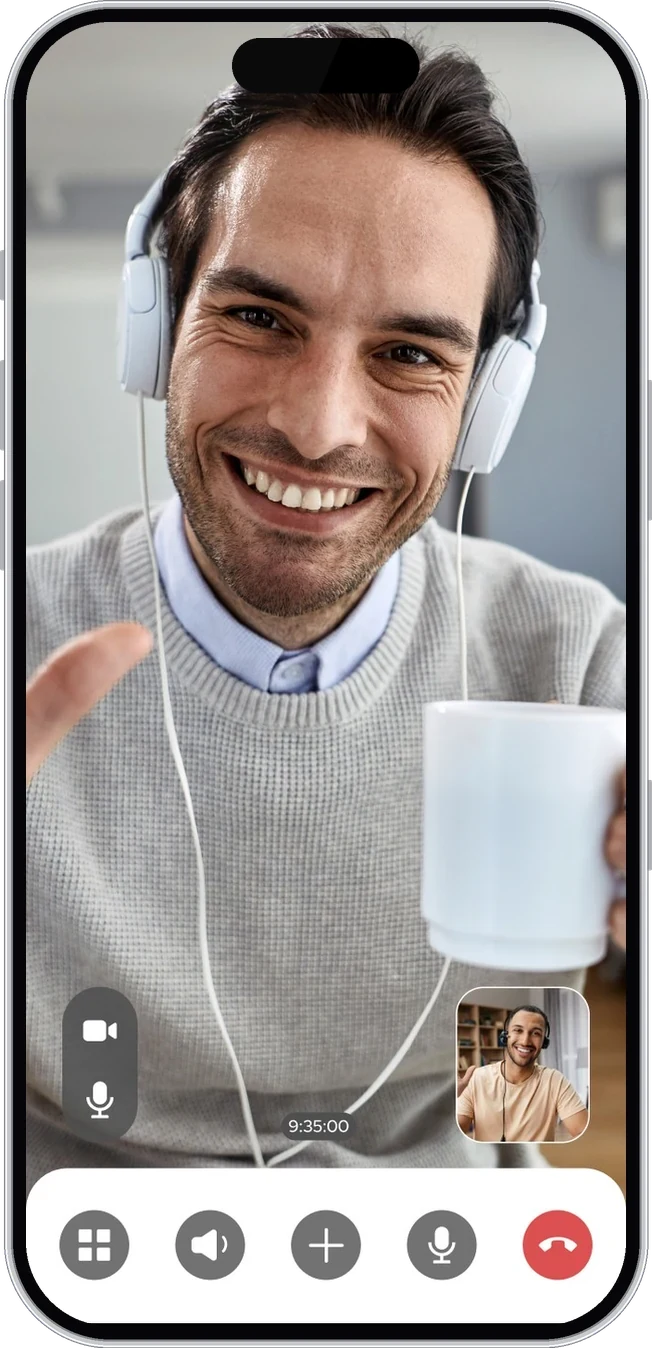
Group video call with participant tiles, a ringing tile and the call control bar

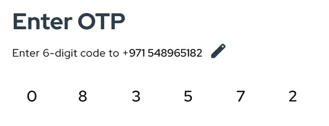
Verify a 6-digit code from SMS

Component 06
OTP entry with six digits

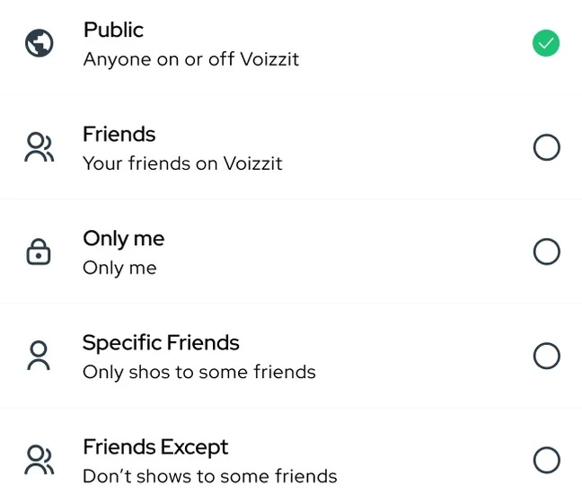
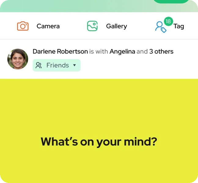
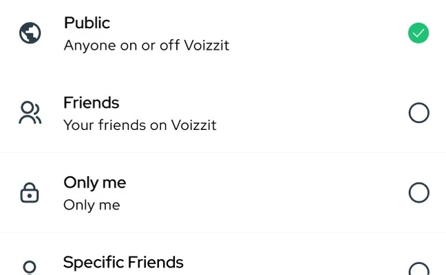
Audience picked before you post

Component 07
Choose audience: public, friends, only me, specific friends, friends except

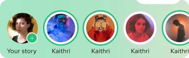
Stories ring the top of the feed

Component 08
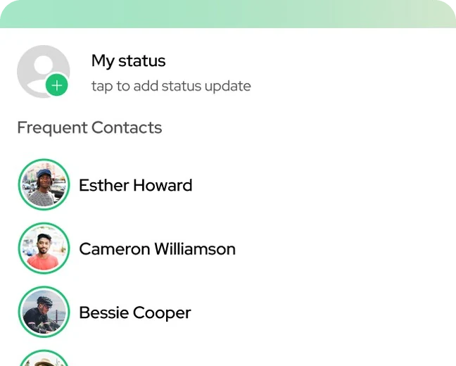
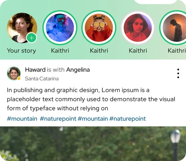
Story avatars with green rings at the top of the feed

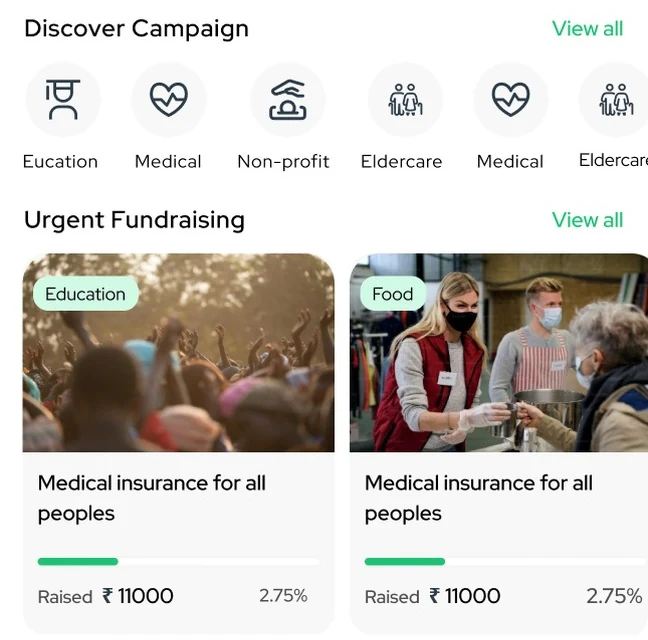
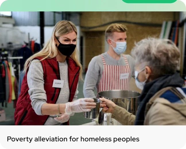
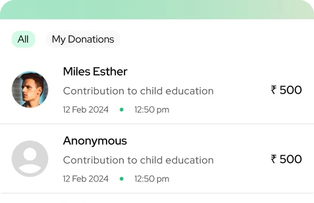
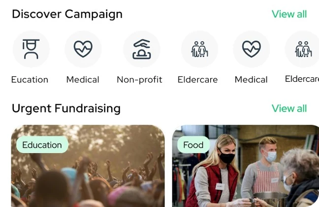
Crowdfunding causes, campaigns and progress

Component 09
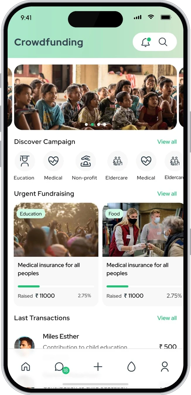
Crowdfunding: campaign categories and urgent fundraising cards with amount raised
The problem

Many features, one thumb

Chat, calls, status, a feed, reels and crowdfunding could easily become six apps in one. Each needed to feel familiar on its own and still belong to the same product.

People open a messenger dozens of times a day, so the most common actions, reading, replying and calling, had to stay one tap away.

Who it is for

Talkers, sharers and givers

CHAT FIRST

People who message all day

They need a fast chat list, clear read states, voice notes and calls without hunting for buttons.

SOCIAL

People who share and support

They post, watch status, follow friends and give to causes, and want each of those in its own clear space.

Information architecture

Five tabs, one home for everything

The bottom bar holds Home (the feed), Chats, Create, Crowdfunding and Profile. Status and calls live inside chats, and every flow comes back to the same five tabs.

Voizzit app
Seen onceOnboarding4 screens
  • Welcome
  • Phone number
  • Verify code
  • Create account
TabHome5 screens
  • Stories
  • Feed posts
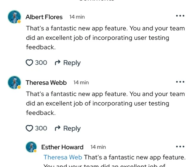
  • Comments · likes
  • Reels
  • Search
TabChats6 screens
  • All · People · Groups
  • Conversation
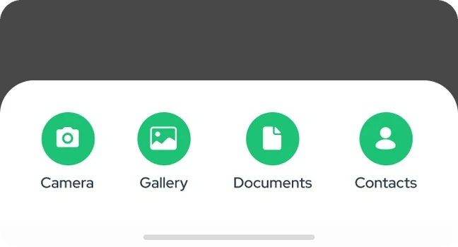
  • Attachments
  • Forward
  • Status
  • Calls · call info
TabCreate4 screens
  • Post
  • Reel
  • Story
  • Choose audience
TabCrowdfunding4 screens
  • Campaigns
  • Causes
  • Donate
  • Transactions
TabProfile5 screens
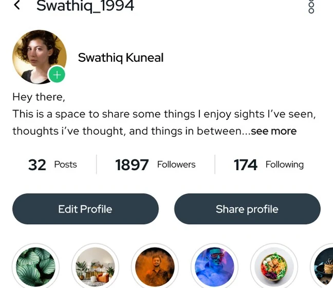
  • Posts · highlights
  • Followers
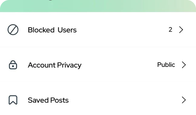
  • Saved posts
  • Settings · privacy
  • Notifications
Process

From wireframe to first release

  1. 01Listed the features for the first release and ranked them
  2. 02Set the navigation: five tabs, chat at the centre
  3. 03Wireframed the core screens in grey
  4. 04Built the style guide: colour, type, icons, light and dark
  5. 05Designed 100+ screens across chat, calls, feed and giving
  6. 06Prototyped the main flows for the developers
Wireframes

Structure first, then colour

Each core screen started as a grey wireframe. Drag the handle to see how the wireframe became the final design.
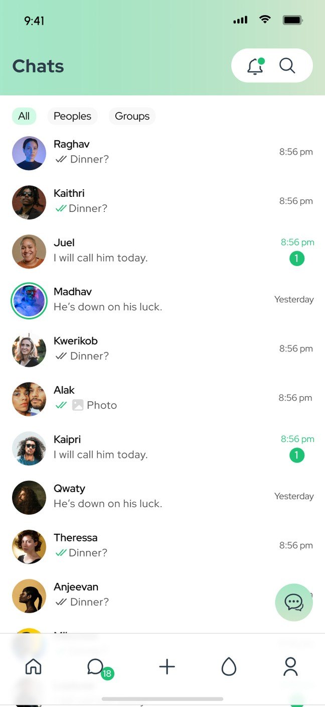
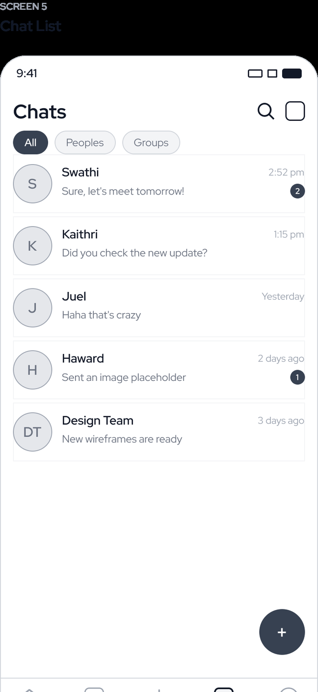
Final design of the chats screen Wireframe of the chats screen WireframeDesign
Interface

A hundred screens, one style guide

Every screen is built from the same parts: list rows, bubbles, tiles, sheets and buttons. Below is a selection from across the app.
Key decisions

Choices that kept a big app simple

CHAT AT THE CENTRE

The chat tab in the middle

Chats sit in the centre of the bottom bar, the easiest spot for a thumb, because that is where people spend most of their time.

ONE BUBBLE

Every message type, one shape

Text, voice notes, photos, files, links and contacts all use the same bubble, so a busy chat still reads cleanly.

CLEAR STATES

Ticks, rings and badges

Read ticks, story rings and unread counts look the same everywhere, so people read them at a glance.

GIVING

Crowdfunding with its own space

Causes, campaigns and transactions have their own tab, with progress bars and filters, instead of being buried in the feed.

Beyond chat

Status, calls and giving

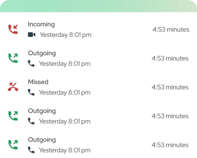
The rest of the app follows the same system: full-screen status with viewers, one-to-one and group calls, a feed with posts and reels, and a crowdfunding space for causes.
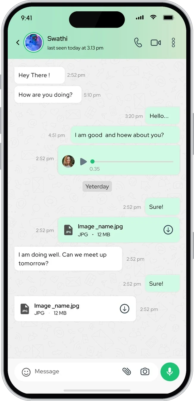
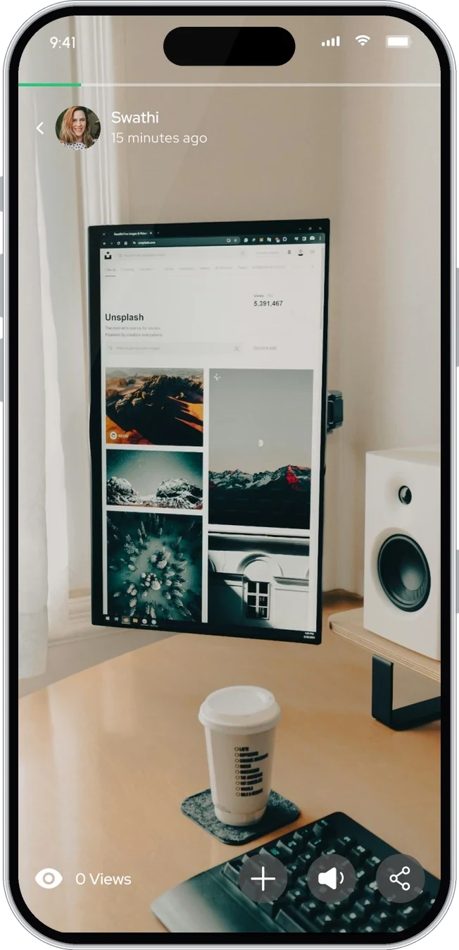
Chat with Swathi: messages, a voice note and files
01Conversation
Full-screen status with views and reply
02Status
One-to-one video call
03Video call
Crowdfunding home with campaigns and urgent fundraising
04Crowdfunding
Where it stands

Shipped as the first release

The first release is live on Google Play. The Figma file holds wireframes, the style guide, light and dark themes and over a hundred screens for chat, calls, status, feed, reels, crowdfunding, profile and settings.

What I took away
  1. 01In a busy app, a fixed home for each feature beats clever shortcuts.
  2. 02One message bubble for every type keeps long chats readable.
  3. 03Wireframing every core screen first made the style guide much easier to build.
Keep exploring Next: Hair Salon Website
Next step

Have a product that needs better thinking?

Let's talk

or write directly: vasudevsra1995@gmail.com