PROJECT SCREENSInside the design

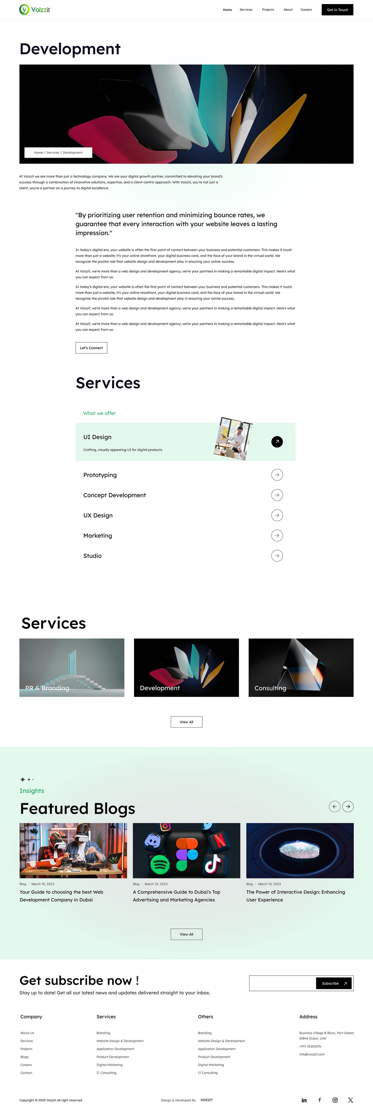
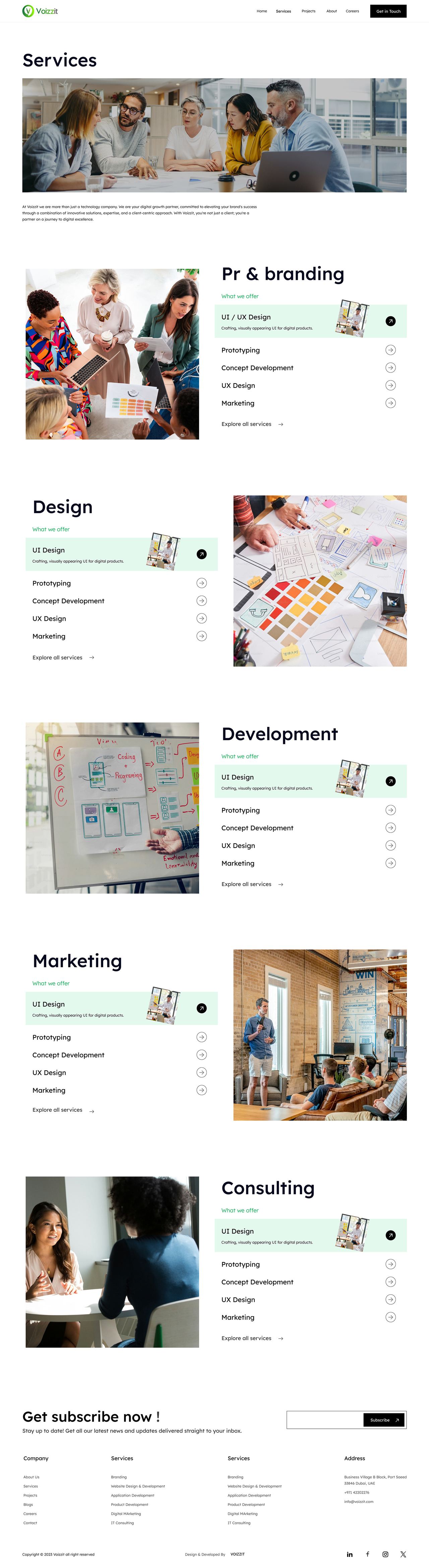
Each page auto-scrolls — hover to pause
A seamless business corporate website concept — credibility, clarity and calm confidence.
Corporate sites carry reputation. This concept expresses stability and momentum through generous spacing, disciplined typography and a clear narrative arc.
Corporate templates feel interchangeable. Stakeholders need differentiation without sacrificing the conventions visitors rely on.
Complete concept: IA, wireframes, visual identity application and responsive high-fidelity design.
Room to breathe reads as institutional strength.
A page system the company can grow without a redesign.
Key metrics presented as verifiable facts, not slogans.
News and thought-leadership keep the site current.
Positioning research came first: what should a visitor believe about the brand within five seconds, and what should they do within thirty? Analysis of comparable sites showed interchangeable layouts and stock messaging — differentiation itself became a design requirement.
Visitors judge the organisation by the craft of the site before reading a word. The design must be the proof.
Each audience arrives with a different question; the IA gives each a clear next step instead of a generic tour.
The phone experience is the brand experience — designed first, not adapted later.
Arrives from a referral or search, scanning for credibility signals: work, results, people. Needs a clear story and an easy way to make contact.
Compares several options in one sitting. Needs fast answers — what, for whom, at what quality — without hunting through pages.
An editorial layout built on generous whitespace, a disciplined type scale and full-bleed imagery where the work speaks. Motion is purposeful — reveals and transitions that guide reading order — and every section ends with a clear, unpushy next step.
The design was pressure-tested for the scan, not the read: five-second impression checks, scroll-depth reasoning, and mobile-first passes. Copy and layout were tightened together — every section had to justify its scroll.
Each page auto-scrolls — hover to pause
A corporate presence built to age well — full concept on Behance.
View full project on Behance