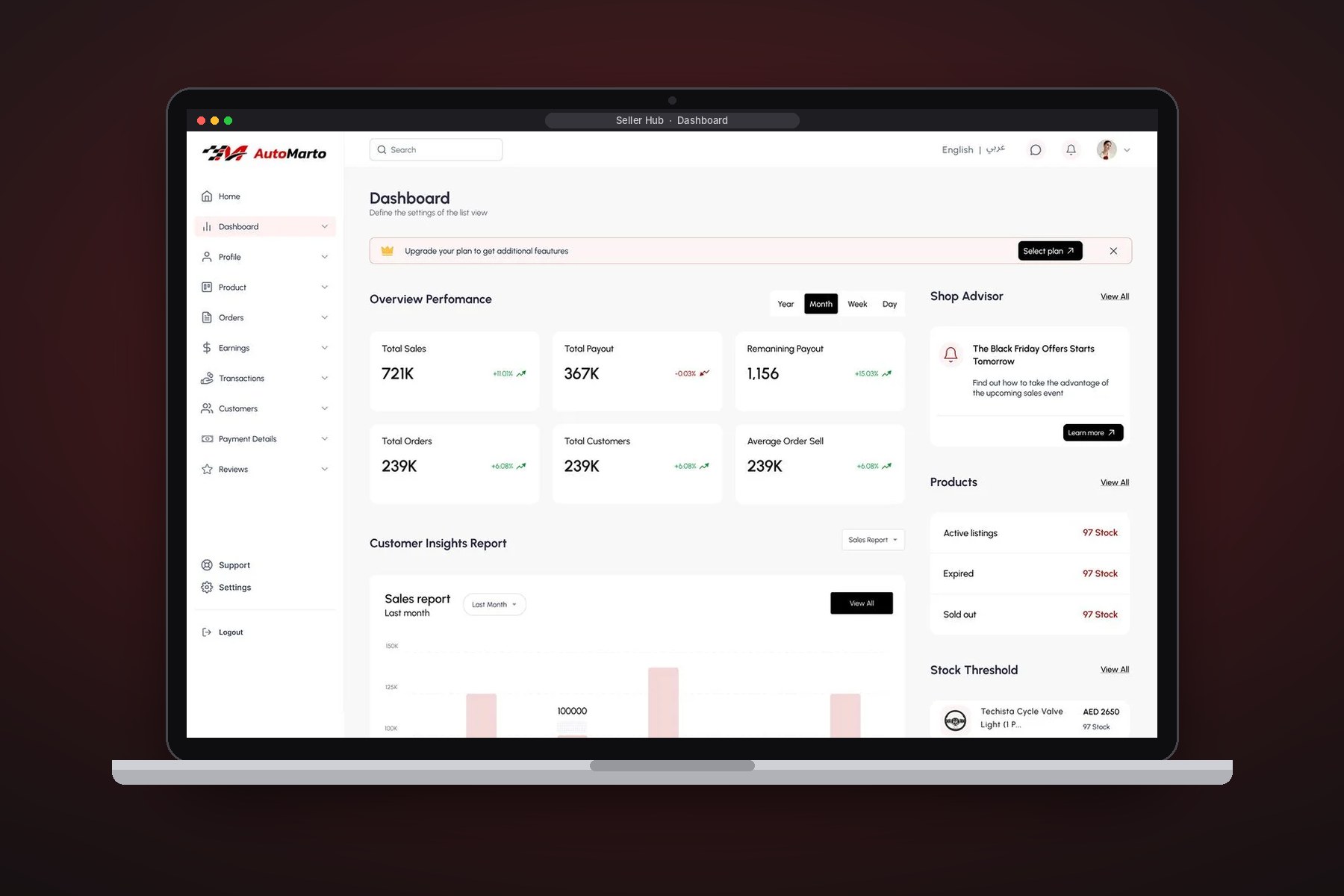
A streamlined seller dashboard for automobile management — catalog, orders and performance in one calm workspace.
The seller side of the Automarto marketplace: a workspace where vendors manage catalog, orders, and performance without a training manual.
Marketplace sellers are busy operators, not analysts. Every extra click on inventory or orders costs them real money.
Dashboard IA, inventory and order-management flows, performance views and the table/card system underneath.
Stock, compatibility and status in one scannable table.
The dashboard surfaces only what needs action.
Earnings and fees explained without a spreadsheet.
Consistent with the buyer experience for one brand feel.
Discovery focused on the jobs users hire the product for: what decision does this screen serve, what action follows, what can wait behind a click. Auditing comparable SaaS tools showed the same trap everywhere — dashboards that display everything and prioritise nothing.
Users open the product to do something. The landing view must answer “what needs me today?” before showing anything else.
Dense tables are fine — undifferentiated dense tables are not. Summary first, detail on demand.
In daily-use tools, users get fast by building muscle memory; consistent patterns are a performance feature.
Lives in the product, values speed and keyboard-friendly flows, and notices every inconsistency. Needs dense-but-ordered screens that reward familiarity.
Drops in weekly for status and numbers. Needs summaries, trends and export — without relearning the interface each visit.
A restrained interface where colour means something: neutrals for structure, one accent for primary actions, and semantic colour reserved for status. Tables use progressive disclosure, cards summarise before they detail, and every component comes from a documented library so new screens ship consistent by default.
Prototypes were tested against realistic data volumes — hundreds of rows, awkward edge cases, long names — because SaaS designs that demo well often collapse under real data. Iterations tightened empty states, loading states and error states, the three screens teams usually forget.
 01
01
 02
02
 03
03
 04
04
Each screen pans on its own — scroll sideways for more
A seller hub that runs a parts business at a glance — see it on Behance. (Companion to the Automarto buyer case study.)
View full project on Behanceor write directly — vasudevsra1995@gmail.com