Chat list shows who, the last message, ticks and unread count
Component 01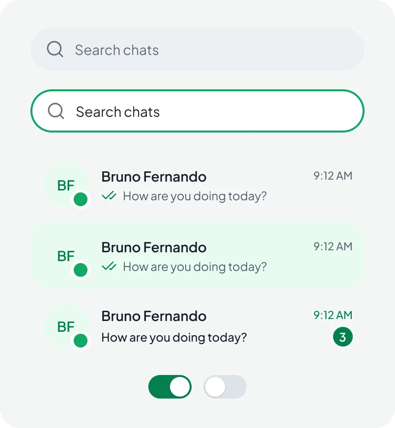
A web app for chatting, sharing and calling, designed in Figma: one-to-one and group chats, a social feed, video calls and profiles, built on one shared component library.
Voizzit Chat is the messaging product from Voizzit in Dubai. On the web it brings together private and group chats, shared media, a social feed with stories and posts, and voice and video calls.
I designed the web app end to end: the flows for chats, groups and calls, the screens, and the component library the developers built from.
The app had to hold a lot: chats, groups, a feed, calls and notifications. Each one could easily have grown its own layout and its own rules, and the product would have felt like five apps glued together.
The goal was a single layout that every feature fits into: a slim navigation rail on the left, the list in the middle, the conversation or feed in the main area, and details in a side panel only when you ask for them.
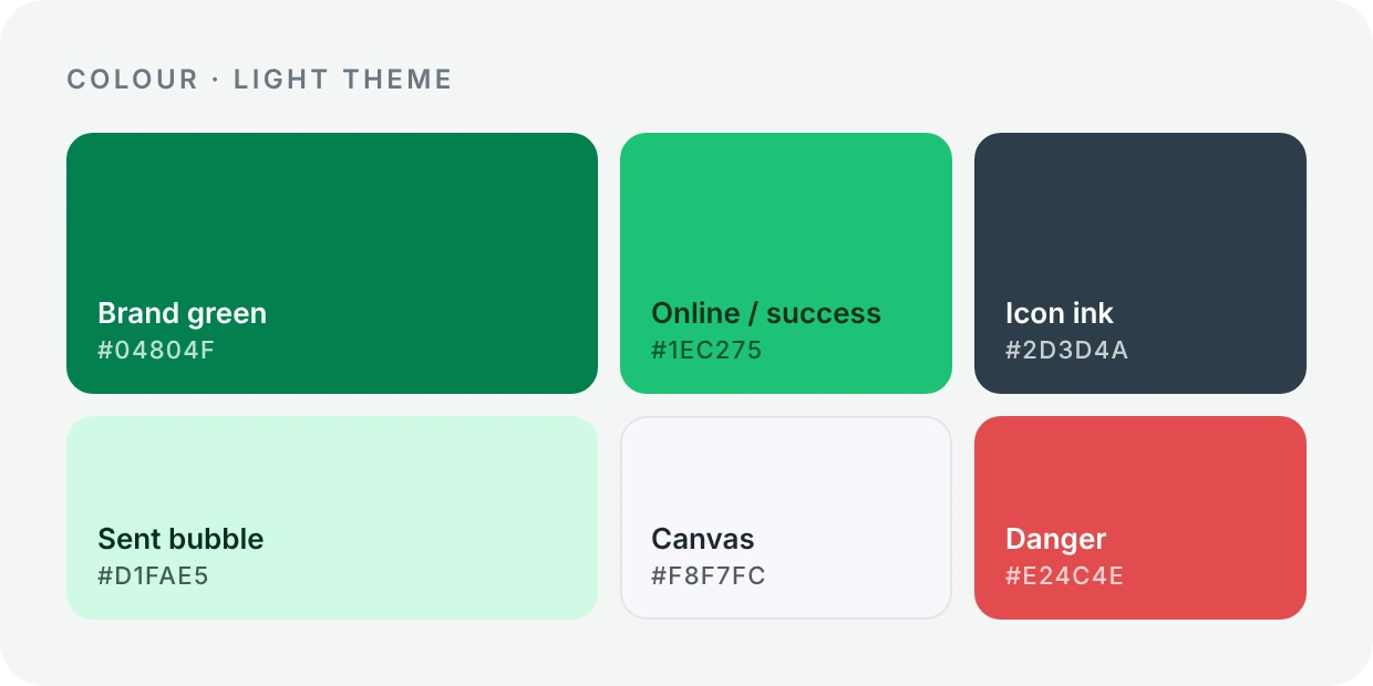
The interface stays light and neutral so messages, photos and faces carry the colour. Green is the only accent, so it always means sent, online or the next step.
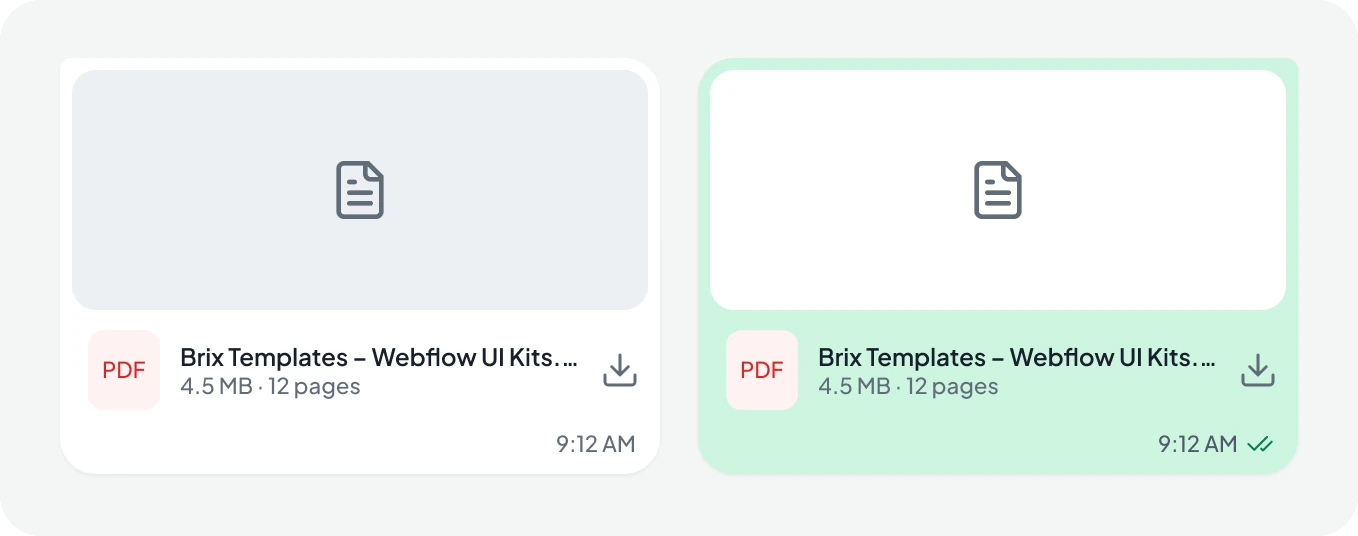
Real chats are busy: unread counts, ticks for sent and read, voice notes, files, replies and group senders. Each of these needed a small, consistent signal that is easy to spot and easy to ignore.
Tasks like starting a new chat, adding members or choosing who sees a post open in a side panel or a focused dialog, so you never lose the conversation you were in.
Everything hangs off the slim rail on the left. Chats are the centre of the app; groups, the feed, calls, profiles and notifications sit one click away and open in the same three-column layout.
"Conversation without clutter."
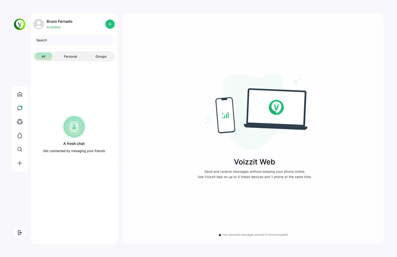
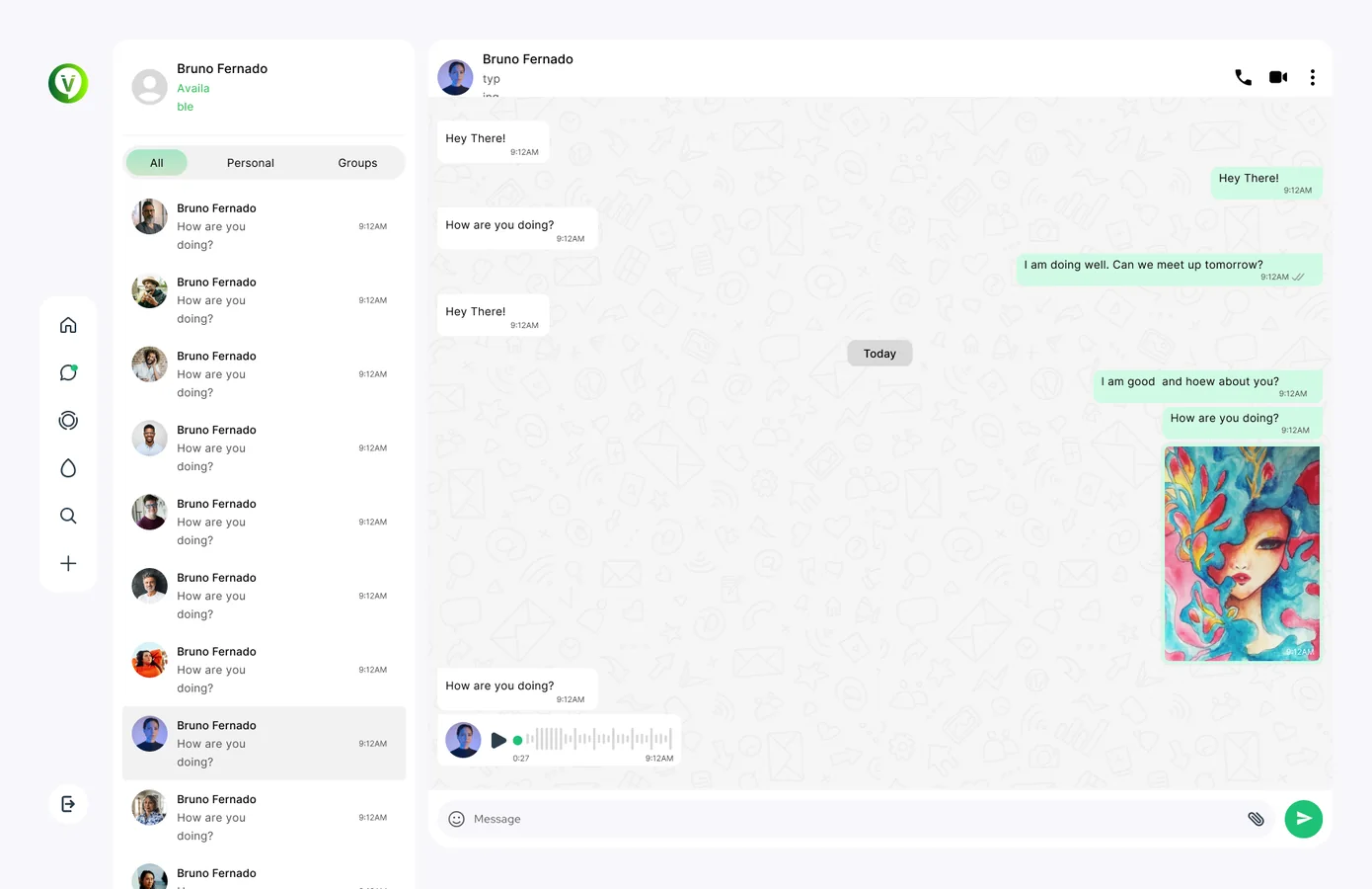
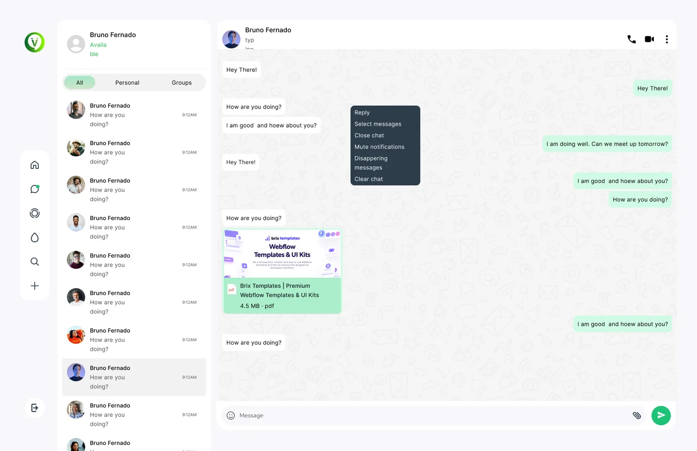
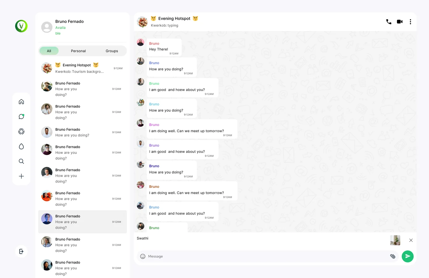
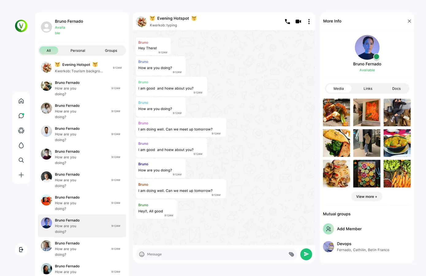
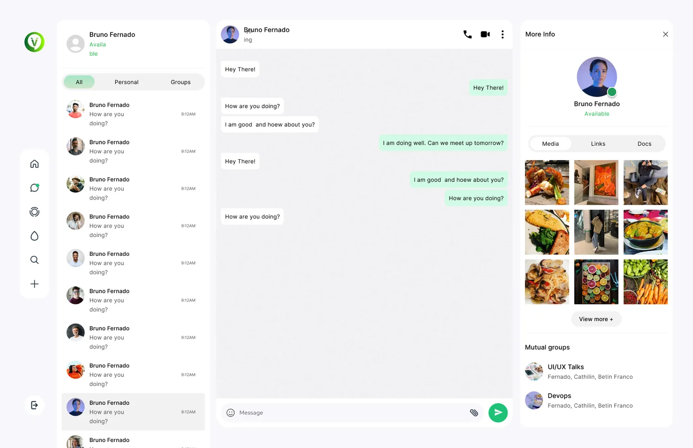
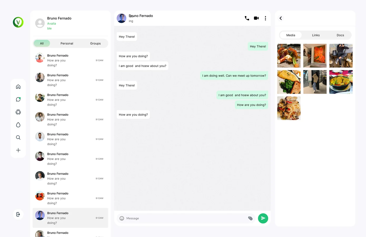
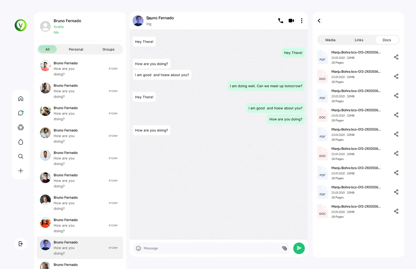
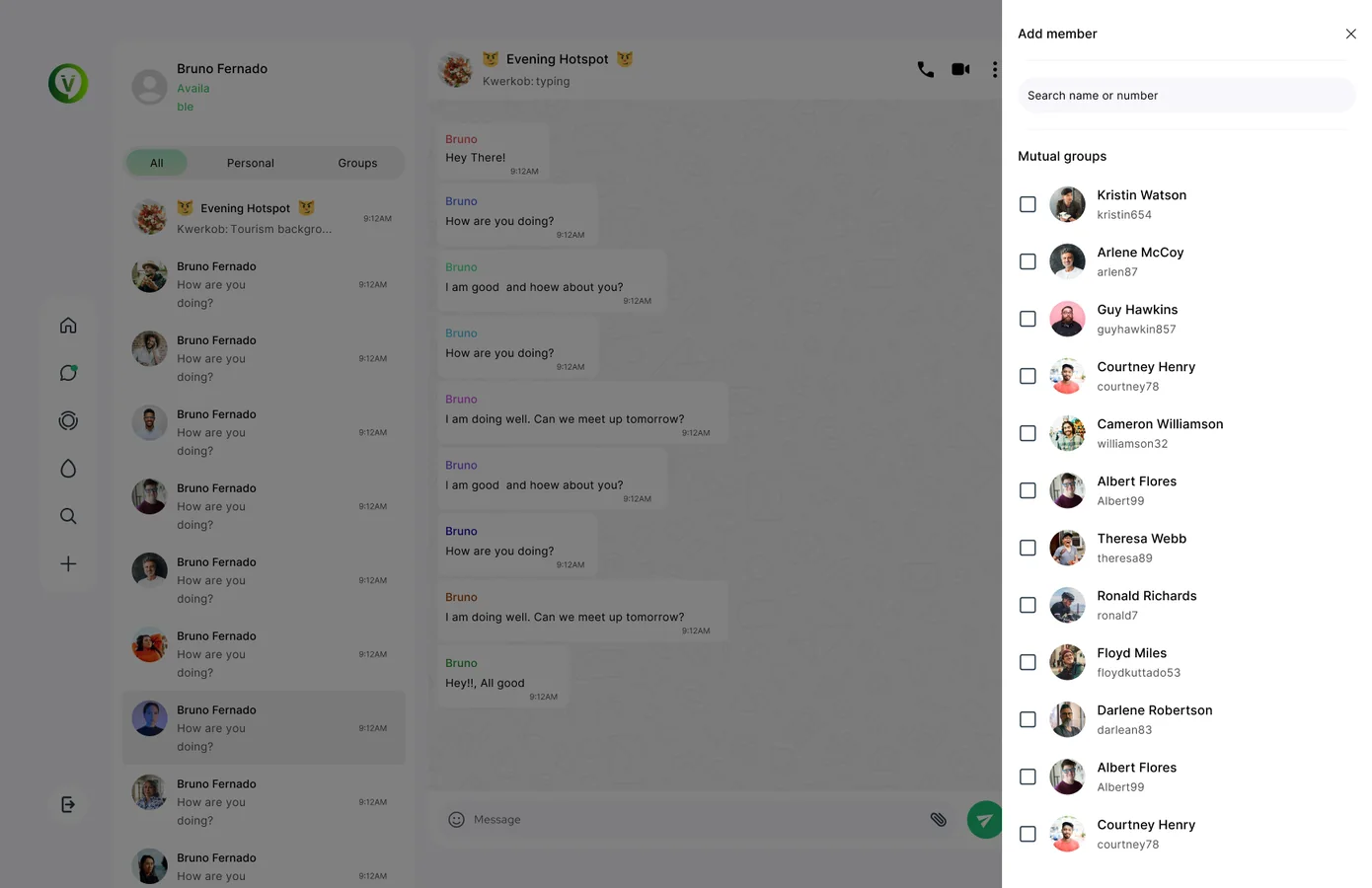
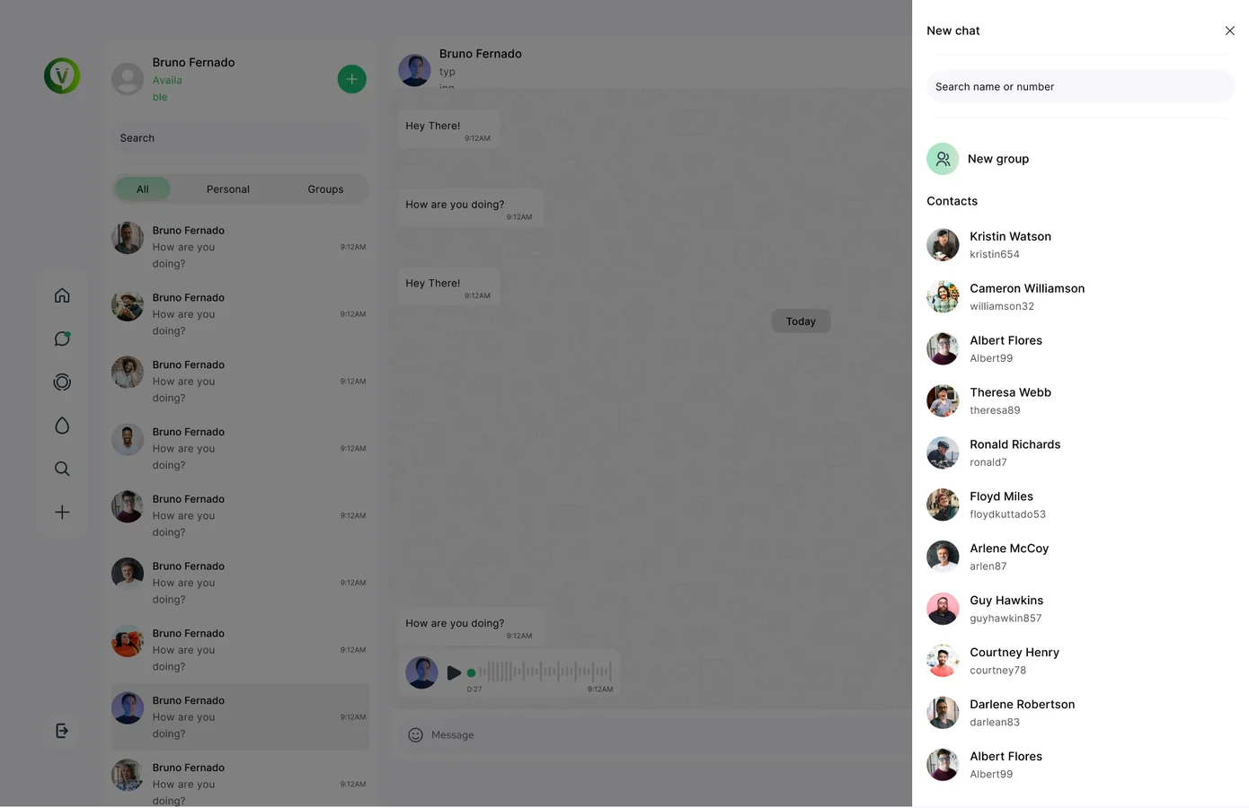
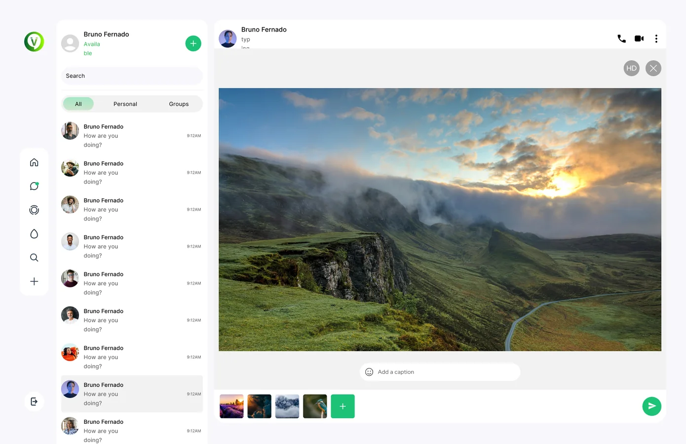
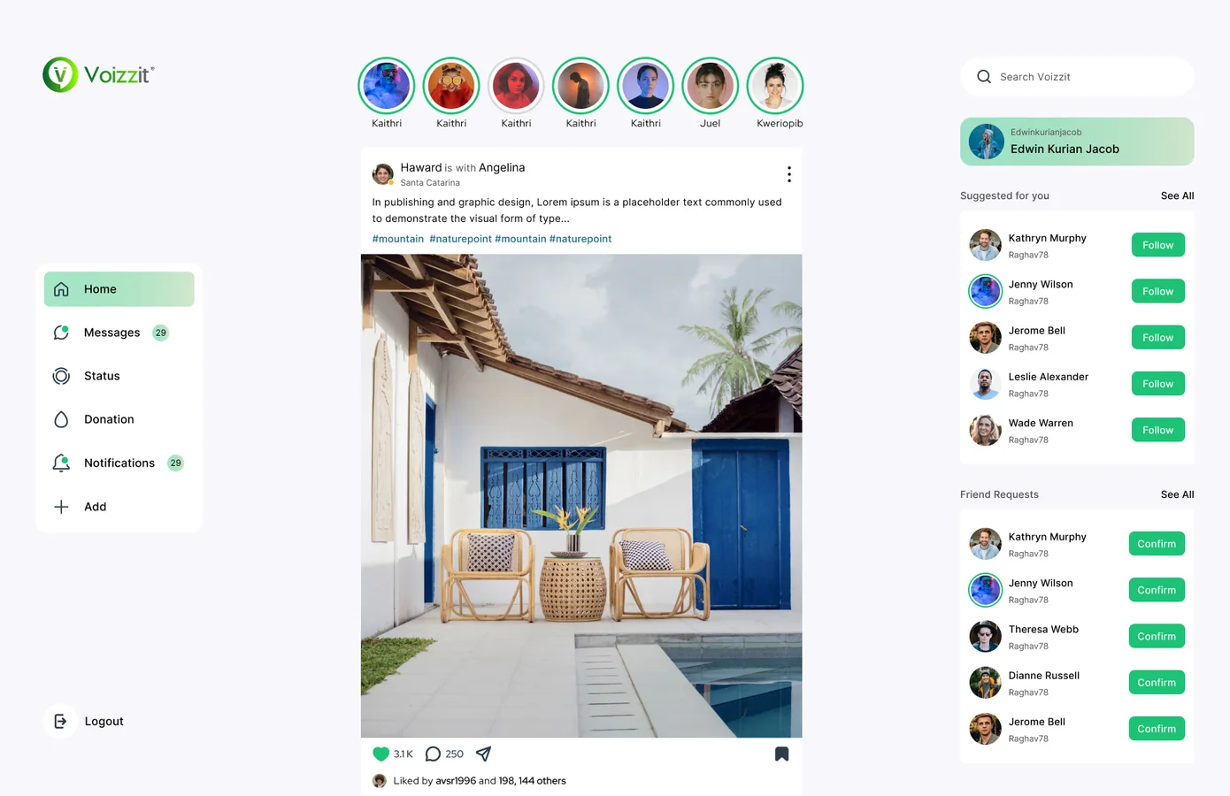
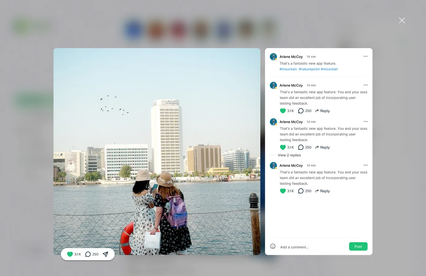
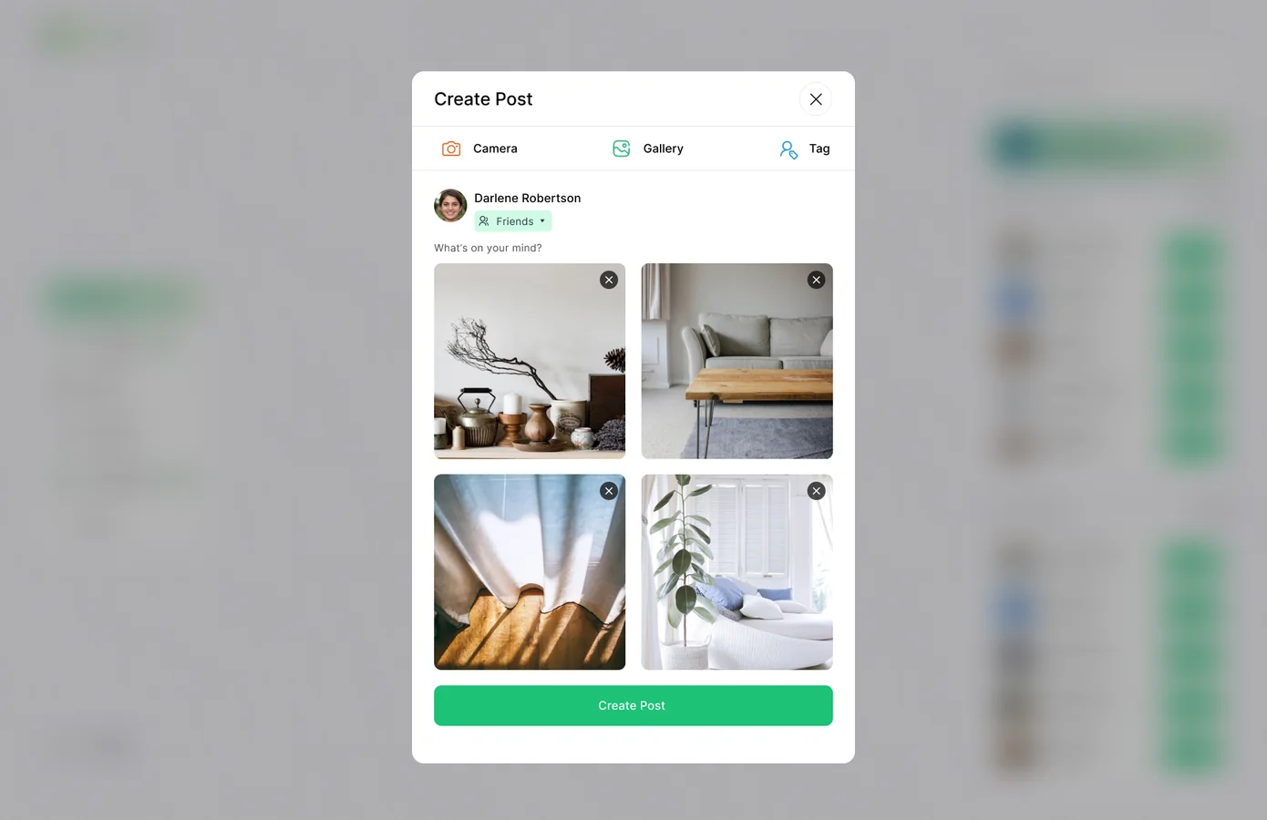


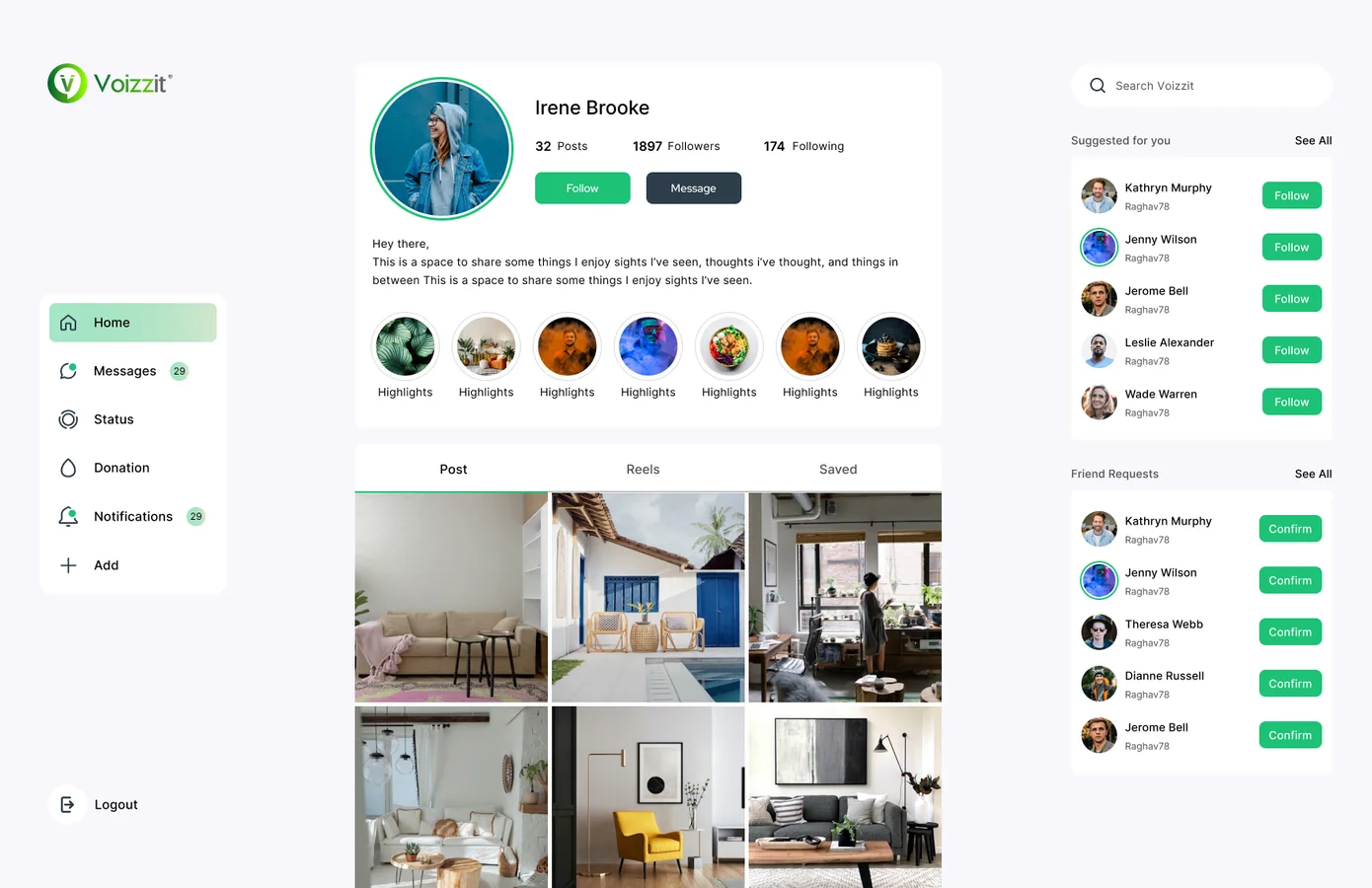
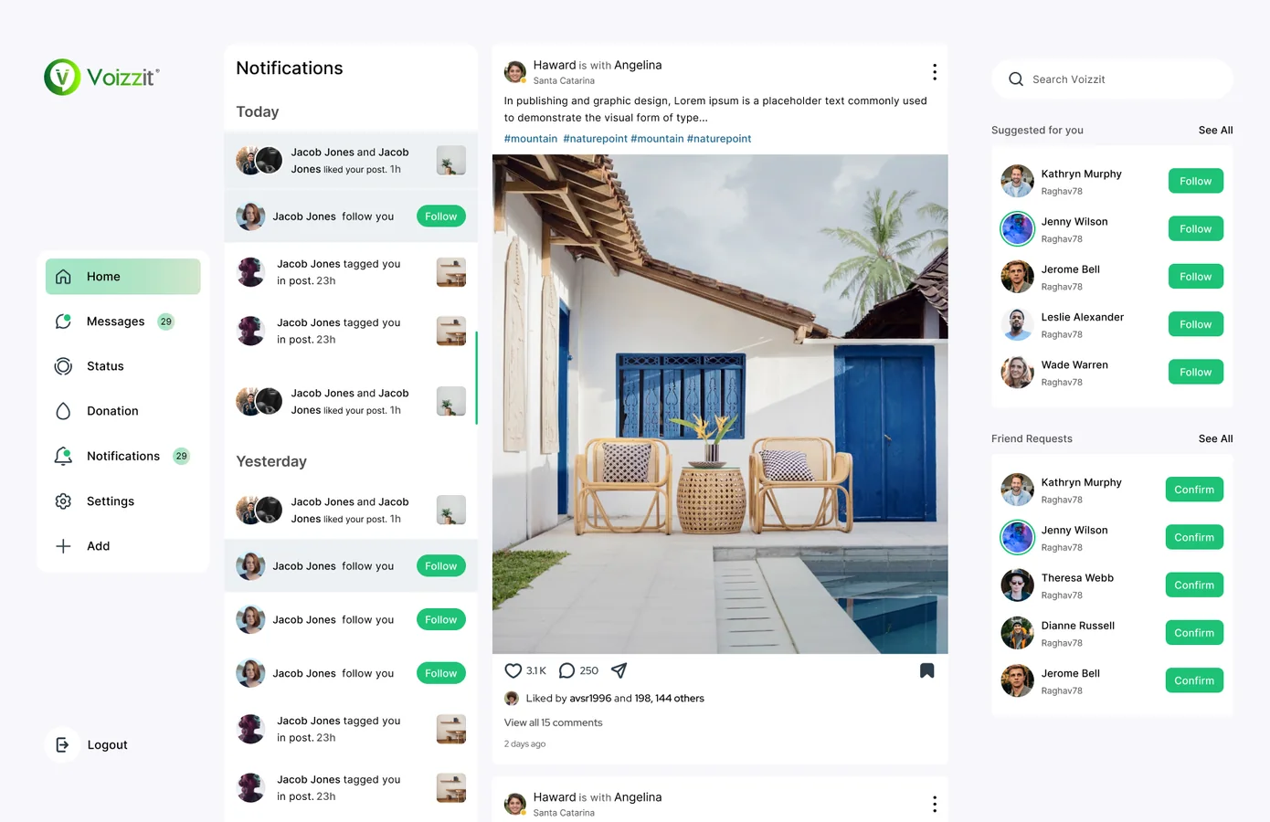
Chats, groups, the feed and notifications all use the same three columns, so moving between them never feels like a new app.
Soft greys and white keep the frame calm. Photos, faces and the mint "sent" bubbles stand out on their own.
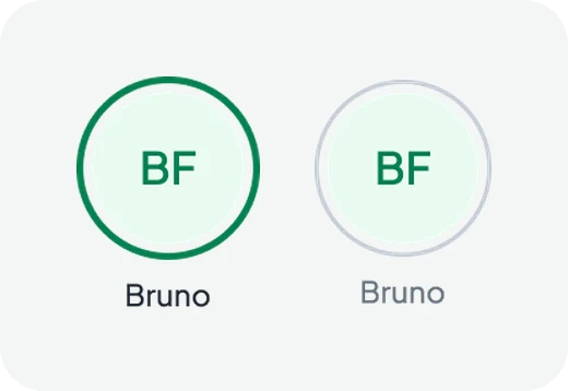
Online dots, read ticks and unread badges look the same everywhere, so people read them at a glance.
Contact info, shared media, new chats and post settings open beside or over the chat, so you can get back with one click.
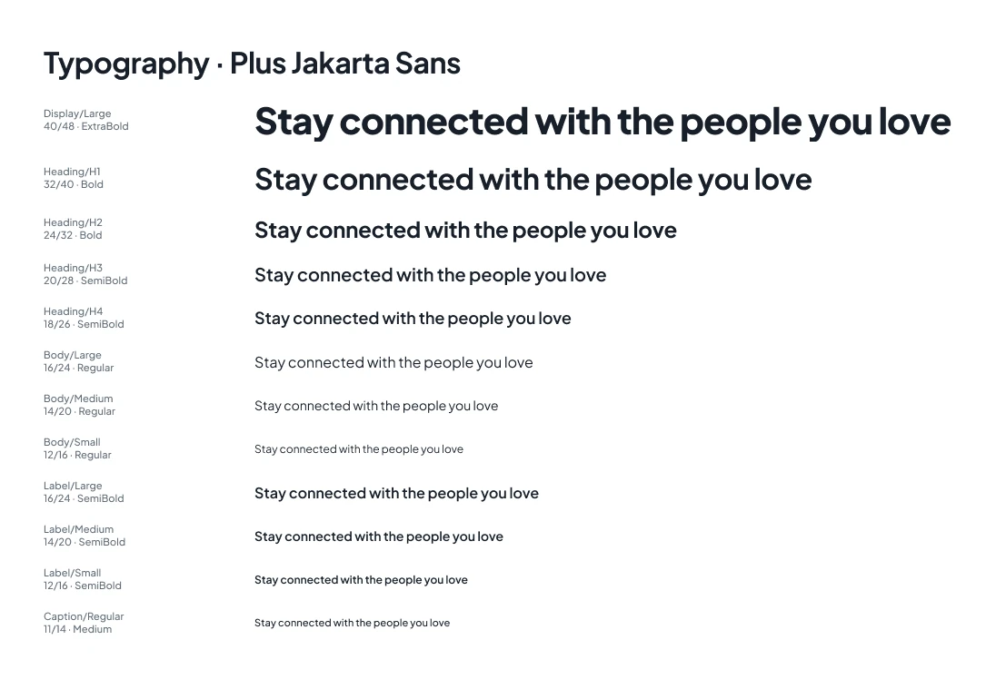
The Figma file has separate pages for icons, foundations, components and screens. Foundations cover light and dark colours, a Plus Jakarta Sans type scale, spacing and radius. More than 40 components, from chat rows and message bubbles to call controls, have their states built in.
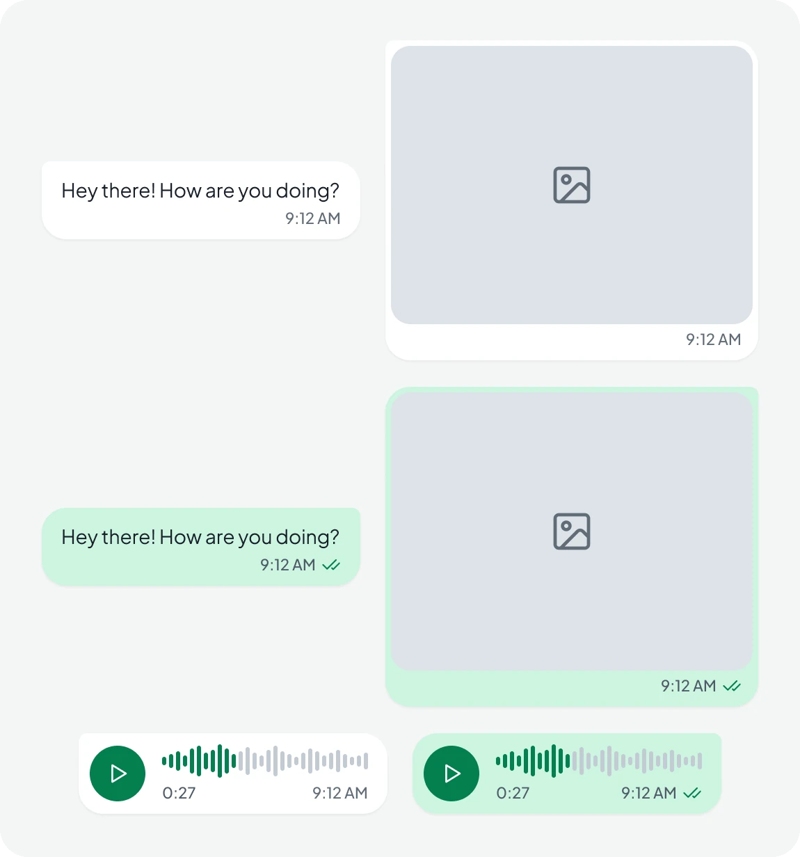
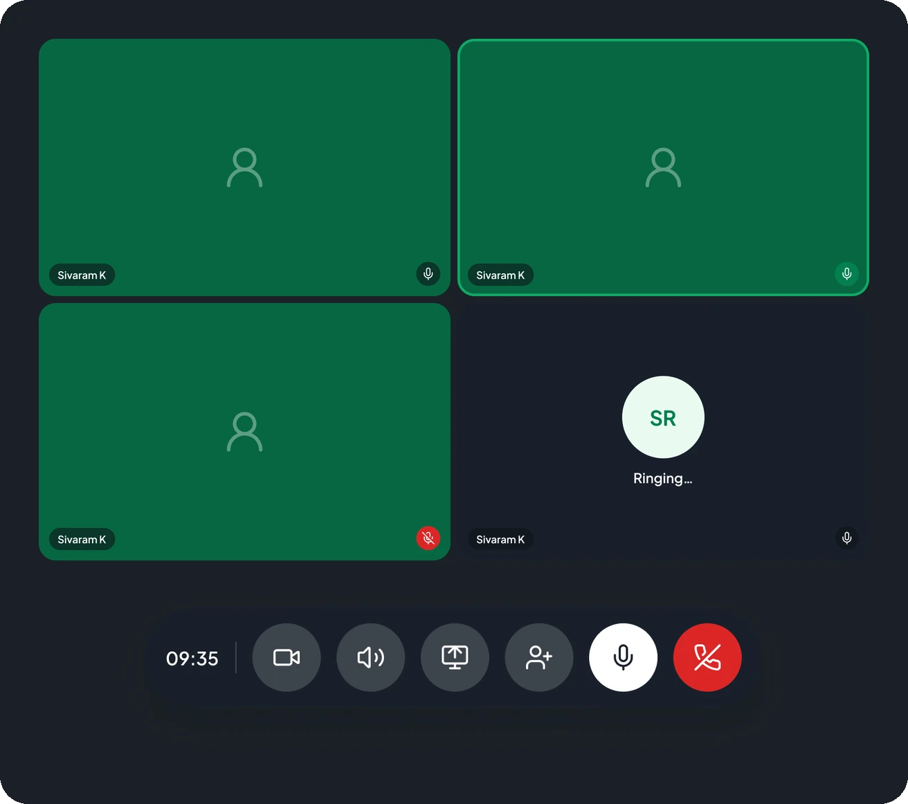
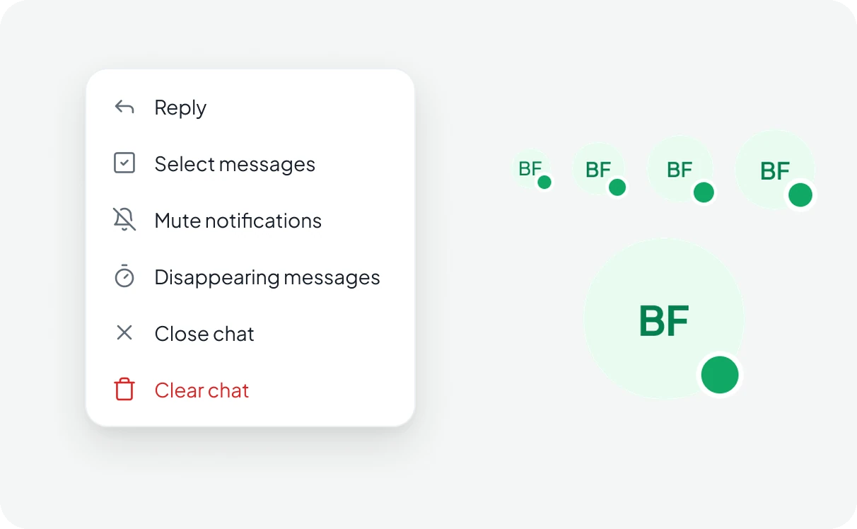
The web app covers the full product: welcome, chats and groups, message actions, shared media, links and docs, new chats and groups, the feed with stories, posts, comments and likes, post creation, video calls, profiles and notifications.
Every screen is built from the same components, so the developers had one set of parts to build and new features slot into the existing layout.
or write directly: vasudevsra1995@gmail.com