Work  /  Case study 04  /  Website

Voizzit Website

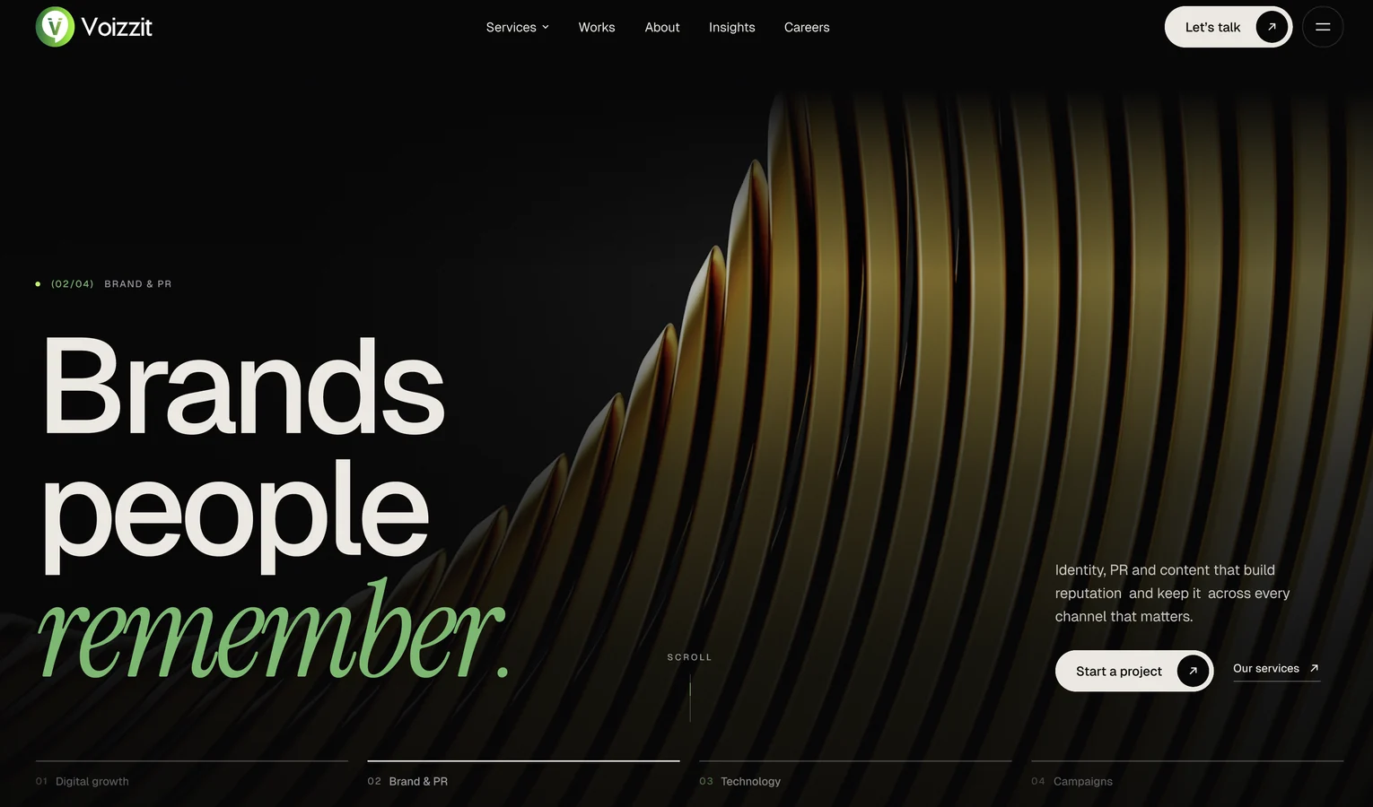
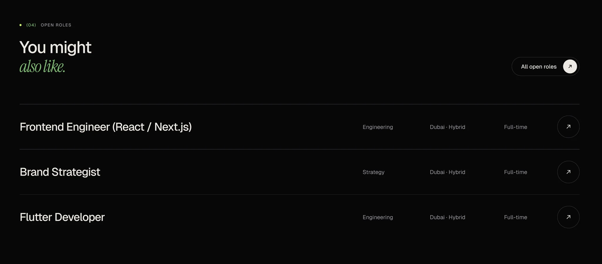
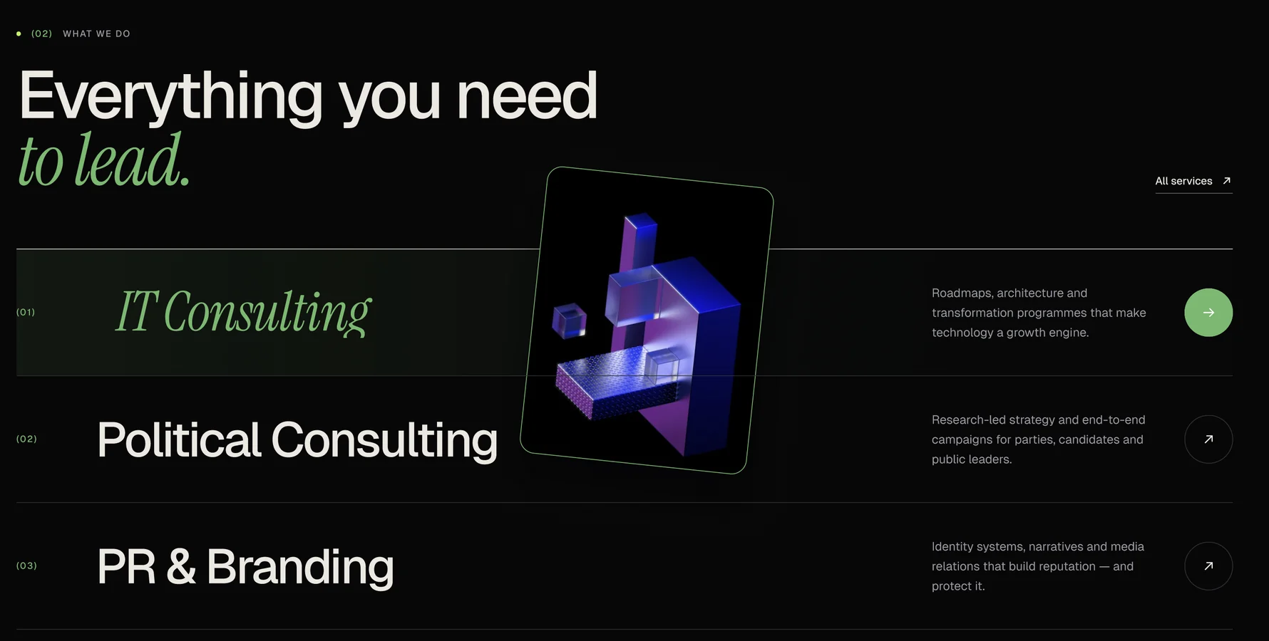
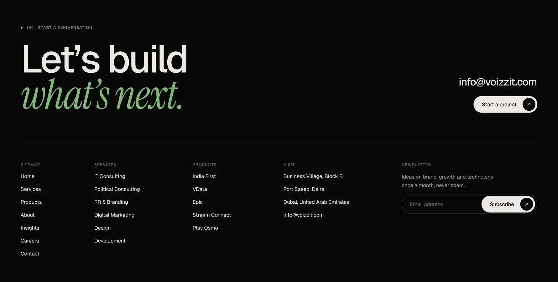
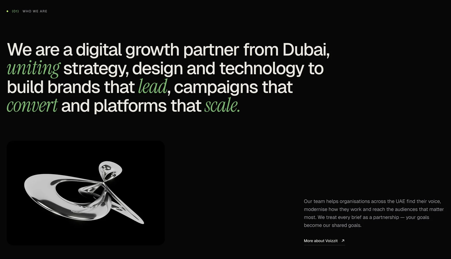
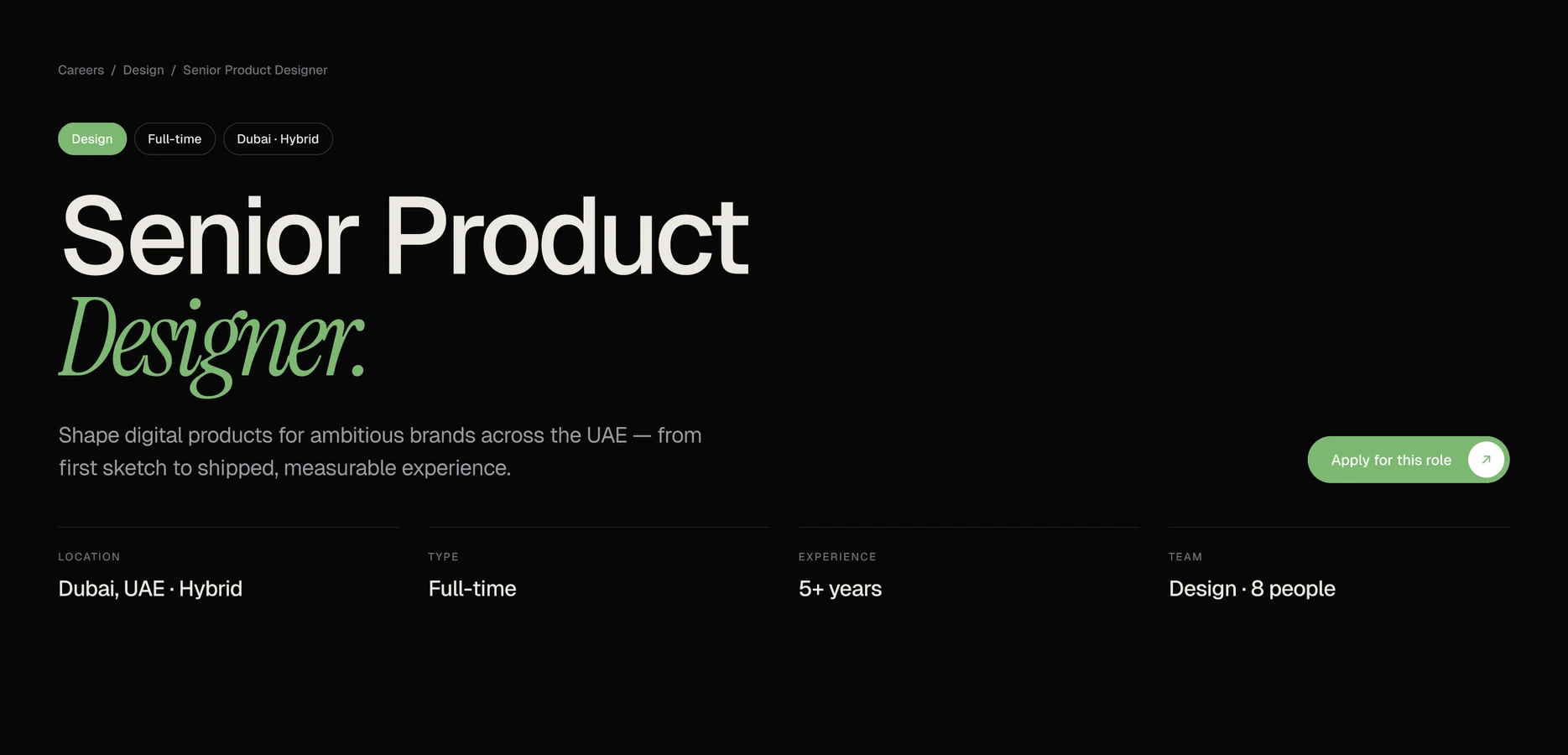
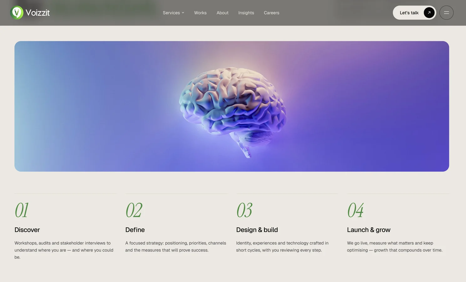
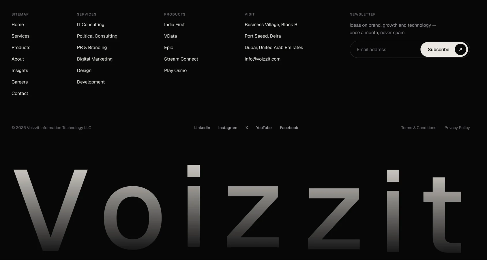
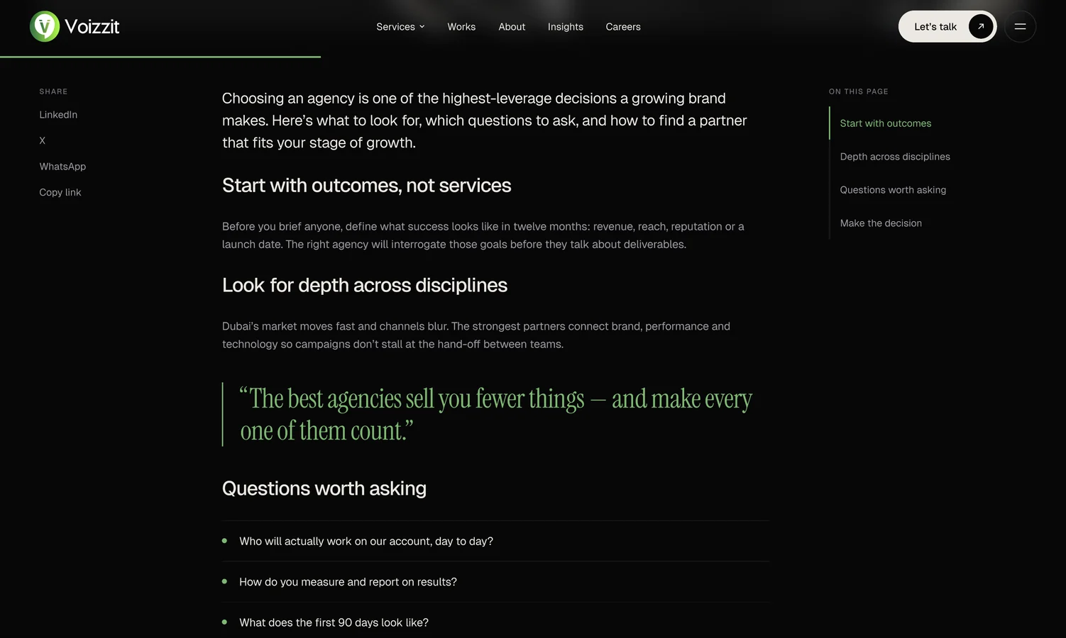
A dark, premium website for a Dubai digital growth partner, designed and prototyped in Figma: 15 desktop pages, a component library and a clickable, animated prototype.

TypeCompany website
My roleUI/UX designer
Scope15 desktop pages
ToolsFigma

What I did

Art directionWeb designDesign system MotionPrototyping

Make Voizzit look as ambitious as the work it does

Voizzit is a Dubai-based digital growth partner: strategy, design, technology and marketing, working as one team to build brands that lead. It works with government, brands and enterprise clients, and runs its own in-house products.

I looked at what the current site was missing, chose a dark editorial direction and built a small design system first. Then I designed the pages, linked them into a prototype and refined the motion and readability.

Client
Voizzit, Dubai
Type
Company website
Deliverables
15 desktop pages, component library, animated prototype
System
25+ components, 21 text styles, colour variables
Tools
Figma
Context

Six services and in-house products, one generic site

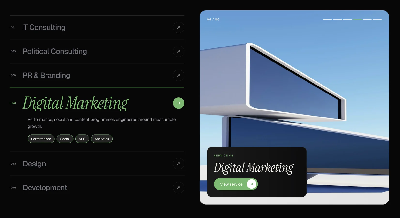
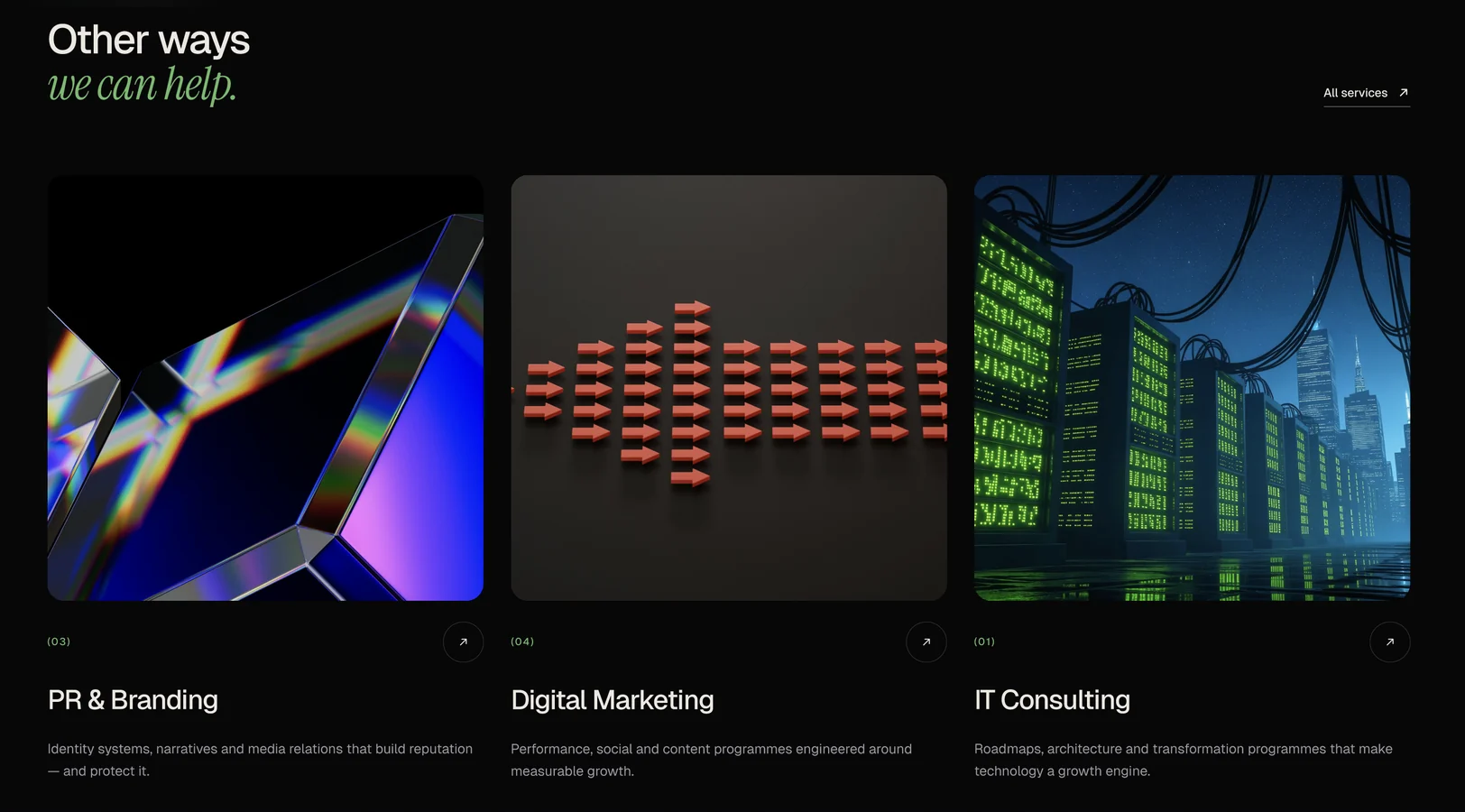
The current site felt generic. It didn't show the range of Voizzit's six services, from IT and political consulting to PR, marketing, design and development, or the products it builds and runs itself.

Goal

A premium, editorial site that builds trust

The goal was a premium, dark, editorial site that builds trust with government, brands and enterprise clients.

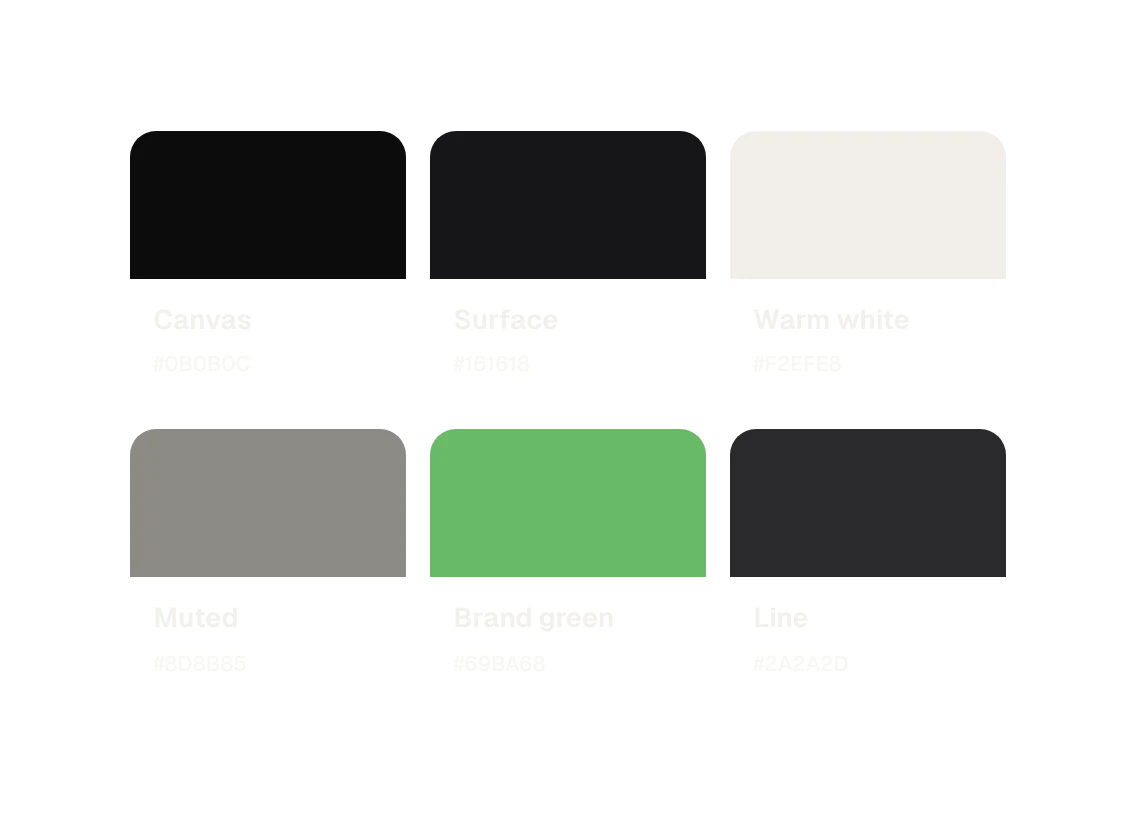
A dark look feels confident and premium, and it makes the 3D images and product screens stand out. Green connects to the Voizzit logo, and it's the only accent, so it always means important or clickable.

Challenges

Consistency as the site grew, readability on any image

The hardest part was keeping things consistent as the site grew to 15 pages. I solved it by turning repeated images and sections into shared components, so a change in one place updates every page.

The banner had to stay readable on any image. Each banner has dark gradients behind the text and the header, and I tested it with a bright image to be sure.

Process

System first, pages second

  1. 01Reviewed the current site and what it was missing
  2. 02Chose a dark, editorial direction
  3. 03Built the system: colour variables, text styles, components
  4. 04Designed the 15 desktop pages
  5. 05Linked every nav, footer and card into a prototype
  6. 06Tuned the motion and readability

"Dark, editorial and calm: the content does the talking."

Design direction

Four rules for the whole site

DARK CANVAS

Near-black backgrounds

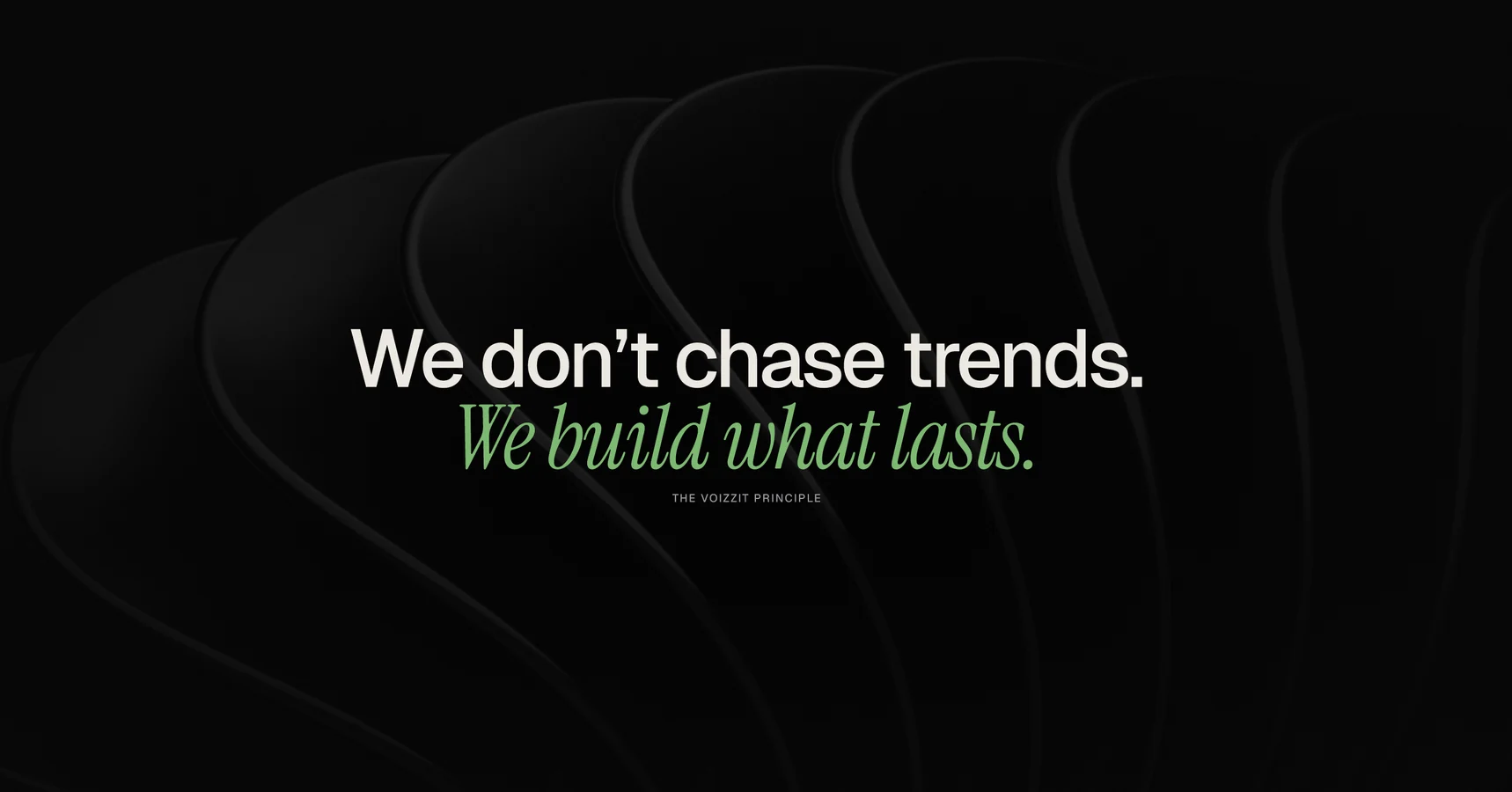
Near-black backgrounds with warm off-white text feel premium and let the imagery glow.

EDITORIAL TYPE

Sans headlines, one italic word

Large sans headlines with an italic serif accent word give each section a voice.

ABSTRACT 3D IMAGERY

One 3D render per service

Stock photos feel generic. A 3D image per service gives each one its own identity, reused everywhere through one shared component.

ONE BRAND GREEN

#69BA68, and nothing else

A single accent for highlights, buttons and hover states, so green always means important or clickable.

Design system

Built once, reused everywhere

The Figma file has three pages: Cover, Components and Website. Colours and text use variables and styles, so one change updates the whole site: 21 text styles in Geist and Instrument Serif, and more than 25 components with hover states.

Type Geist for reading, an Instrument Serif italic for one accent word

Component 01
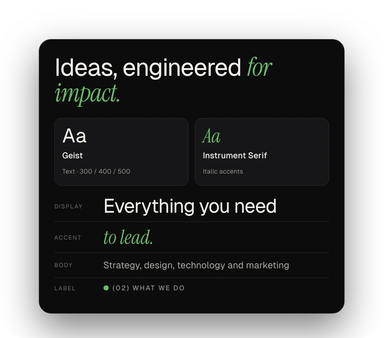
Type card: Geist and Instrument Serif italic with display, accent, body and label examples

Colour a dark canvas, warm text and one green

Component 02
Colour palette: Canvas, Surface, Warm white, Muted, Brand green #69BA68 and Line

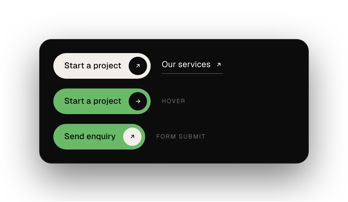
Buttons one primary pill, one text link, one green send

Component 03
Start a project pill, Our services text link, the green hover state and the green Send enquiry button

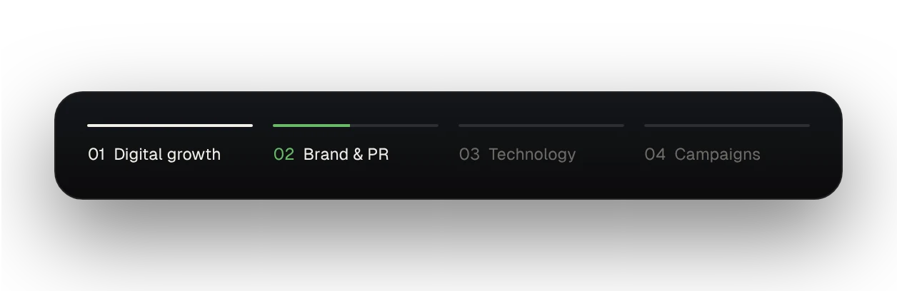
Banner tabs fill up to show which of four slides is playing

Component 04
Four banner tabs with progress lines: Digital growth, Brand & PR, Technology, Campaigns

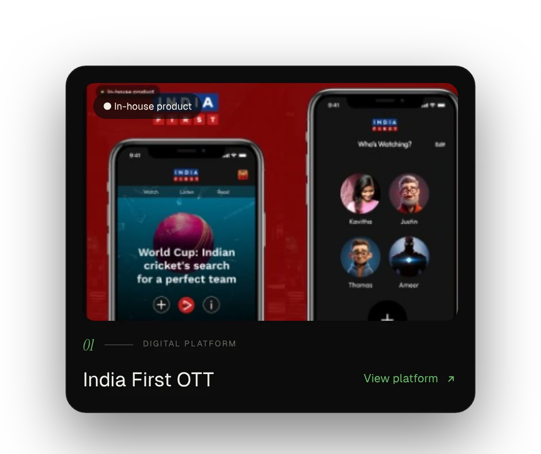
Product cards zoom the image and turn the arrow green on hover

Component 05
Product card for India First OTT with an In-house product badge and a View platform link

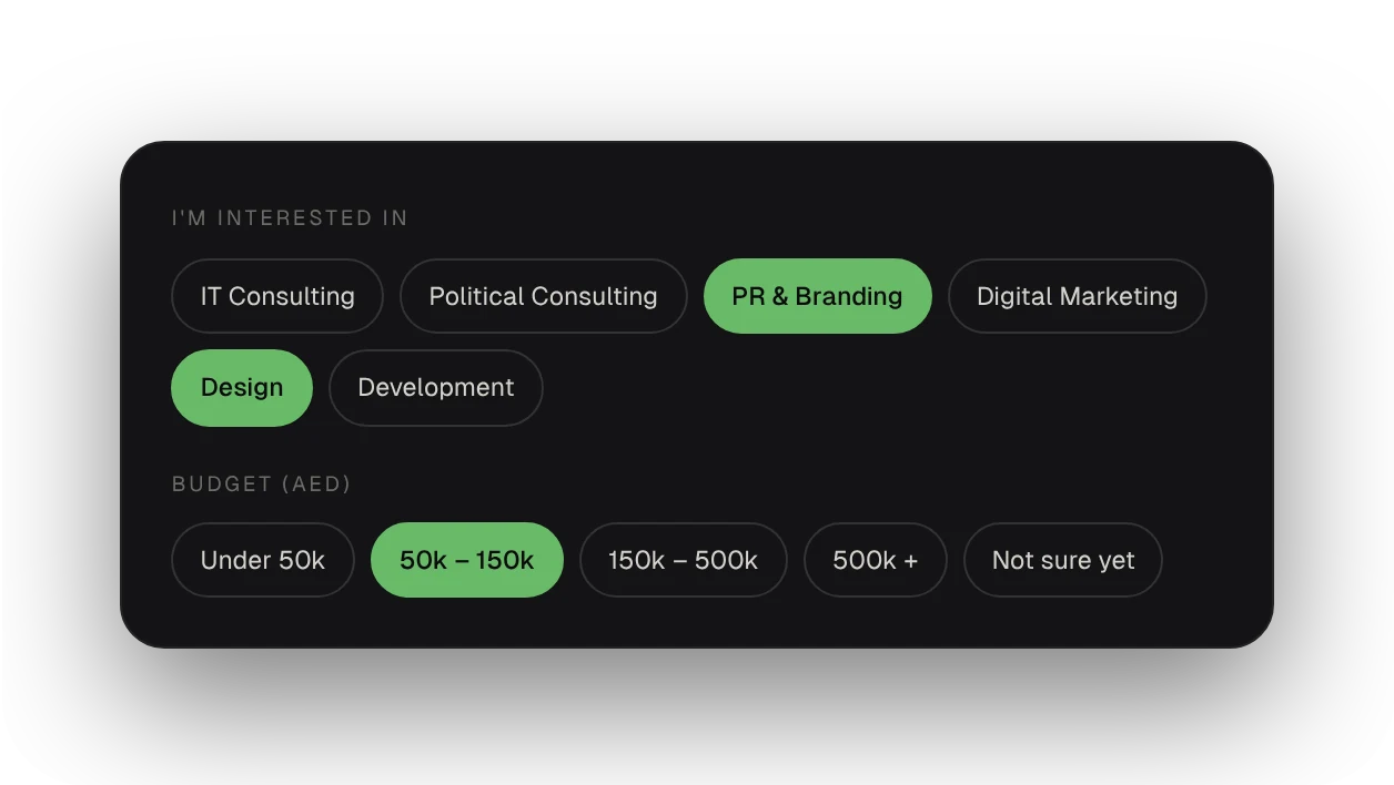
Selection chips let people pick services and a budget in one tap each

Component 06
Selection chips for services and budget, with selected chips in green

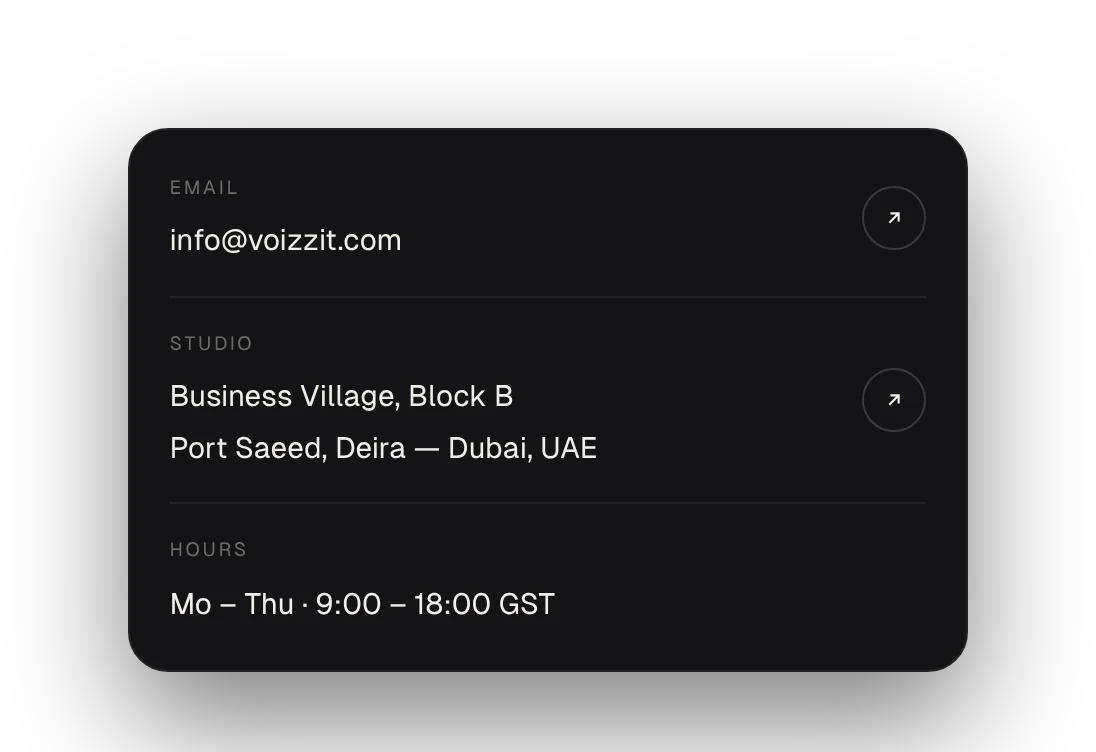
Contact rows put a real address and inbox one click away

Component 07
Contact rows for email, studio address and hours, each with an arrow button

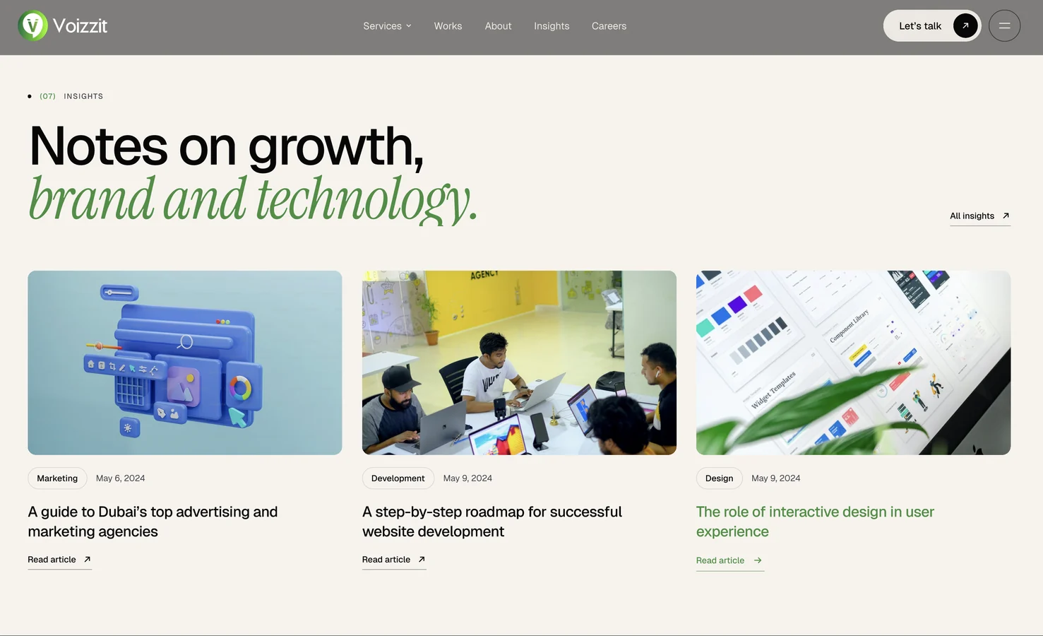
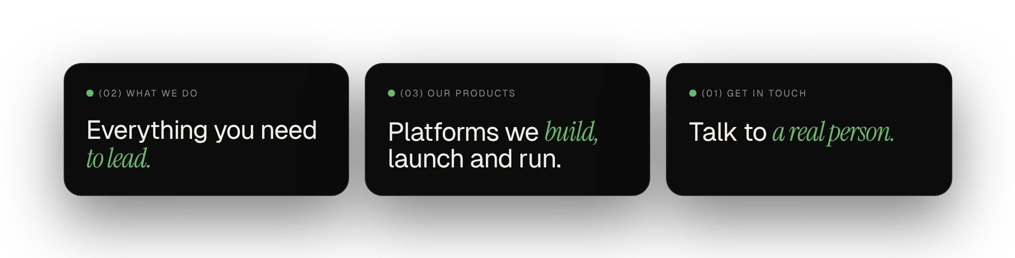
Section headers number, label, a sans headline and one italic word

Component 08
Three section headers: Everything you need to lead, Platforms we build launch and run, Talk to a real person
Where it stands

15 pages, linked end to end

Every nav, footer and card link in the prototype is connected, so the whole site can be clicked through like the real thing.

Next: tablet and mobile layouts with the same components, colour-contrast checks and keyboard focus states, real product pages, and testing the contact and careers flows with users.

What I took away
  1. 01Build the system before the pages, and the pages get faster.
  2. 02Anything that repeats should become a component.
  3. 03One accent colour is easier to read than three.
Keep exploring Next: Voizzit Chat
Next step

Have a product that needs better thinking?

Let's talk

or write directly — vasudevsra1995@gmail.com