Work  /  Case study 01  /  UX & UI

Twamo Booking car care, two ways in

Twamo is a B2C automotive service app for the UAE. I designed the booking experience end to end, from sign-in to live tracking, along with the design system, the Arabic version and a clickable prototype. This case study focuses on the booking flow and Twam, a voice assistant that drafts a booking from one sentence.

IndustryAutomotive services
My roleProduct designer, UX & UI
PlatformiOS · English & Arabic
ToolsFigma

What I did

User flowsInformation architectureUI design Design systemConversational UXPrototypingArabic RTL

Booking a wash should take less time than the wash

Twamo connects drivers with car care providers who come to the car: at home, at the office or in a mall car park. A booking means choosing a vehicle, a service package, a provider, a place and a time, then paying in the app and following the specialist on a live map.

The brief was to make booking quick for people who book the same thing every time, without hiding the choices a first-time user needs. I covered user flows, information architecture, wireframes, UI, the design system and the prototype.

Project
Twamo
Industry
Automotive services (B2C)
Market
United Arab Emirates
Platform
iOS app, English and Arabic (RTL)
My role
Product designer, end to end
Deliverables
30+ screens, design system, clickable prototype
Tools
Figma
Design system

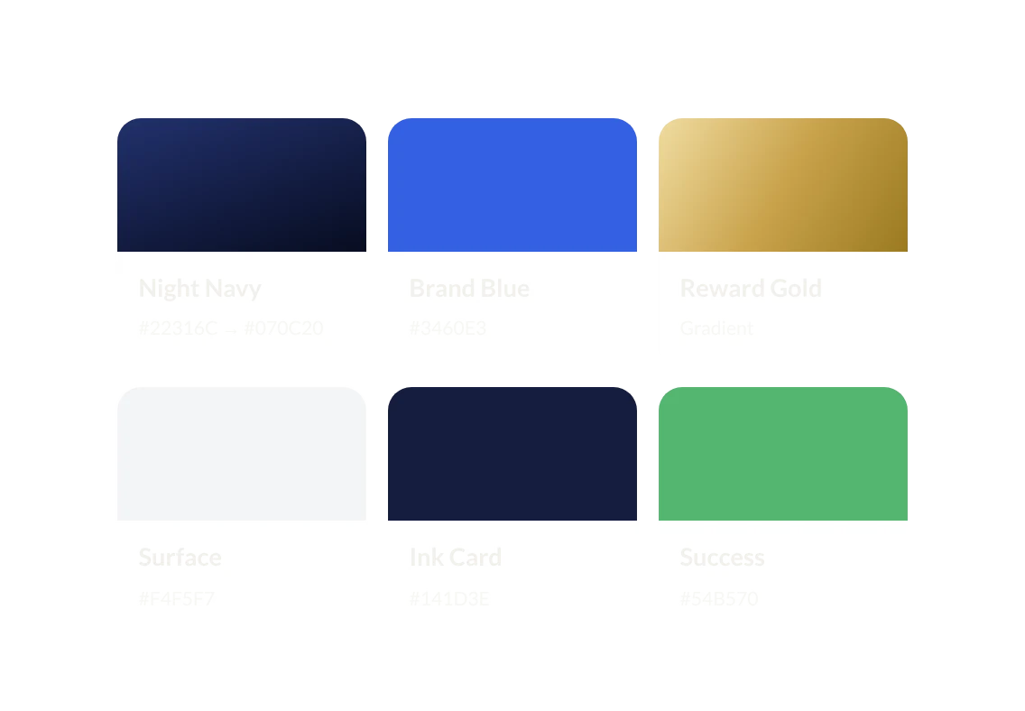
Night navy, brand blue and a touch of gold

The app runs on two surfaces: a deep navy for moments that should feel premium, like home, the assistant and the splash, and a light grey for the work of booking, where clarity matters more than mood. Blue is for actions. Gold is kept for rewards, the voice button and anything you've earned.

The cards below are components from the Figma library, shown as they appear in the app.

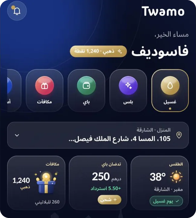
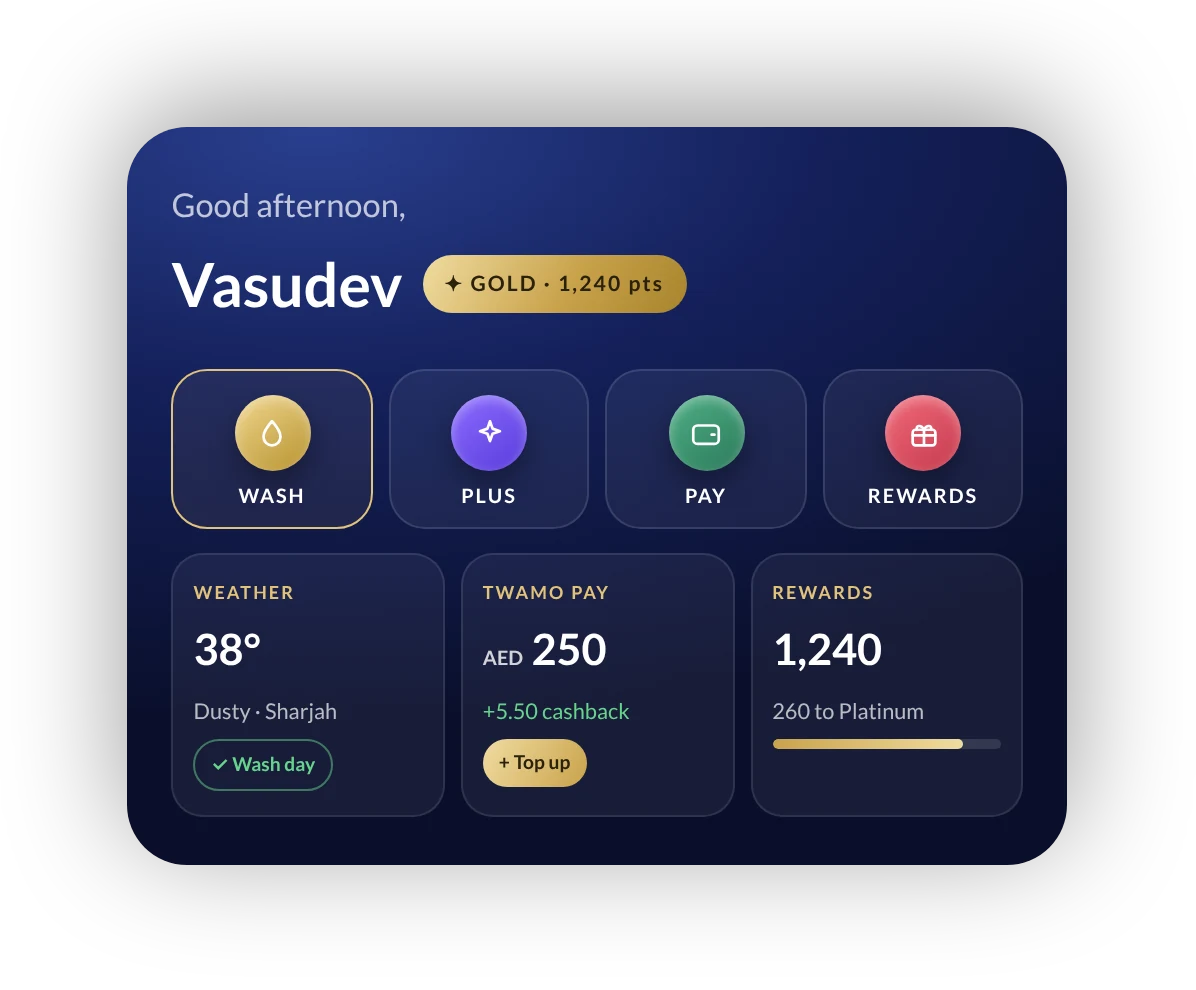
Home widgets answer three questions before you tap anything

Component 01
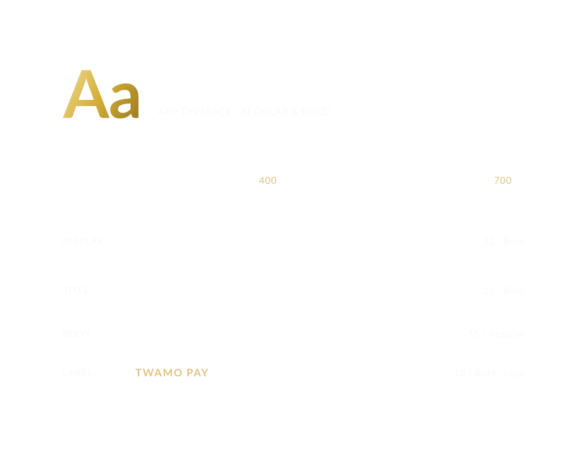
App typeface Lato in Regular and Bold, with display, title, body and label sizes
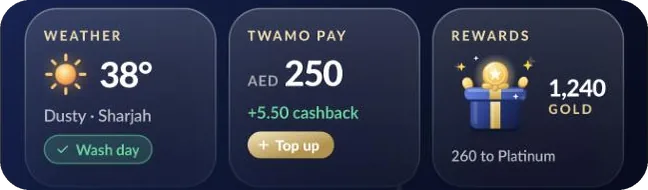
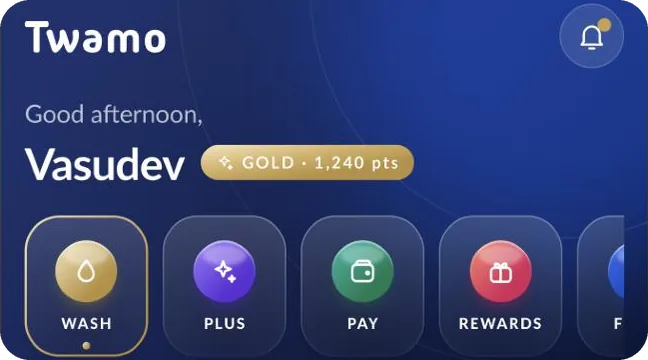
Home widgets: greeting with Gold tier, quick actions for Wash, Plus, Pay and Rewards, and weather, wallet and rewards cards

Colour navy for mood, blue for action, gold for reward

Component 02
Colour palette: Night Navy, Brand Blue, Reward Gold, Surface, Ink Card and Success

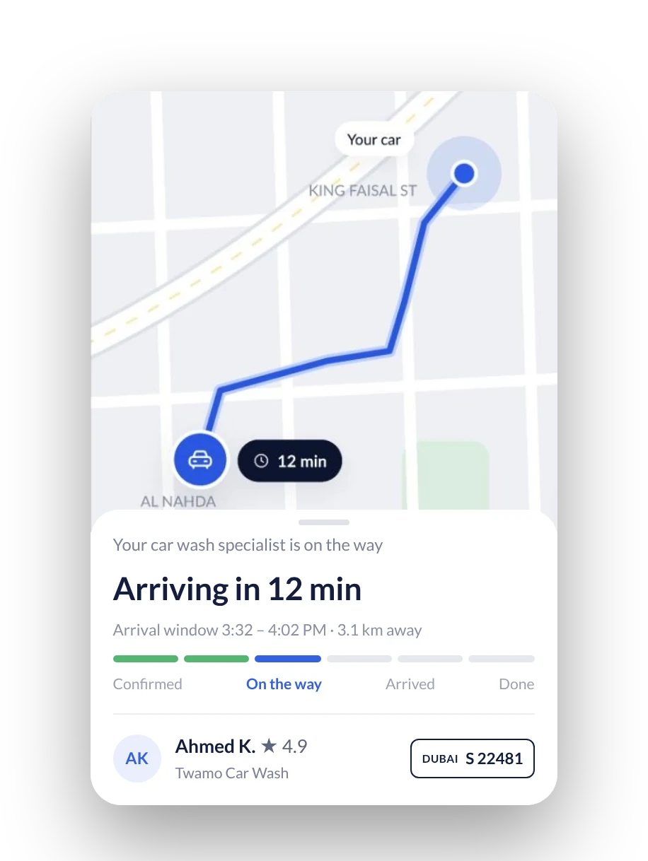
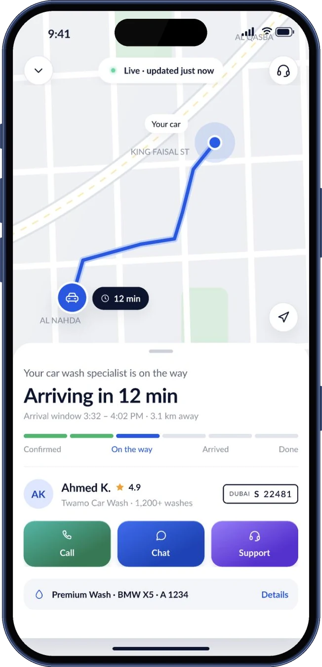
Live tracking shows the route, arrival time and who is coming

Component 03
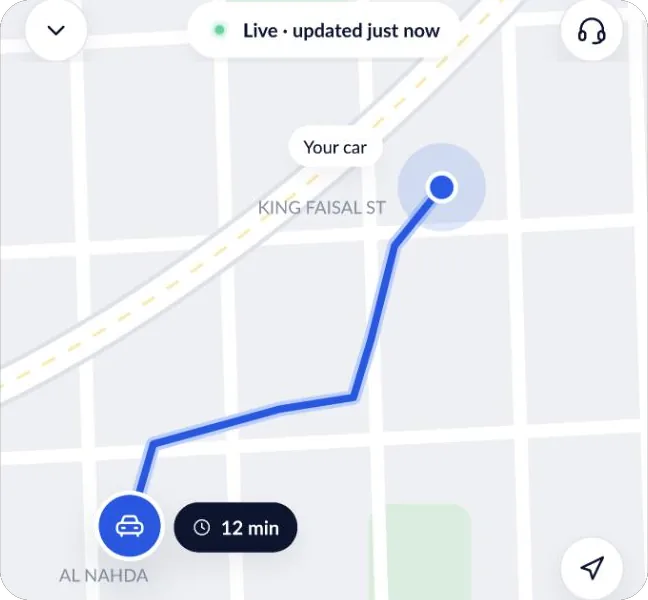
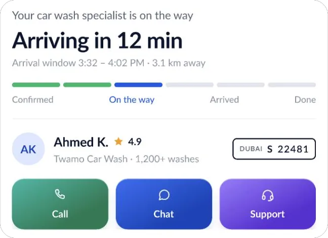
Live tracking: map with the route and car, arriving in 12 minutes, progress steps and the specialist with plate number

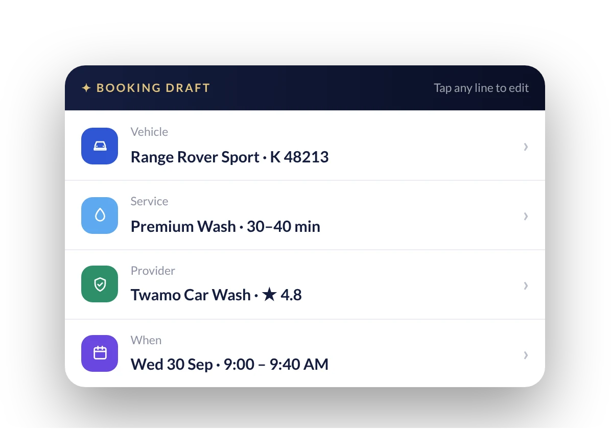
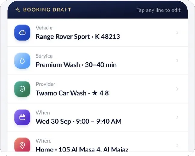
The booking draft lets you fix one line without starting over

Component 04
Booking draft card listing vehicle, service, provider and time, each line editable

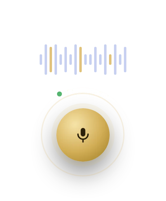
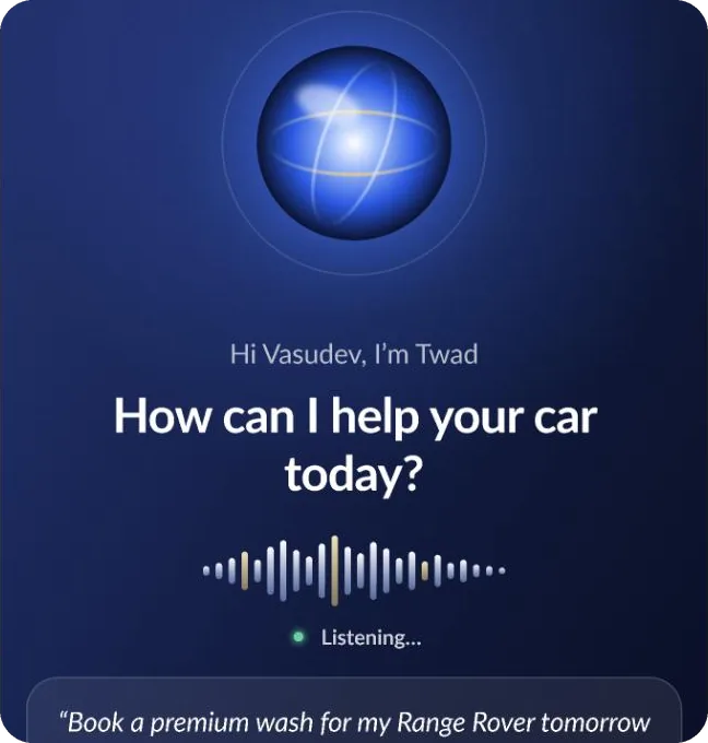
The voice button is gold, round and always within reach

Component 05
Gold voice button with a live waveform and a Listening status

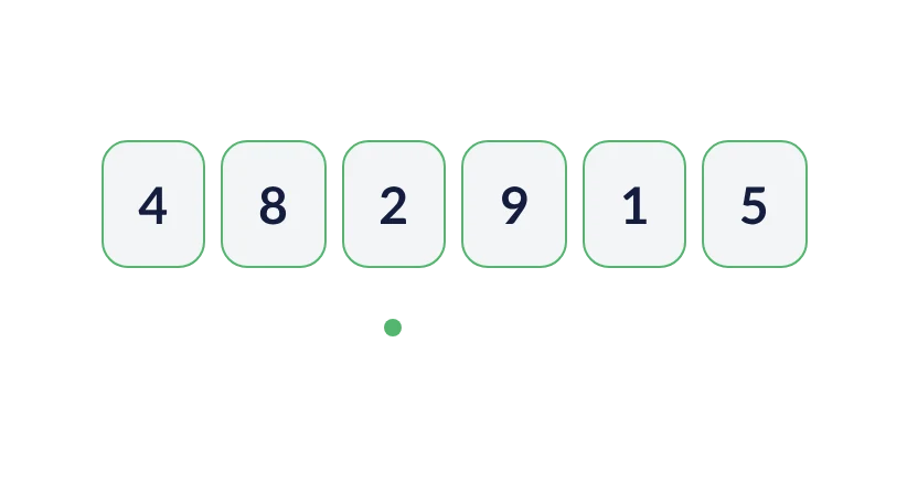
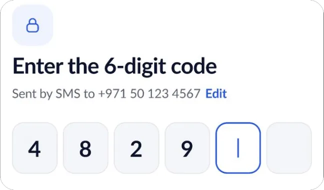
Sign-in with a six-digit code, read from SMS

Component 06
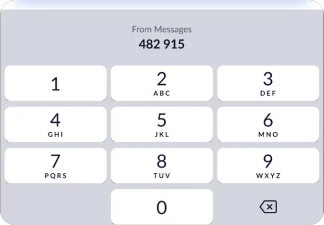
Six-digit verification code filled in and verified

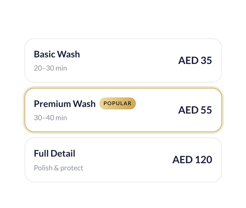
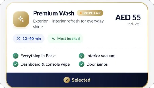
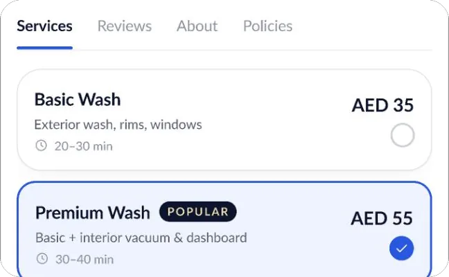
Packages priced for your car, VAT included

Component 07
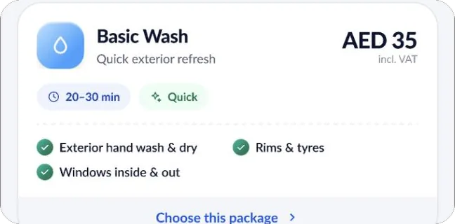
Wash packages: Basic AED 35, Premium AED 55 marked popular, Full Detail AED 120

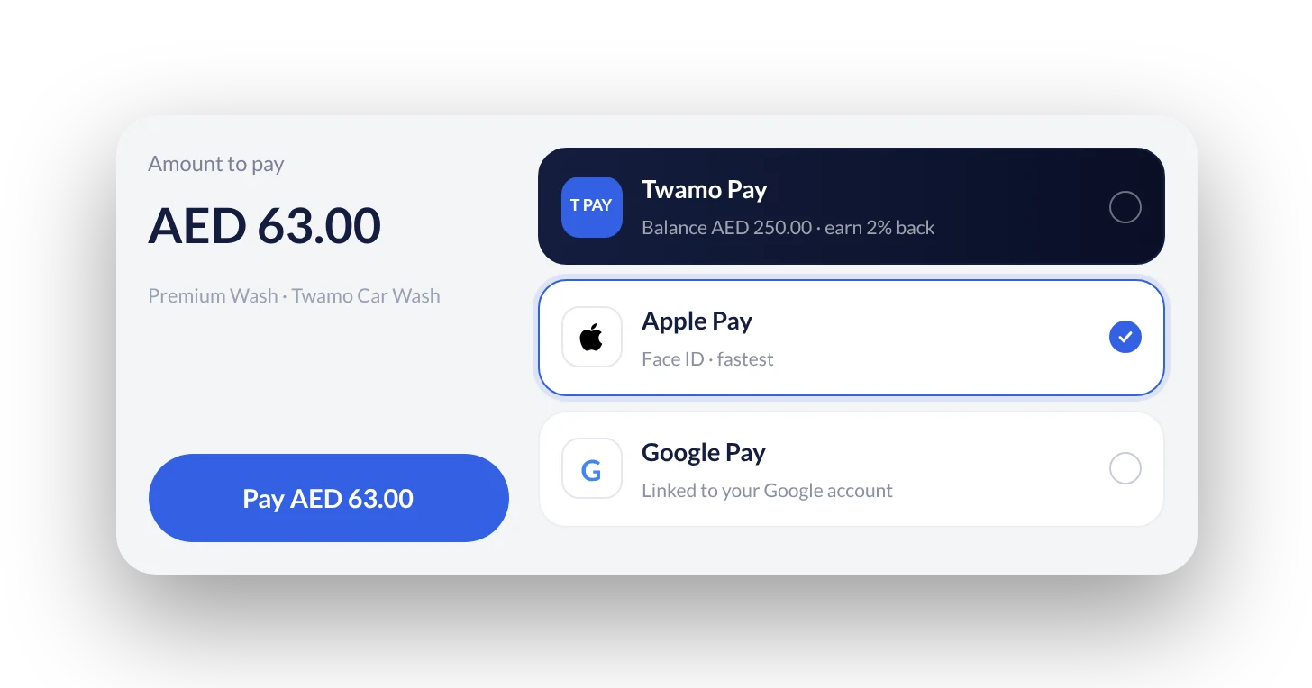
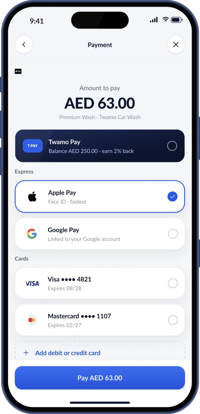
Payment keeps the wallet first and Apple Pay one tap away

Component 08
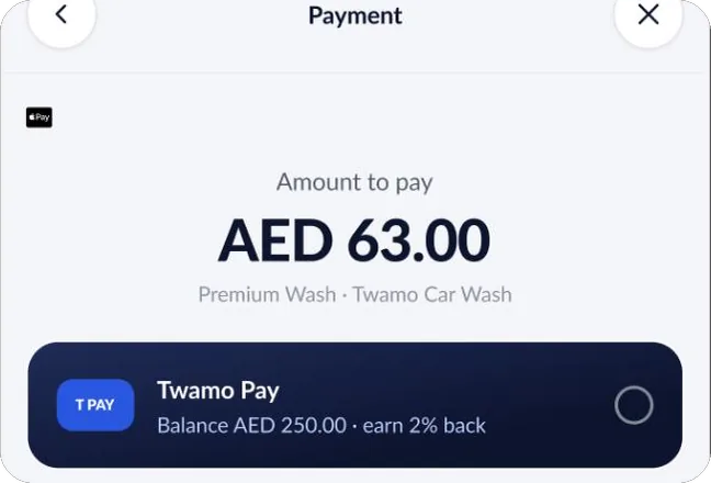
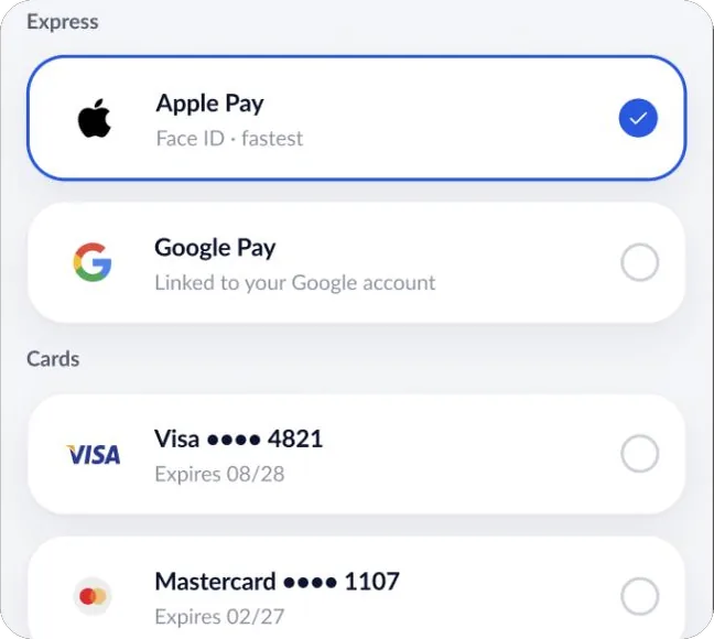
Payment: AED 63.00 to pay, Twamo Pay wallet, Apple Pay selected, Google Pay and a Pay button

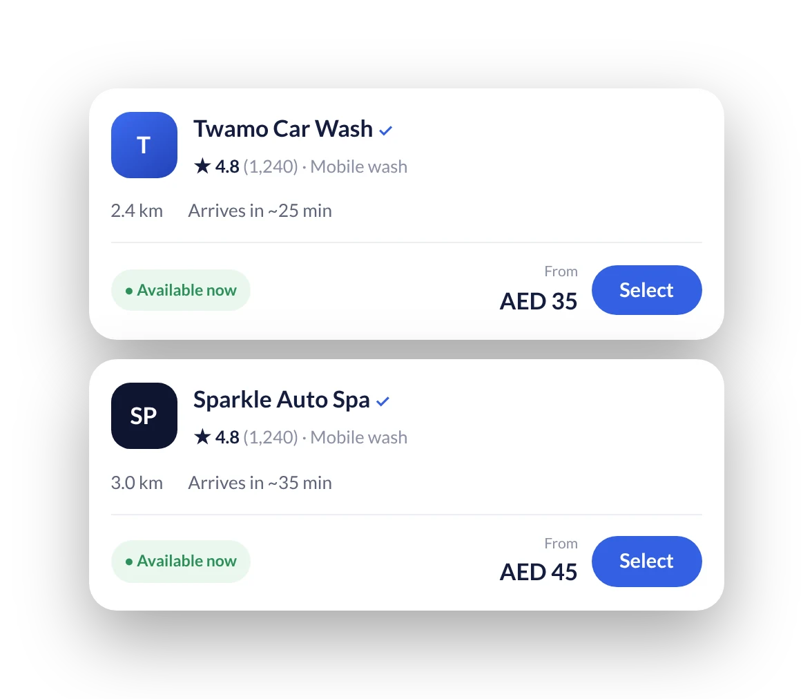
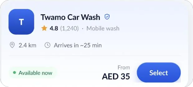
Provider cards show rating, distance, arrival time and price in one row

Component 09
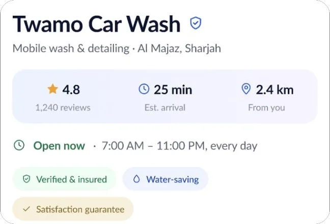
Two provider cards with rating, distance, arrival time, price and a Select button
Problem

Six decisions for a twenty-minute wash

To book a wash you have to settle six things: which car, which package, which provider, when, where the car is parked, and how to pay. Each one is simple. Together, on a phone, they turn a small errand into a form.

Most people book the same wash for the same car at roughly the same place every time. So I asked a simple question: what if the app already knew most of the answers, and you only had to confirm them?

Users and goals

Three kinds of user, one flow for all of them

REPEAT BOOKERS

Same car, same wash, same place

Most bookings repeat. These users need their saved car, address and usual package filled in, so booking becomes a confirmation instead of a form.

FIRST-TIME USERS

Compare before committing

New users want packages, prices with VAT, ratings and arrival times side by side before they trust a provider with their car.

ARABIC-FIRST USERS

The whole app, not a translation

Layouts, icons and the assistant button mirror for right-to-left reading, and the flow stays the same as in English.

Design goals

  1. 01A repeat booking should need no typing.
  2. 02Price, time and provider stay visible at every step.
  3. 03The assistant can only produce a booking the user could have made by hand, and the user always confirms it.
  4. 04Arabic is designed alongside English, not after it.
The approach

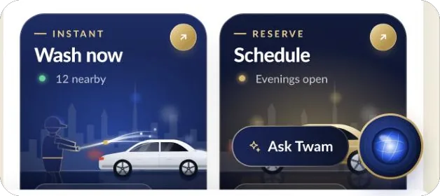
Two ways in, one booking out

STEP BY STEP

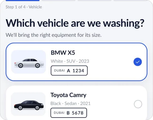
Four short screens

Vehicle, service, location, then date and time, with a progress bar at the top and the price always visible at the bottom. Nothing is hidden, and every step can be changed from the summary.

ASK TWAM

One sentence

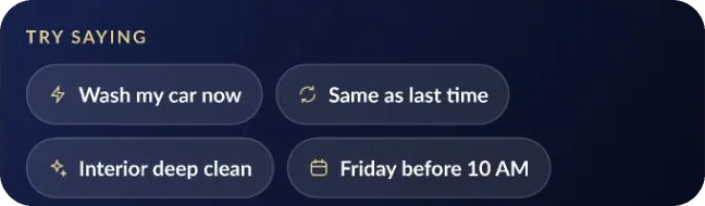
Tap the gold button and say what you want. Twam matches your saved car and address, checks nearby providers for the time you asked for, and hands you a finished draft to confirm and pay.

Both paths end on the same booking draft and the same payment screen. That kept the assistant honest: it can't book anything you couldn't have booked yourself, and you always see exactly what it chose.

User flow

Step by step
  1. Vehicle
  2. Service
  3. Location
  4. Date & time
Ask Twam
  1. Speak one sentence
  2. Twam fills the details
Shared ending
  1. Booking draft
  2. Pay
  3. Track live
Process

How I worked through it

  1. 01Mapped the booking journey and every decision in it
  2. 02Grouped the app into four areas: book, track, pay, account
  3. 03Wireframed the core screens and the assistant conversation
  4. 04Built the design library: colour, type, components and states
  5. 05Designed 30+ screens, then mirrored the key ones for Arabic
  6. 06Connected everything into a clickable prototype with motion
Wireframes

Structure first, then colour

I settled the layout of each screen in grey before any styling. Drag the handle to see how the wireframe became the final design.
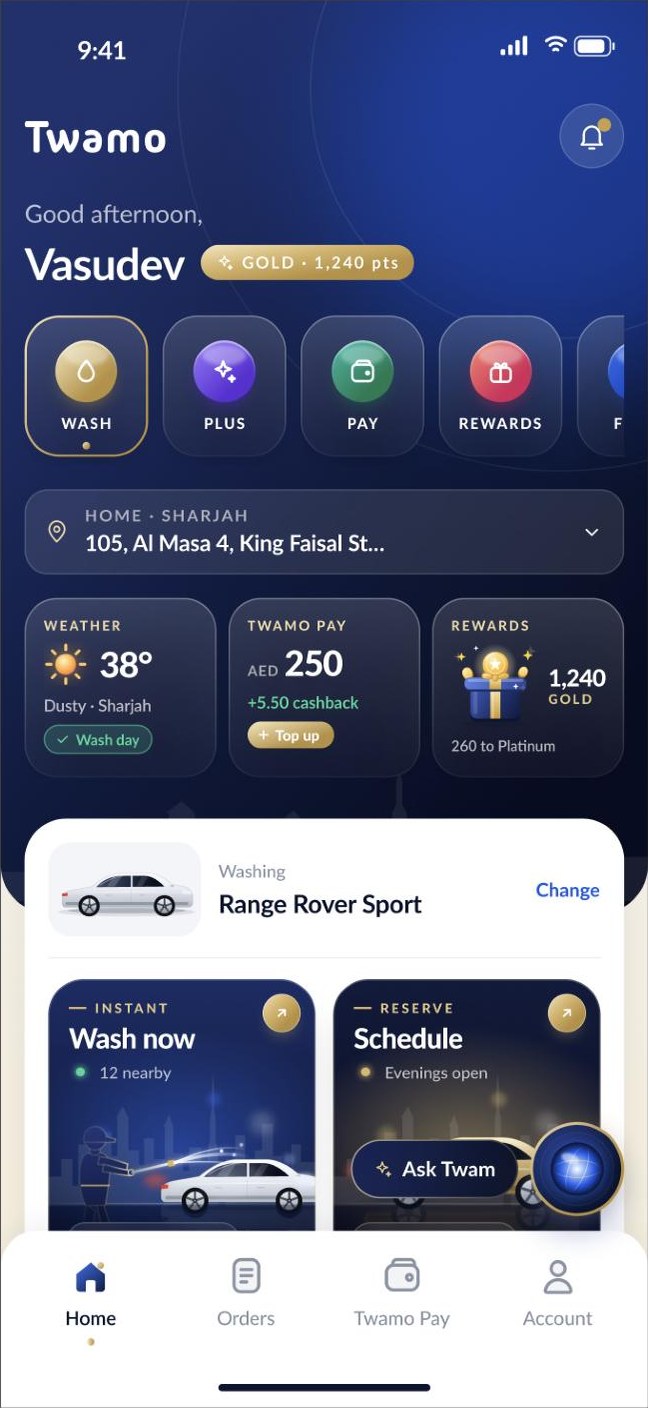
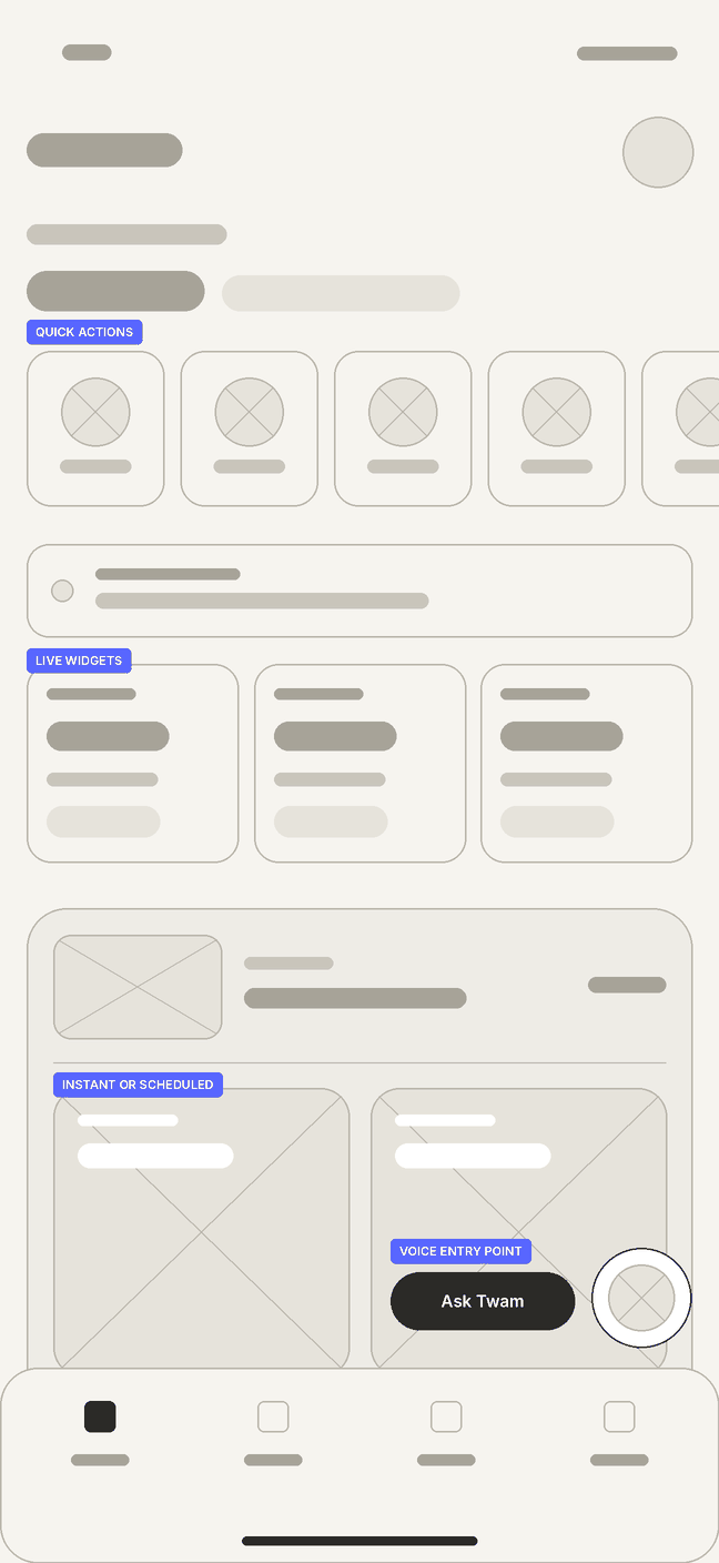
Final design of the home screen Wireframe of the home screen WireframeDesign
Interface

Thirty screens, one shared library

Every screen is assembled from the same parts: cards, chips, list rows, sheets and buttons, each with its states. Below is a selection from sign-in, booking, the assistant, payment and tracking.
Key decisions

Designing an assistant people would trust

SHOW THE WORK

Twam explains what it did

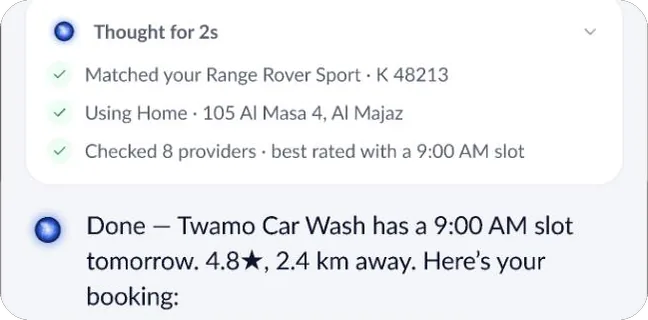
Before the draft appears, a short "Thought for 2s" list shows which car, which address and how many providers it checked. People trust an answer more when they can see how it was reached.

NOTHING IS FINAL

Every line can be changed

The draft is a list, not a sentence. Tap the time to change it, or ask a follow-up like "make it 10 AM". Paying is the only step that can't be undone, so it's the only one with a big button.

CONTEXT

Suggestions that know the weather

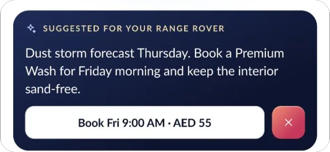
When dust is forecast, Twam suggests a wash for the day after, priced and ready to book in one tap. The home screen does the same with a small "Wash day" tag on the weather card.

AFTER BOOKING

Tracking that feels familiar

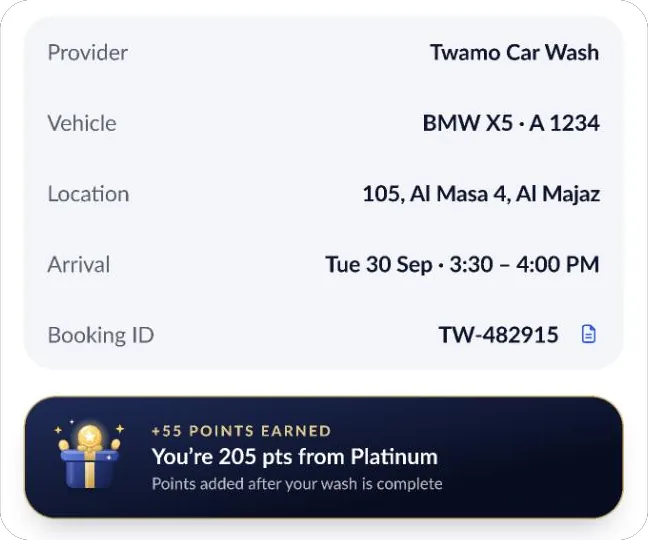
Once booked, the wash is followed like a ride: a live map, an arrival window, the specialist's name and plate, and one-tap call, chat or support.

Beyond the booking

Choose, pay, track, in English or Arabic

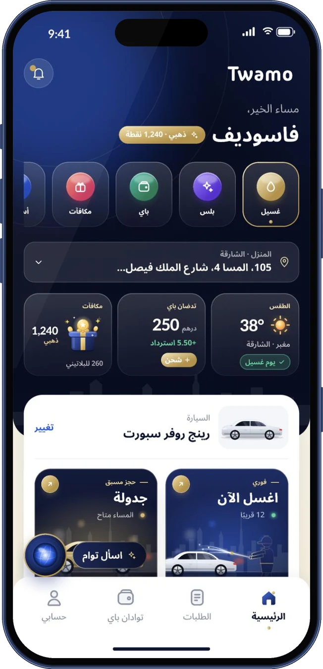
The rest of the app follows the same system. The Arabic version isn't a translation pasted into English layouts: the whole screen mirrors, from the greeting and quick actions to the bottom navigation and the position of the assistant button.
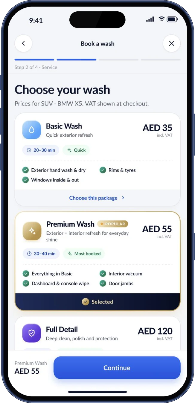
Choose your wash: Basic, Premium and Full Detail packages with prices (iPhone 17 Pro)
01Choose a package
Payment screen with Twamo Pay, Apple Pay, Google Pay and saved cards (iPhone 17 Pro)
02Payment
Live tracking map with arrival time, status steps and the specialist's details (iPhone 17 Pro)
03Live tracking
Home screen in Arabic with a fully mirrored right-to-left layout (iPhone 17 Pro)
04Arabic, right to left
Status and next steps

A complete prototype, ready to test

Twamo exists as a full clickable prototype: onboarding, both booking paths, payment, live tracking, orders, the Twamo Pay wallet, vehicles, account, notifications, the assistant and Arabic. Every screen is built from the shared library, with states and motion for the key moments.

The next step is usability testing with drivers in the UAE. These are the questions I'd test first:

  1. Q1Can first-time users finish a step-by-step booking without help, and where do they hesitate?
  2. Q2How often do people choose Twam over tapping, and does that change after the first booking?
  3. Q3Do users read the booking draft before paying, and can they find how to change one line?
  4. Q4Does the mirrored Arabic layout feel natural on the key screens?
What I took away
  1. 01An assistant should end on the same screen as the manual flow. It keeps the AI accountable.
  2. 02Showing a short reasoning step costs a second and buys a lot of trust.
  3. 03Designing Arabic alongside English, not after it, caught layout problems early.
Keep exploring Next: Voizzit Website
Next step

Have a product that needs better thinking?

Let's talk

or write directly — vasudevsra1995@gmail.com