Type Geist for reading, an Instrument Serif italic for one accent word
Component 01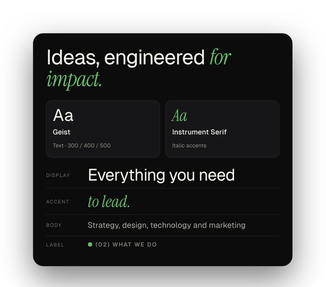
A dark, premium website for a Dubai digital growth partner, designed and prototyped in Figma: 15 desktop pages, a component library and a clickable, animated prototype.
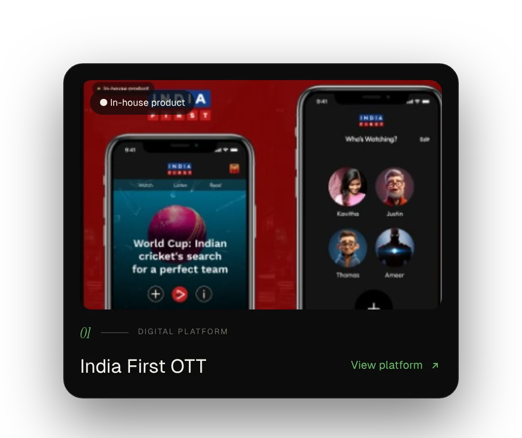
Voizzit is a Dubai-based digital growth partner: strategy, design, technology and marketing, working as one team to build brands that lead. It works with government, brands and enterprise clients, and runs its own in-house products.
I looked at what the current site was missing, chose a dark editorial direction and built a small design system first. Then I designed the pages, linked them into a prototype and refined the motion and readability.
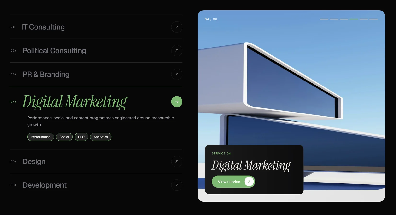
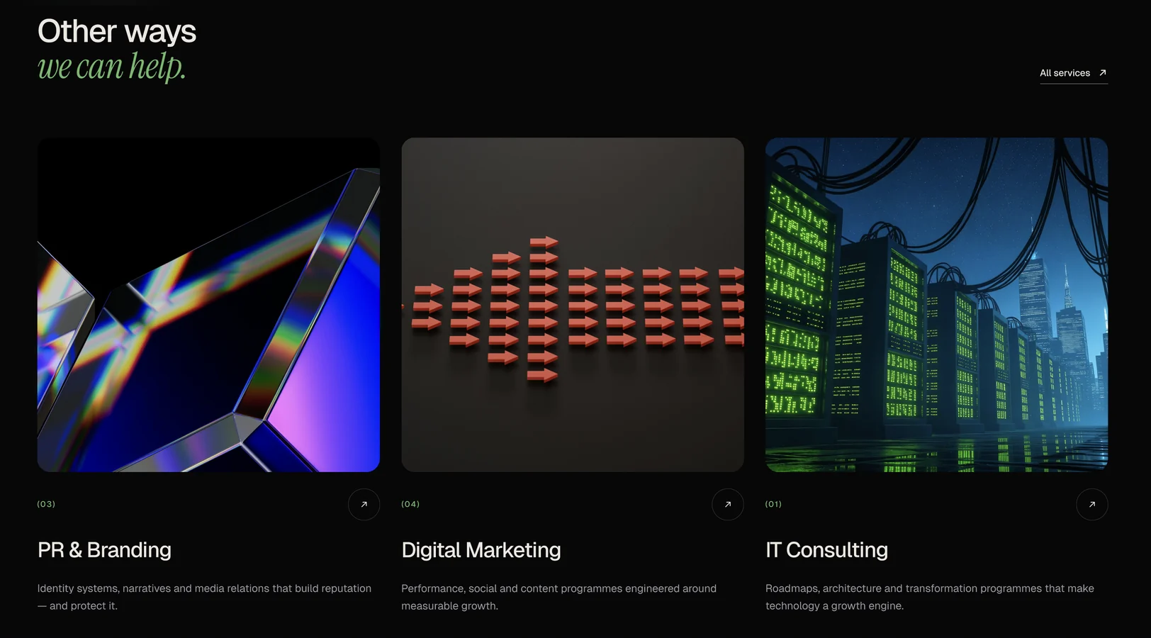
The current site felt generic. It didn't show the range of Voizzit's six services, from IT and political consulting to PR, marketing, design and development, or the products it builds and runs itself.
The goal was a premium, dark, editorial site that builds trust with government, brands and enterprise clients.
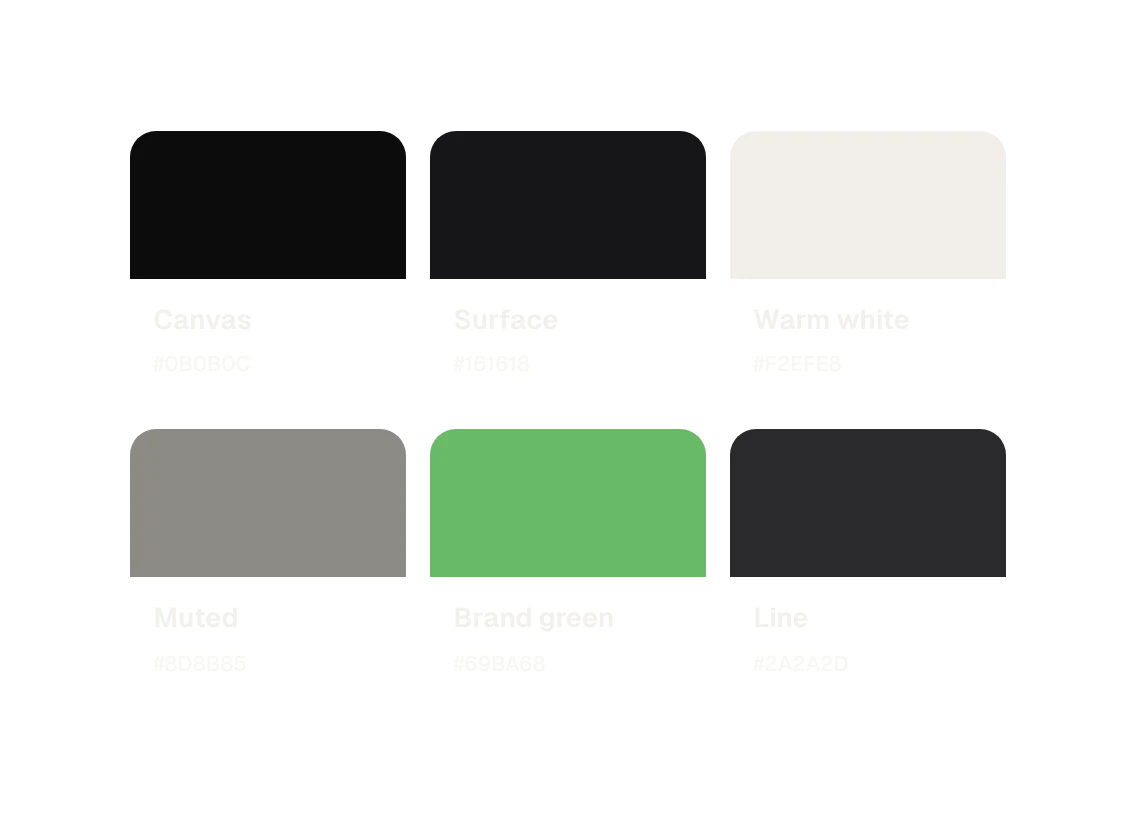
A dark look feels confident and premium, and it makes the 3D images and product screens stand out. Green connects to the Voizzit logo, and it's the only accent, so it always means important or clickable.
The hardest part was keeping things consistent as the site grew to 15 pages. I solved it by turning repeated images and sections into shared components, so a change in one place updates every page.
The banner had to stay readable on any image. Each banner has dark gradients behind the text and the header, and I tested it with a bright image to be sure.
"Dark, editorial and calm: the content does the talking."
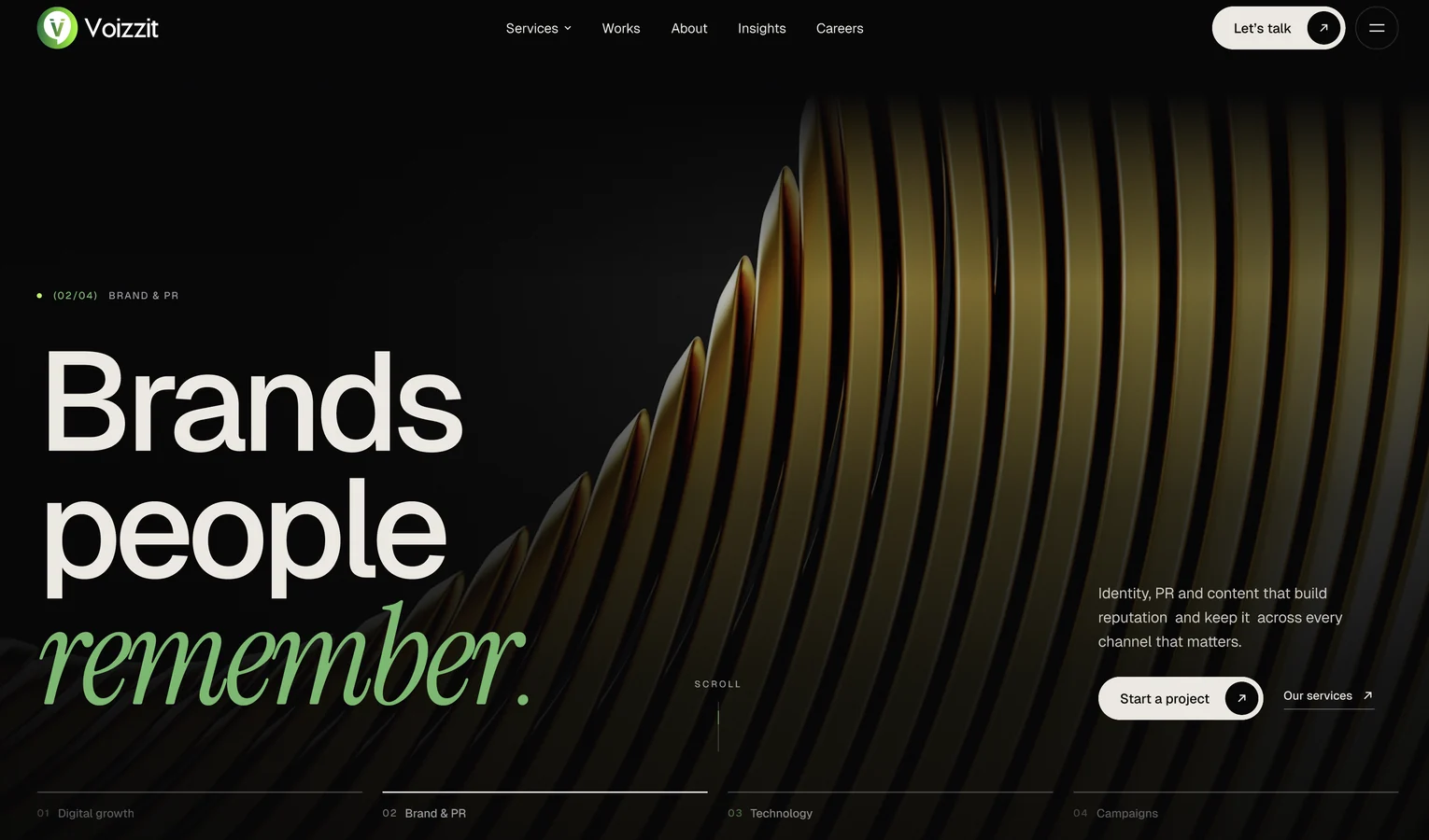
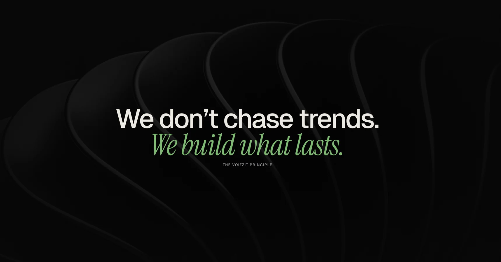
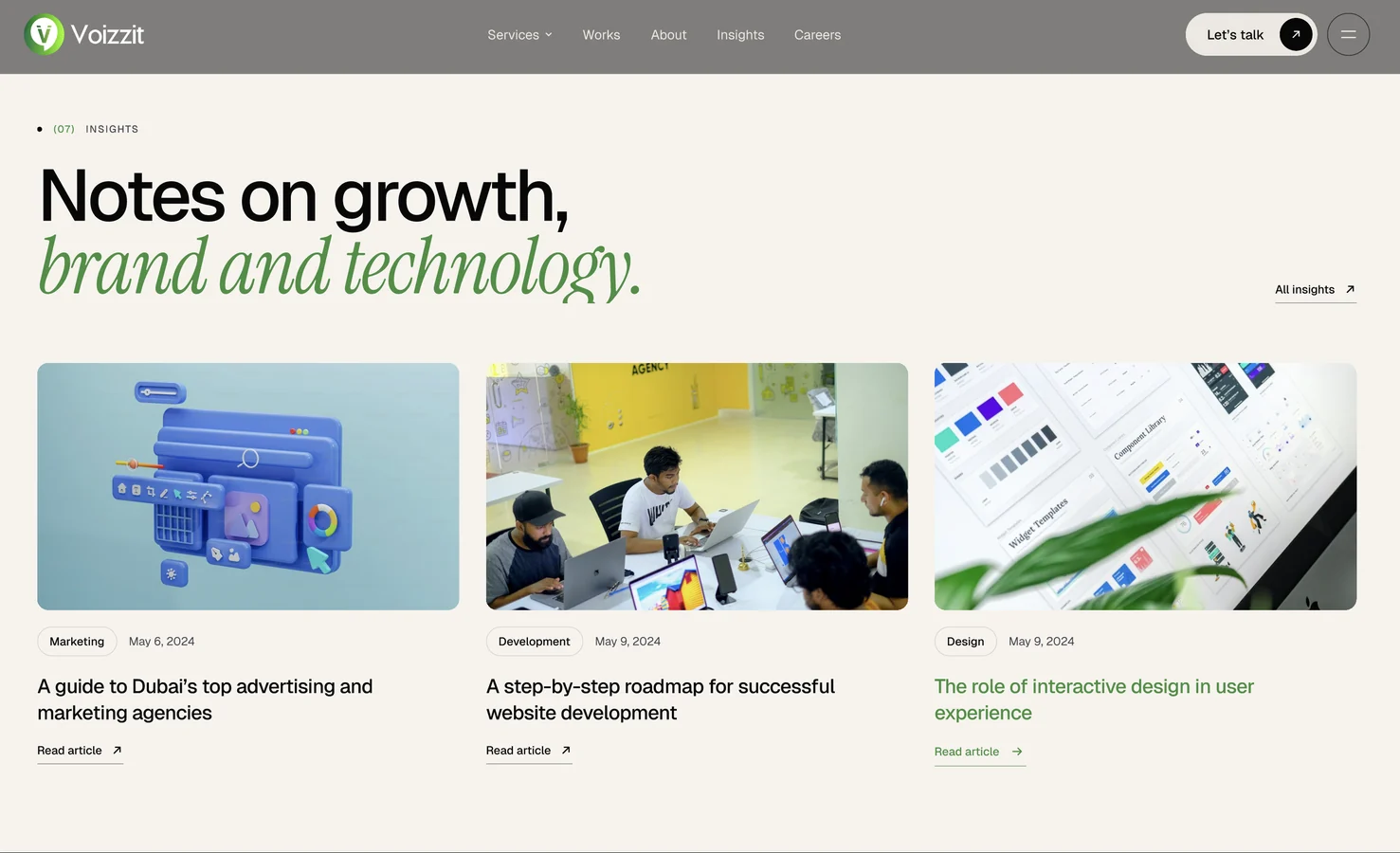
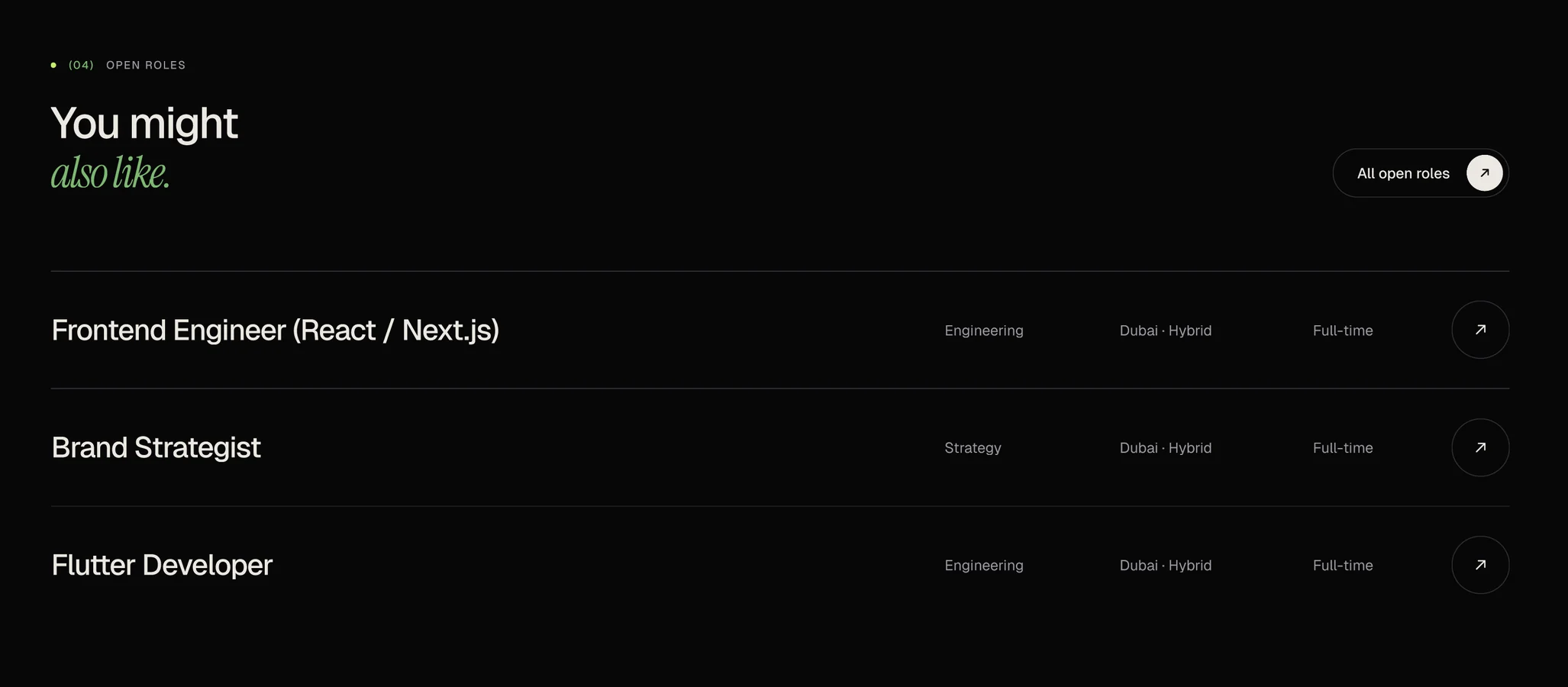
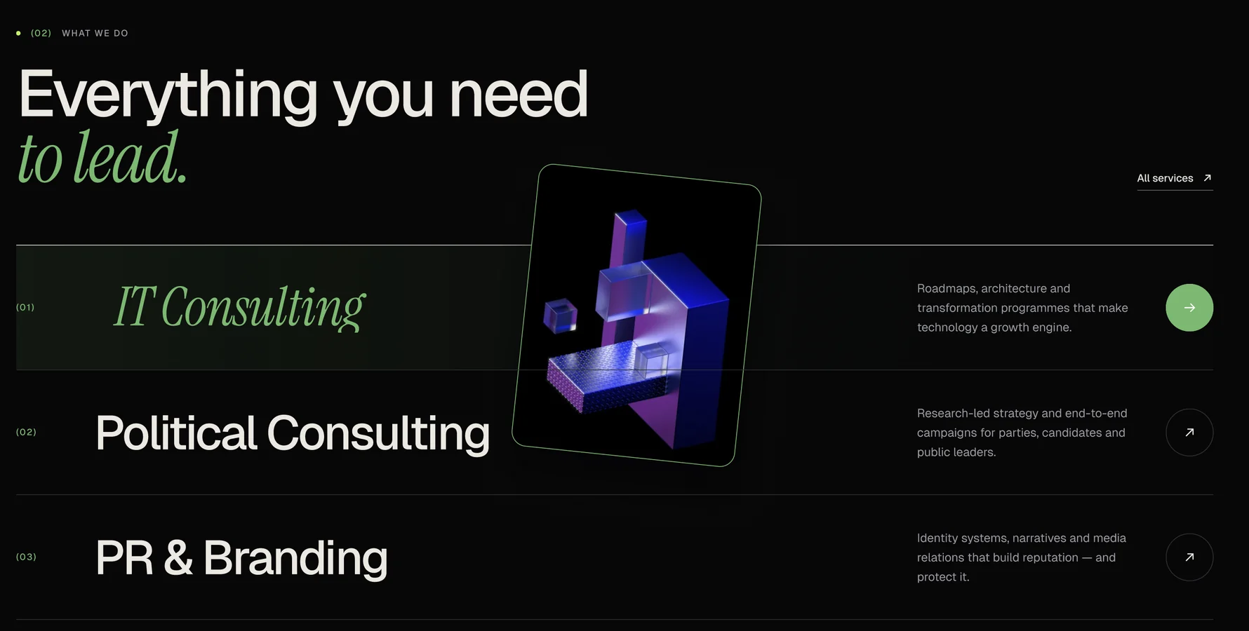
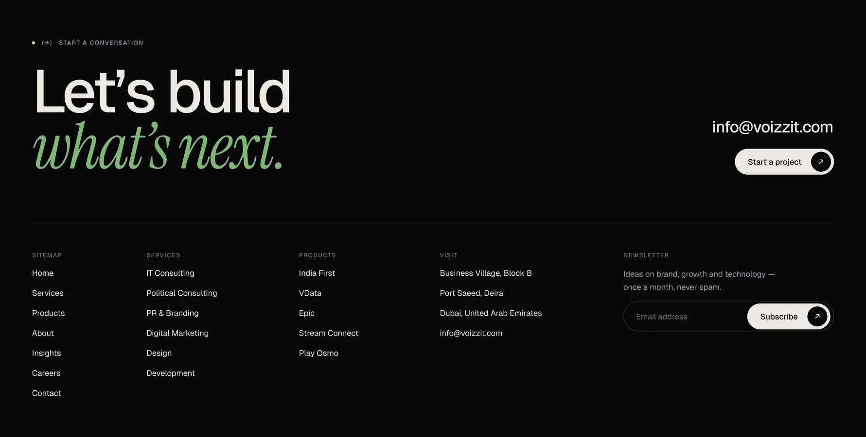
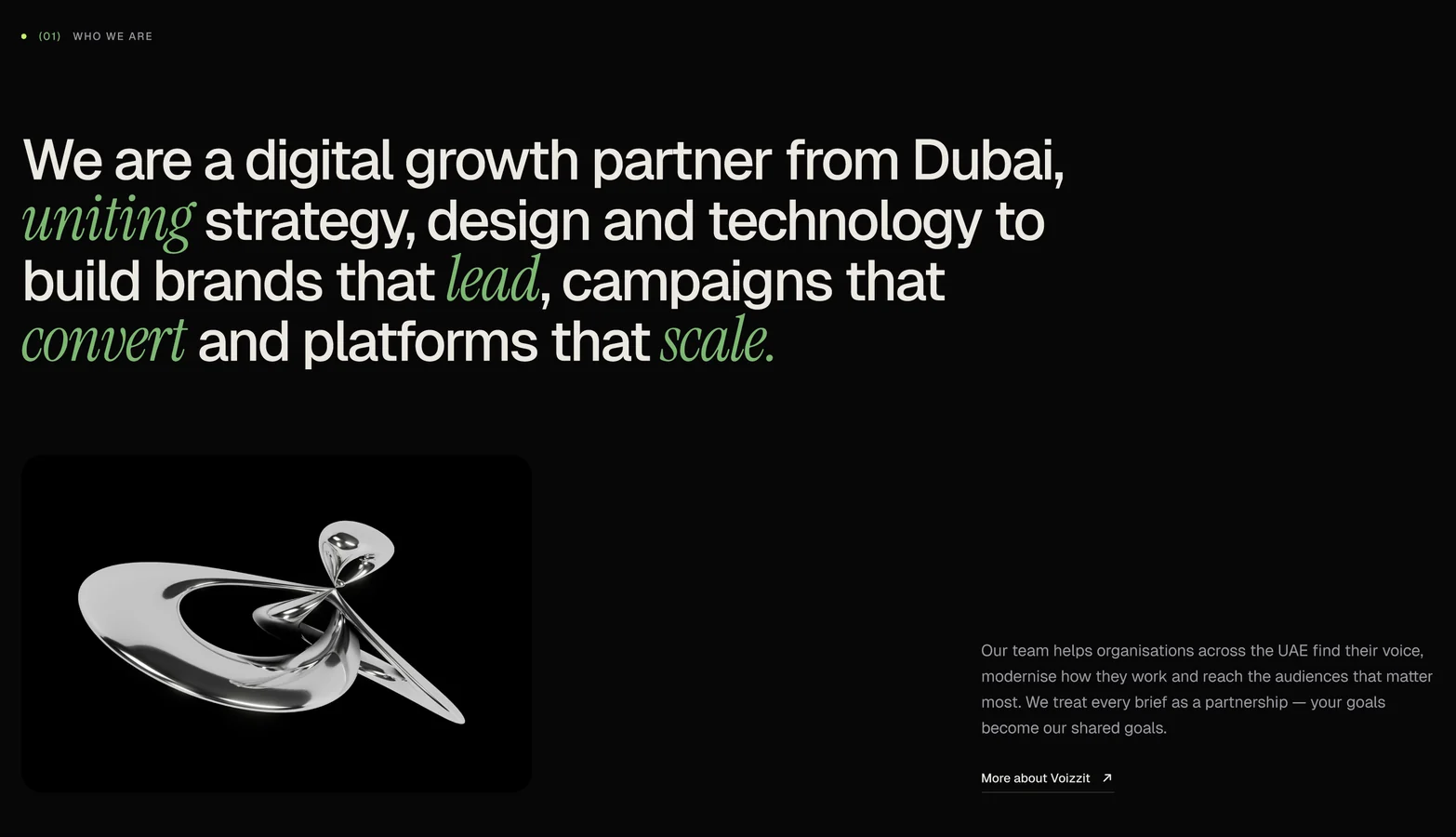
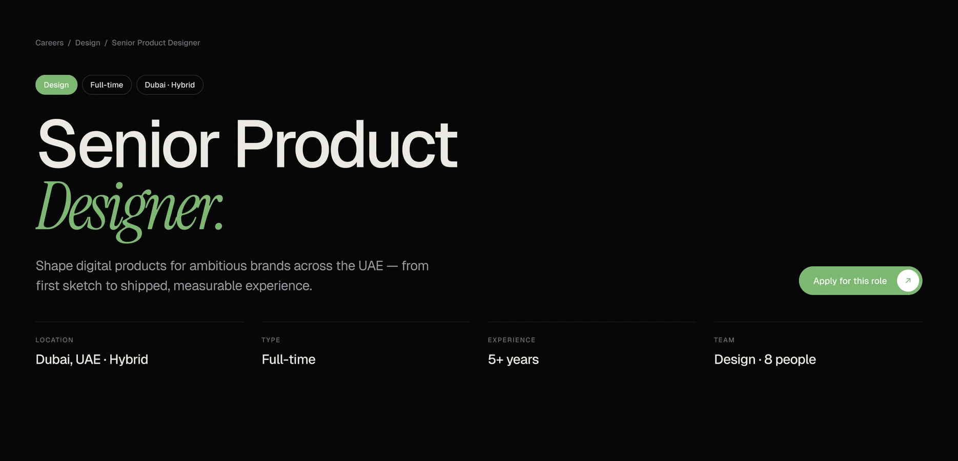
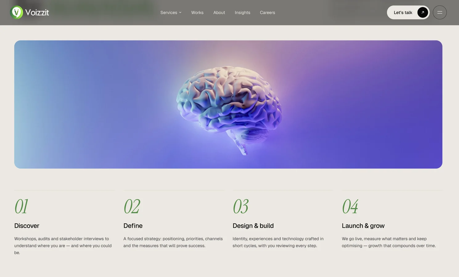
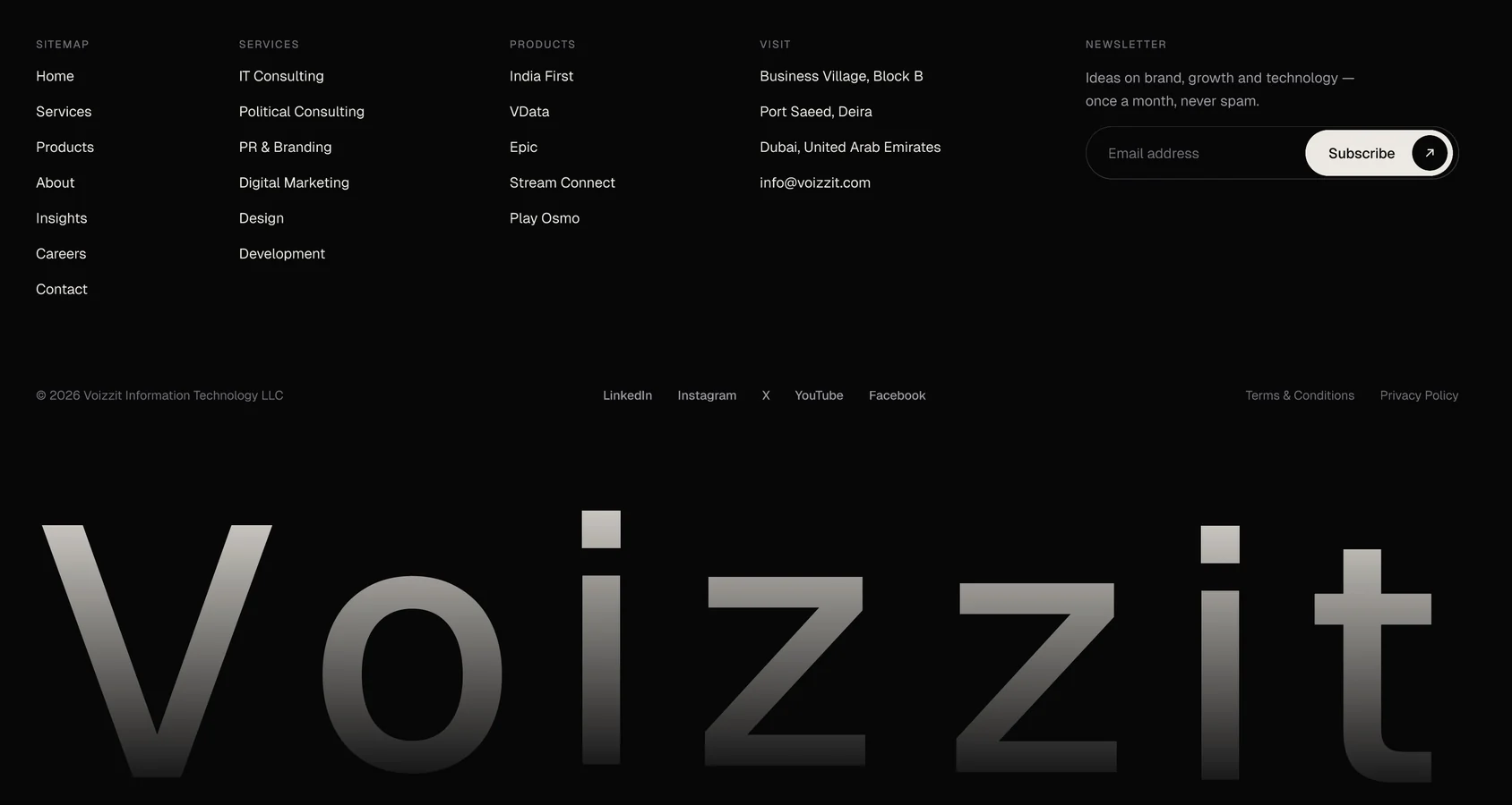
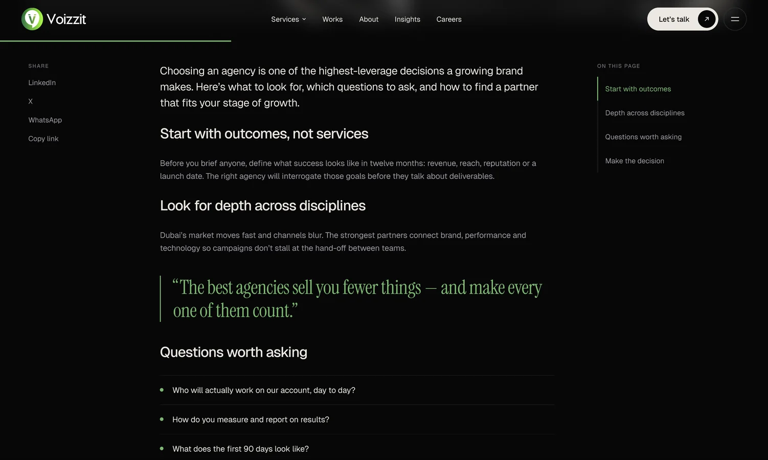
Near-black backgrounds with warm off-white text feel premium and let the imagery glow.
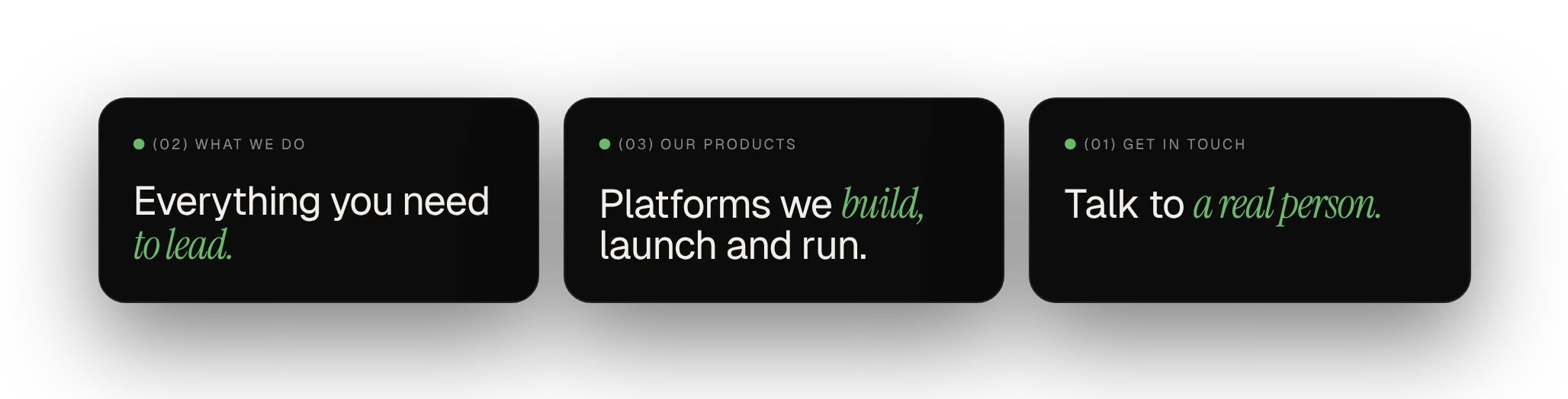
Large sans headlines with an italic serif accent word give each section a voice.
Stock photos feel generic. A 3D image per service gives each one its own identity, reused everywhere through one shared component.
A single accent for highlights, buttons and hover states, so green always means important or clickable.
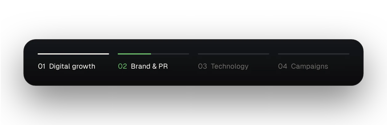
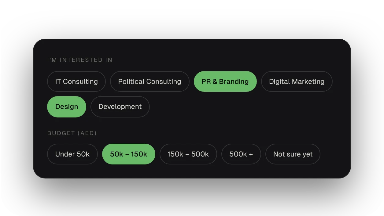
The Figma file has three pages: Cover, Components and Website. Colours and text use variables and styles, so one change updates the whole site: 21 text styles in Geist and Instrument Serif, and more than 25 components with hover states.
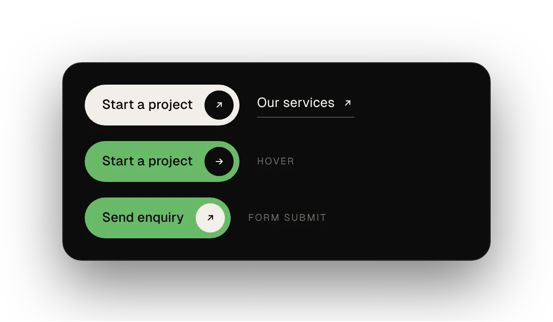
Every nav, footer and card link in the prototype is connected, so the whole site can be clicked through like the real thing.
Next: tablet and mobile layouts with the same components, colour-contrast checks and keyboard focus states, real product pages, and testing the contact and careers flows with users.
or write directly — vasudevsra1995@gmail.com