Case study / 15 — Website · E-Commerce

Finding the right part, without the guesswork.

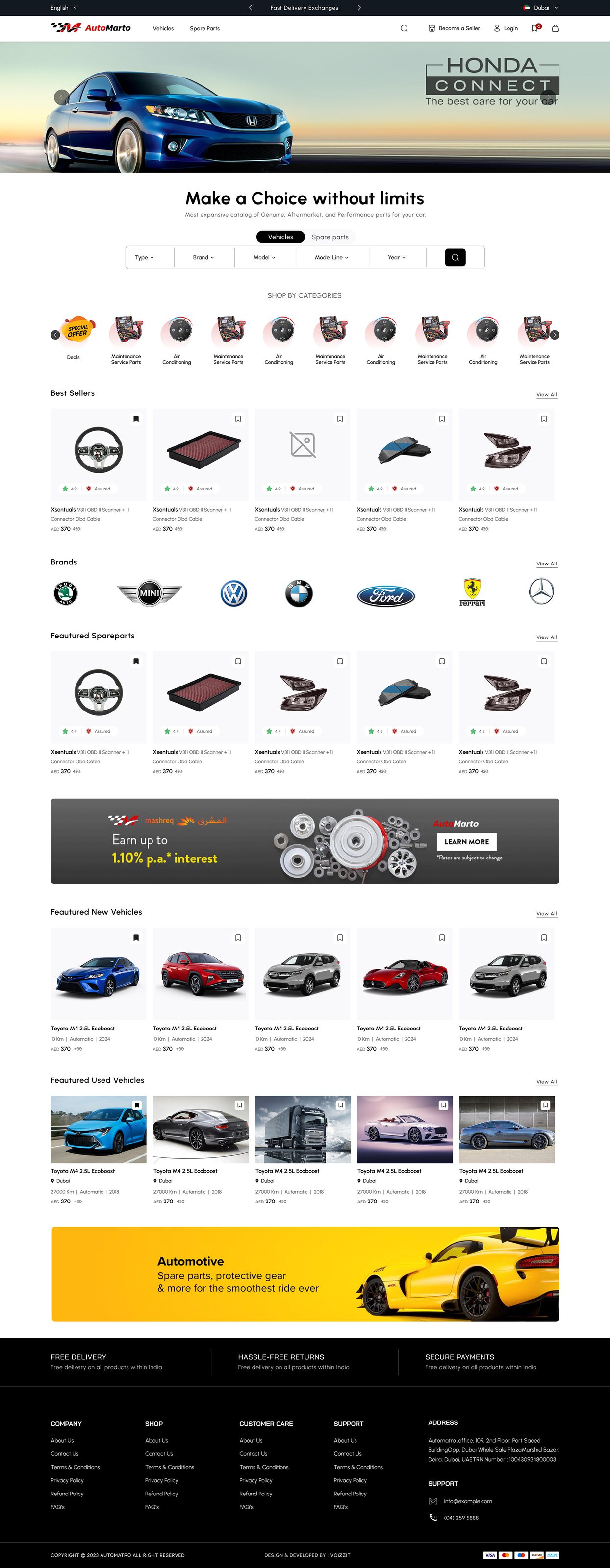
The web storefront for AUTOMARTO — a fast, trustworthy marketplace for discovering and buying automotive parts, with vehicle-compatibility at the core of every search, listing and product page.

Role
UI/UX Designer
Platform
Web · Responsive
Focus
Discovery · Compatibility · Checkout
Type
E-Commerce Website
0
Core sections
0
Process phases
0
Key decisions
0
Research insights

OVERVIEWThe web storefront

The website is AUTOMARTO's front door — discovery-led and built for confidence. Its job is to help buyers find compatible parts, compare sellers and prices, and check out without doubt, carrying the same compatibility-first thinking that runs through the whole platform.

THE PROBLEMFit, trust and too many steps

Parts shopping stalls on three questions: will it fit my vehicle, can I trust this seller, and why is checkout so long? A fragmented catalog and cluttered listings made all three worse — hurting conversion and driving order errors.

MY ROLEThe storefront, end to end

Website UI/UX end-to-end — catalog IA, discovery and search, faceted filters, compatibility-aware product pages, seller trust signals, and a streamlined responsive checkout.

DESIGN PROCESSResearch to iteration

01 Competitive analysis
02 User surveys (B2C & B2B)
03 Catalog IA
04 Discovery & search flows
05 Filters & compatibility
06 Product detail & trust
07 Checkout optimization
08 Usability testing & iteration

METHODThe workflow, end to end

01
Step 01
Competitive analysis
02
Step 02
User surveys (B2C & B2B)
03
Step 03
Catalog IA
04
Step 04
Discovery & search flows
05
Step 05
Filters & compatibility
06
Step 06
Product detail & trust
07
Step 07
Checkout optimization
08
Step 08
Usability testing & iteration

KEY DECISIONSWhat made it work

🚗

Compatibility on every page

A fit check follows each part from search to product page, so buyers never wonder if it works with their vehicle.

🔎

Filters that mirror thinking

Faceted discovery by make, model, year and part — the buyer's mental model, not the database schema.

🛡️

Trust, itemised

Verified sellers, ratings and reviews sit beside every listing to remove doubt at the point of decision.

🛒

Fewer steps to checkout

A short, responsive checkout with clear totals and delivery estimates to cut abandonment.

RESEARCH & INSIGHTSWhat shaped the direction

Research combined competitive analysis of major and regional marketplaces with B2C and B2B surveys. Across the board, compatibility uncertainty and unclear pricing were the biggest blockers — and mobile users wanted fewer steps and saved preferences.

🚗

Fit is the first question

Compatibility uncertainty is the top reason parts carts are abandoned; answering it early is the highest-leverage fix.

🔍

Facets mirror thinking

Buyers filter make → model → year → part; the IA had to follow that path to feel effortless.

🛡️

Trust is itemised

Verified sellers, honest photos and transparent pricing each remove a specific doubt; together they close the sale.

WHO IT'S FORDesigning for real people

B2C PERSONAThe vehicle owner

An individual, mobile-first buyer who knows their vehicle, not part numbers. Needs compatibility checks, plain-language specs and reassurance before buying.

B2B PERSONAThe dealer / workshop

Buys often and knows exactly what they need. Needs fast search, saved preferences and clear pricing to find, verify and re-order in minutes.

DESIGN LANGUAGEThe visual system

A neutral automotive palette with strong accent actions, clean product imagery, and bold typography for the data that decides a purchase — price, availability and compatibility. A responsive grid flexes from immersive desktop browsing to efficient mobile scanning without losing hierarchy.

Neutral palette + accent actions
Compatibility indicators
Faceted discovery
Verified-seller trust signals
Responsive checkout path

TESTING & ITERATIONPressure-testing the design

Prototypes were walked through real scenarios — find a compatible part, compare two sellers, check out on mobile — and iterated: filters simplified, pricing breakdowns clarified, compatibility indicators strengthened, and checkout steps removed.

PROJECT SCREENSInside the design

AUTO WEB — UI/UX design screen by Vasudev R

Screens scroll automatically — hover to pause

OUTCOMEThe result

A storefront that answers fit and trust before checkout — faster discovery, fewer order errors and more confident buyers. Part of the Automarto family with the app and seller dashboard.

View full project on Behance

KEY LEARNINGSWhat I'd carry forward

01 Answer the buyer's biggest doubt — compatibility — before the cart, not at checkout.
02 Filters and comparison must mirror how buyers think, or they leave for other tabs.
03 Removing a checkout step beats adding a checkout feature, every time.
← Previous
Seller Dashboard