Product card shows fabric, rating and savings at a glance
Component 01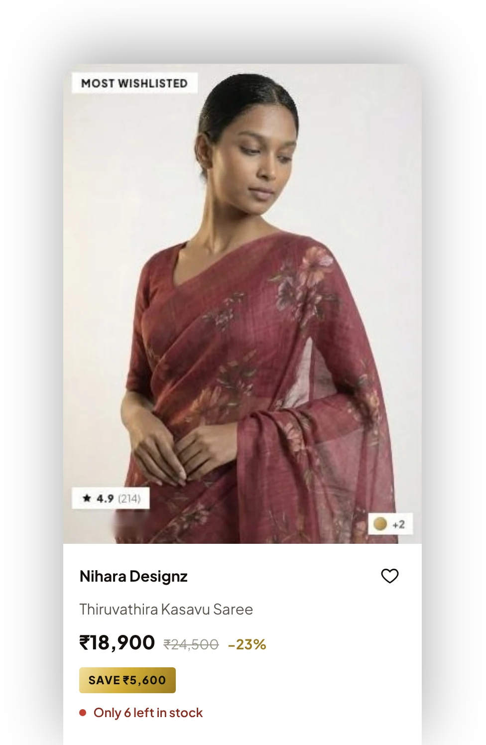
A responsive B2B store for an ethnic-wear label. I designed the UX and UI and built the front end.
Nihara Designz sells sarees, set mundu, blouses and bridal wear to other businesses. Nihara Ecommerce is the web store where those buyers browse the range, check price and stock, choose sizes and quantities, and place an order.
I worked on it end to end. I set up the structure and the design system, designed the pages, and wrote the front-end code, so the live site is the design, not an interpretation of it.
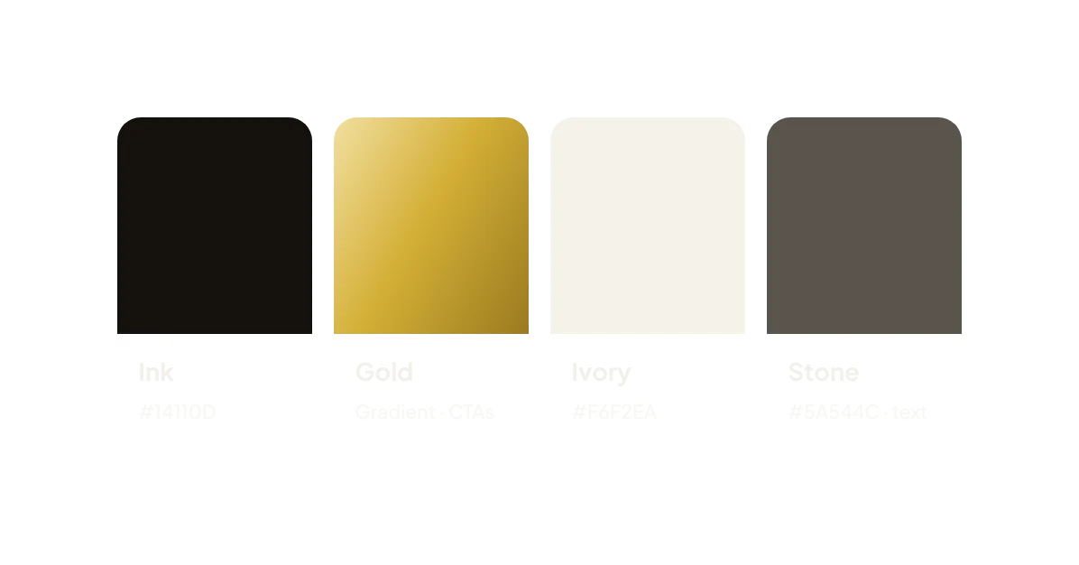
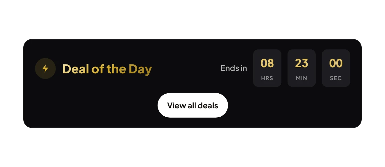
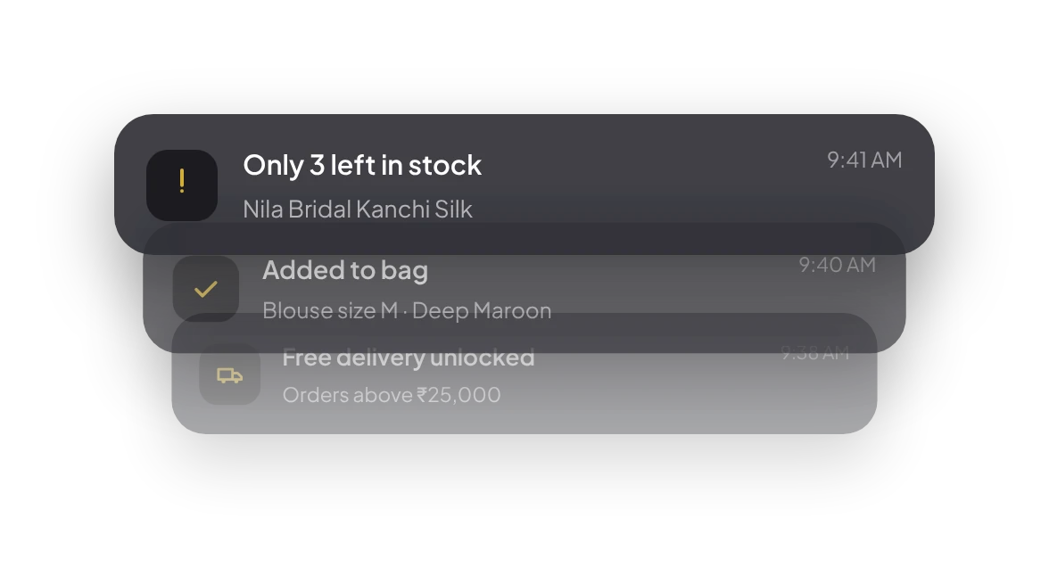
Before I laid out a single page, I built the parts every page would need: the product card, filters, buttons, pickers and alerts, in the brand's black and gold. Every screen in the store is assembled from this set, which kept things consistent and made new pages quick to add.
The cards below are taken from the component library, shown as they appear on the live store.

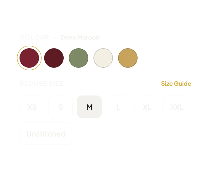

A retail shopper might scroll for fun. A business buyer usually knows what they're after: a fabric, an occasion, a price band. They want to get to it quickly, see if it's in stock, pick the size and quantity, and move on to the next item.
The catch is that many of these products look alike in a small photo. Two sarees can be a few thousand rupees apart because of the fabric or the border. So the store's real job was to make those differences visible without opening every product.
Low stock shows on the product card and again beside the quantity selector, so nobody orders something that's nearly gone.
Fabric, weave, border, length and blouse piece are in a spec table on the product page. Easy to scan, easy to compare.
Price, original price, discount and the saving are on every card. The free-delivery threshold is repeated right by the buy buttons.
Below are the wireframes next to the finished pages. Drag the handle to compare.
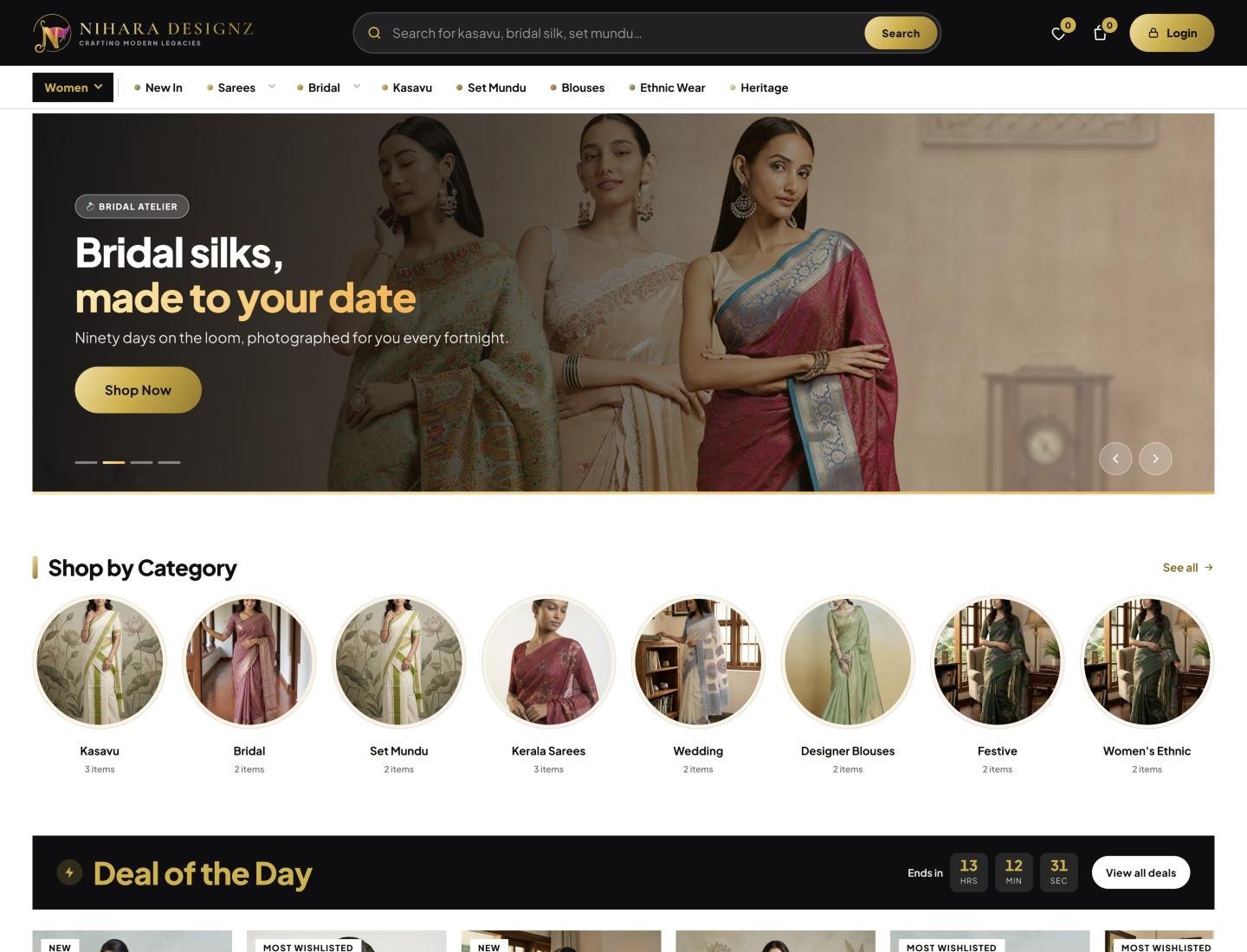
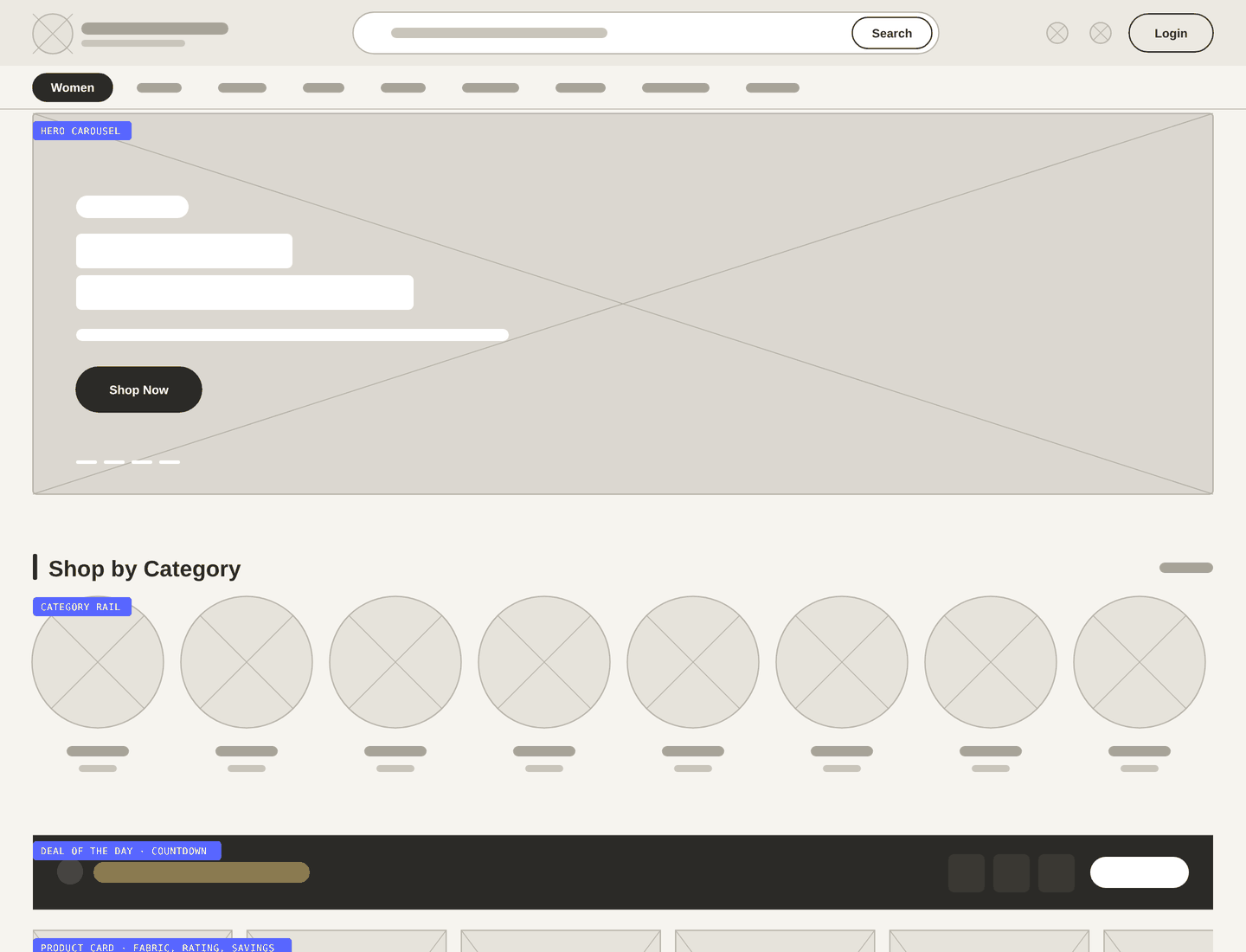 WireframeFinal design
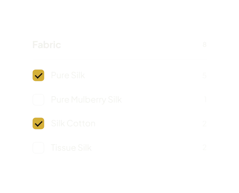
Category, fabric and occasion, each option with a live count, plus sorting by newest, popularity, price and rating. The counts stop people clicking into empty results.
Fabric, rating, colour options, price, discount and stock. For a repeat order, a buyer can often decide straight from the grid.
Colour, blouse size (including unstitched) and quantity sit together. Add to Bag and Buy Now stay on screen while you read the details.
Desktop gets a full search bar, category menu and filter sidebar. On a phone, the same site moves navigation to the bottom and turns filters into a drawer.
This isn't a separate app. It's the same website in a phone browser. On small screens the layout changes so it feels like an app: the main navigation moves to a bottom bar within thumb reach, categories scroll sideways, and the filter sidebar becomes a full-height drawer.
Designing both sizes at the same time meant nothing had to be squeezed down at the end.
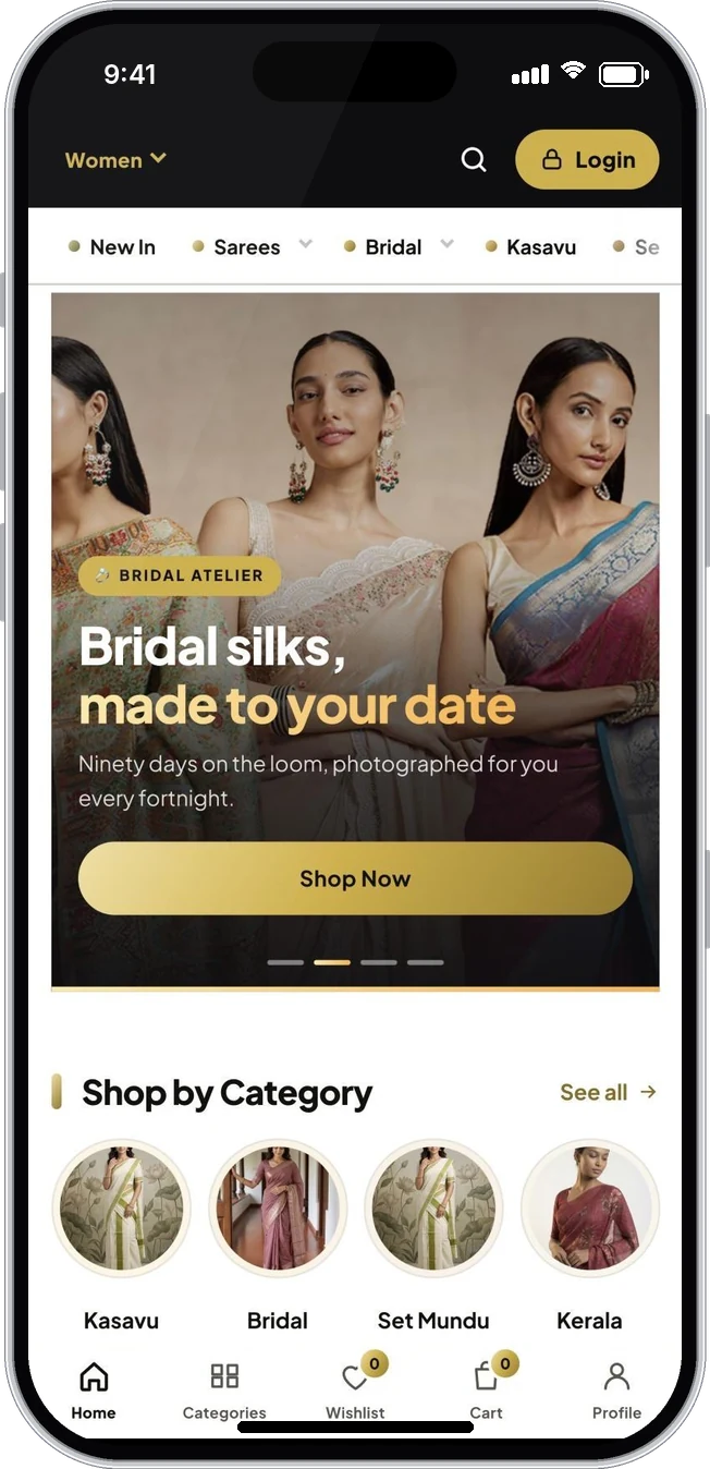
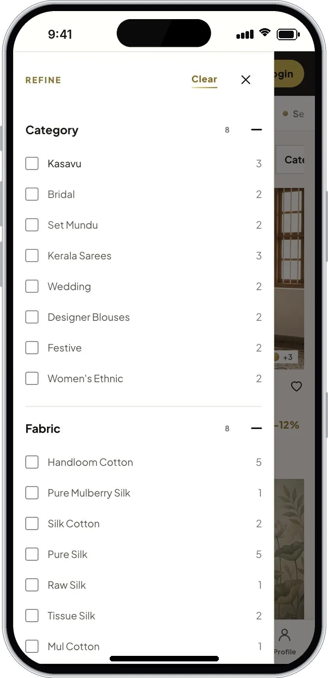
The store is live with the full catalogue, filters, product pages and the bridal made-to-order flow, on desktop and mobile. Because everything is made from the same components, adding a new category or landing page is mostly assembly.
Visit the live storeor write directly — vasudevsra1995@gmail.com