Review cards a short quote, a star rating and the client's name
Component 01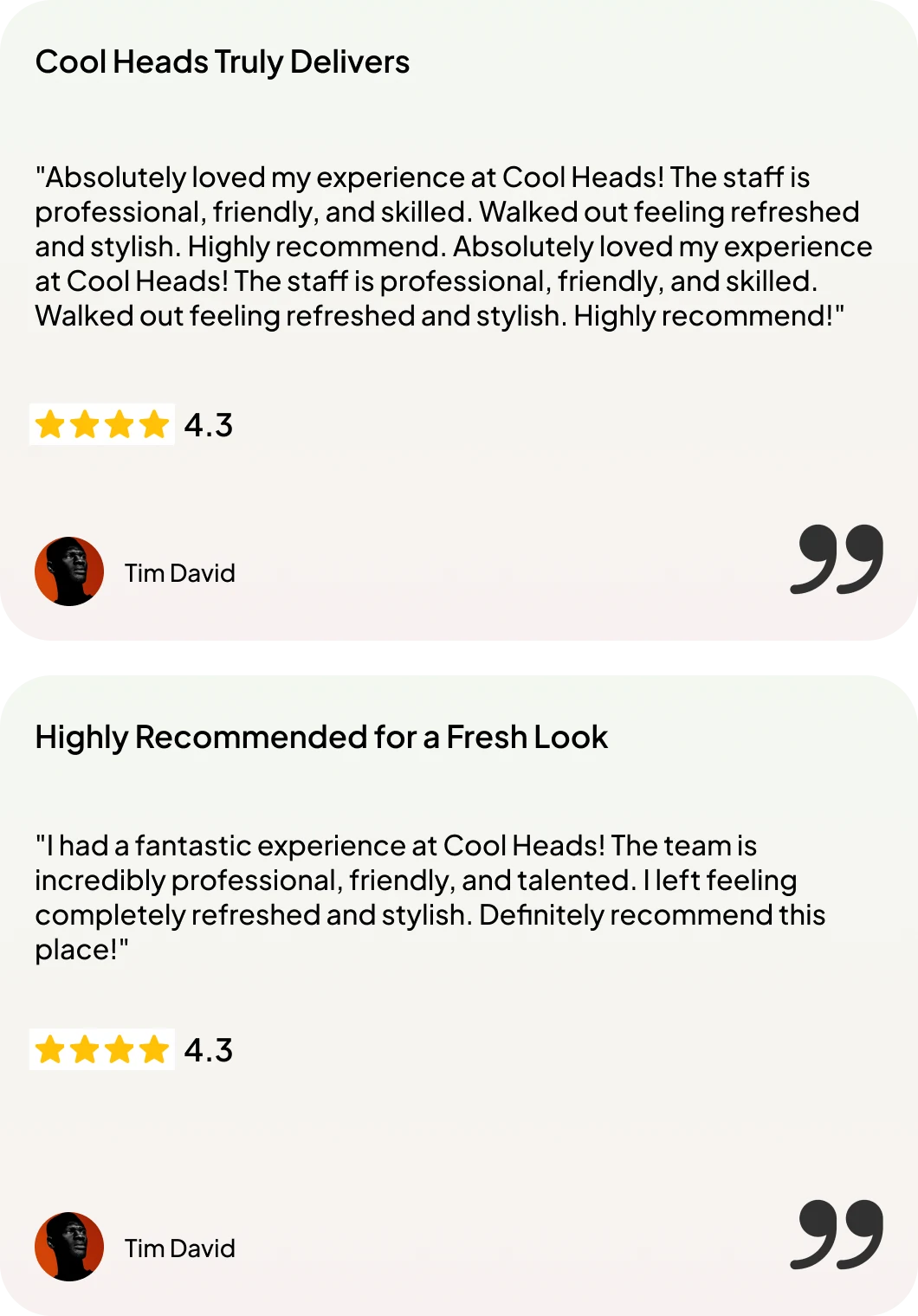
A hair salon booking platform for a men's grooming brand with many shops. Customers find a shop, pick a barber and book a chair. My design won 1st prize in a Freelancer.com design contest, chosen from more than 480 entries.
Cool Heads is a men's grooming brand with many shops. It needed a website that works as a booking platform: show the brand, help people find the nearest shop and get them into a chair. The brief was run as an open design contest on Freelancer.com.
I wireframed nine pages first, then built a small design system and designed the final pages in Figma. The entry won 1st prize.
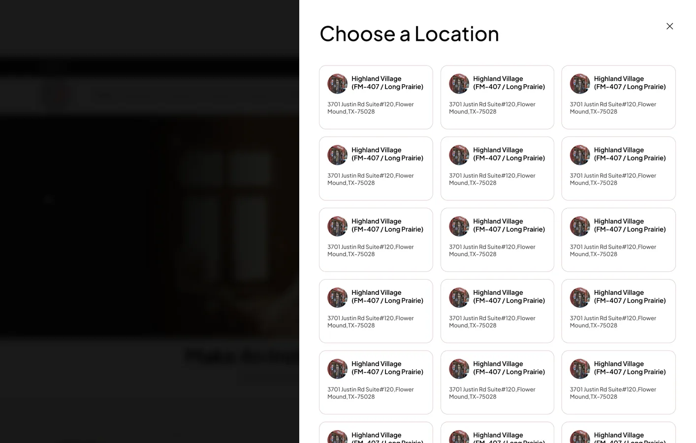
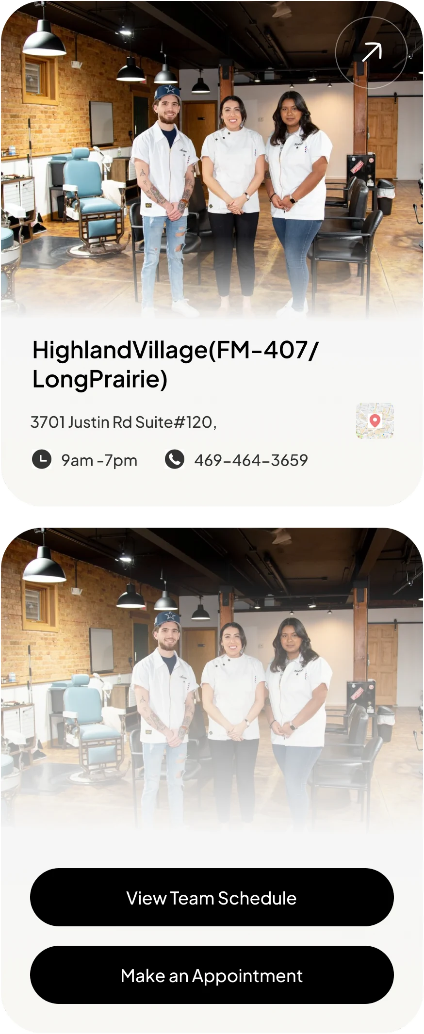
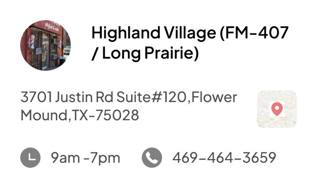
Each Cool Heads shop has its own address, hours, phone number, team and waiting time. A customer needs to find the nearest shop, see who is free and book, often on a phone.
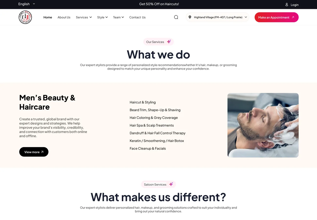
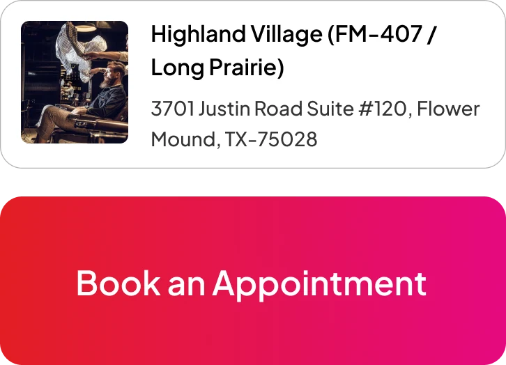
The site had to feel like a premium men's barbershop and turn visits into bookings. The red "Make an Appointment" button sits in the header of every page, and every shop card ends in a booking action.
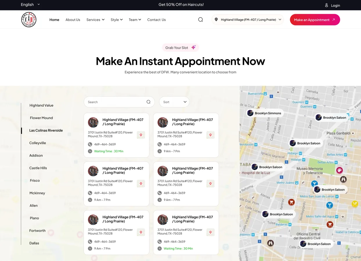
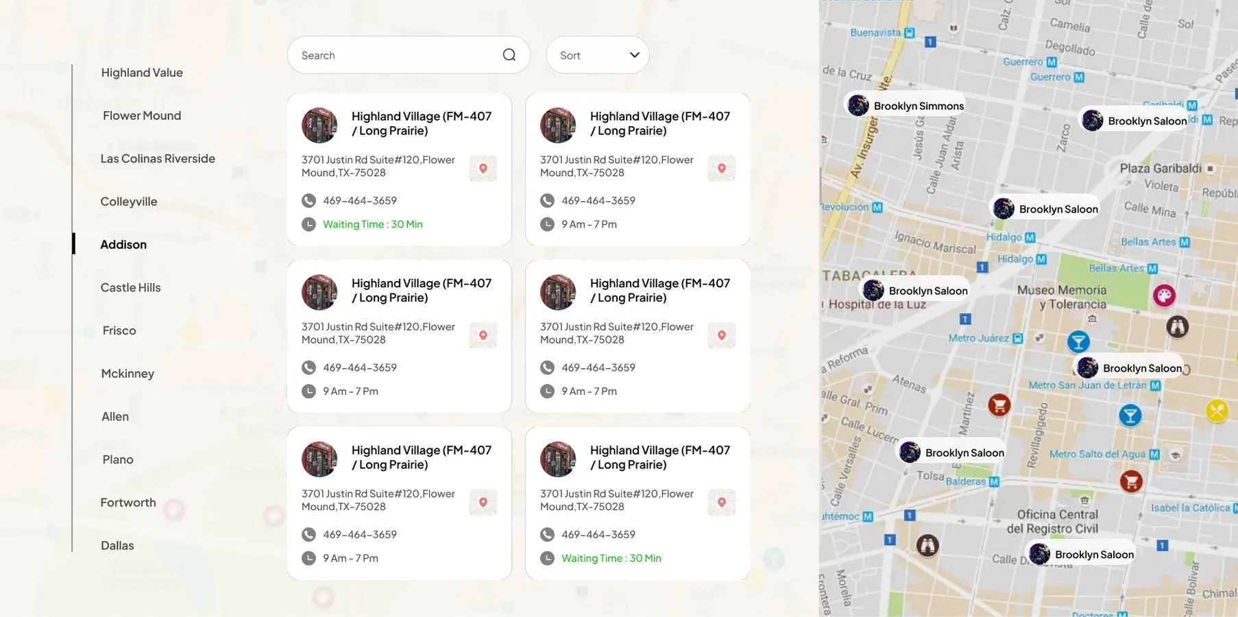
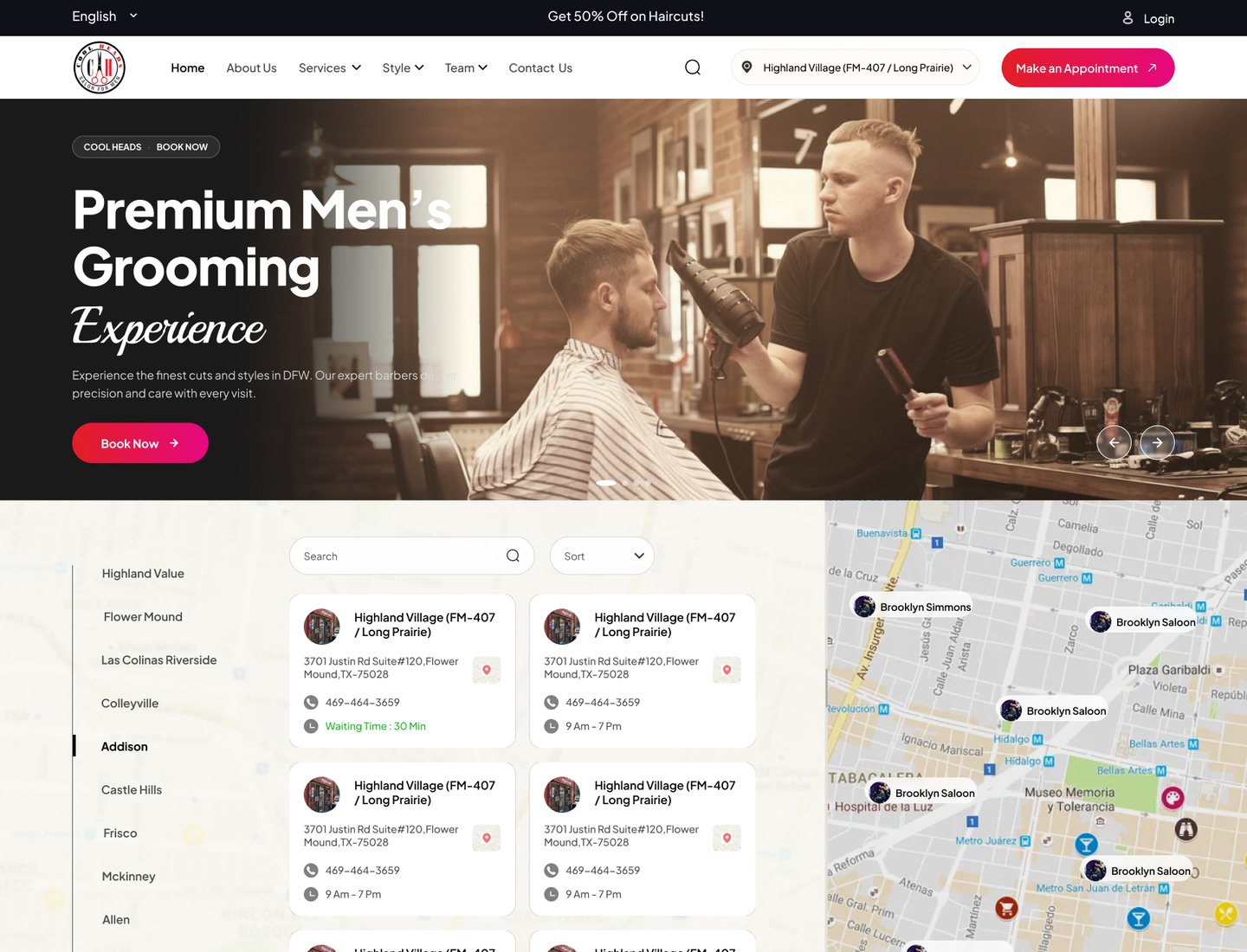
Showing twelve areas without a wall of addresses was the hardest part. I put the area list, the shop cards and a map side by side, so people can scan by name or by place. Each card shows the waiting time, so people can choose the quickest shop.
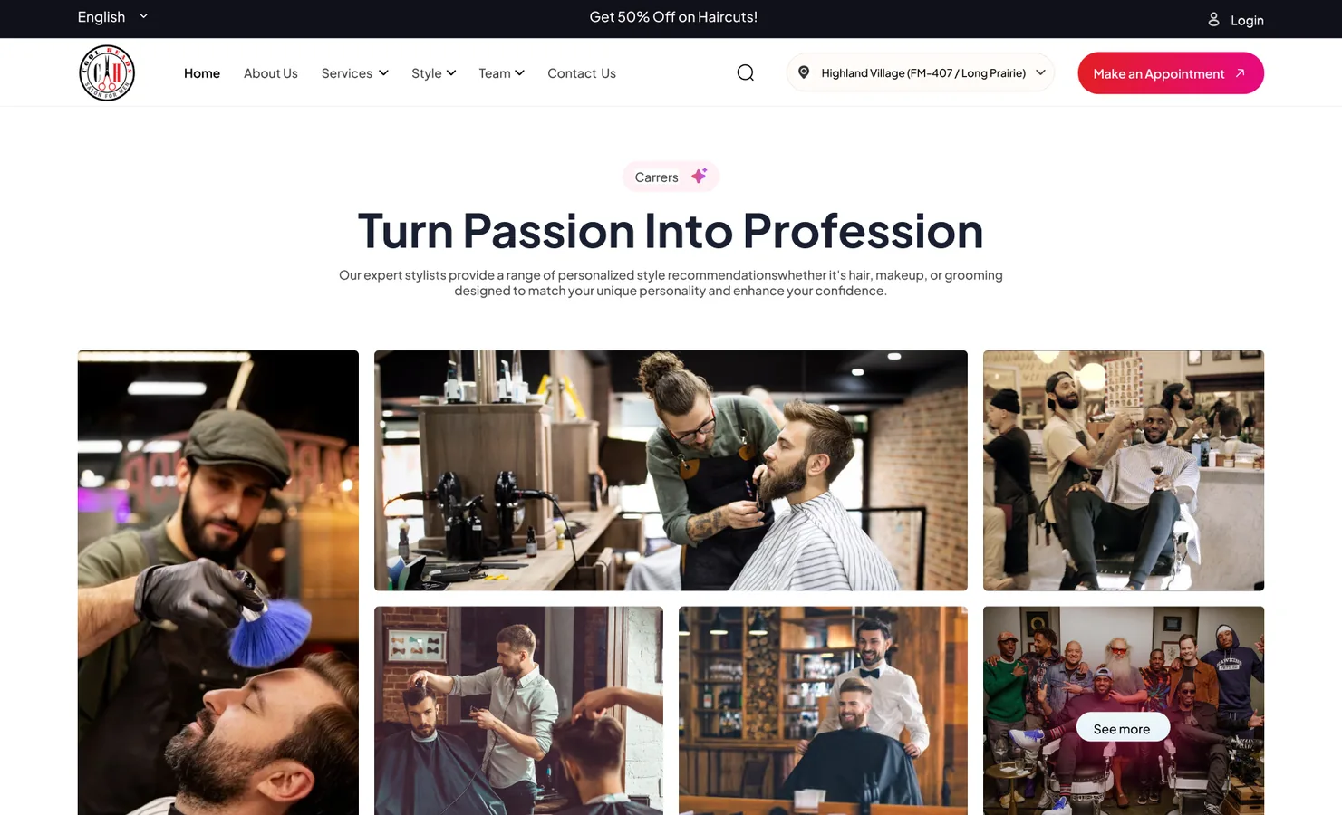
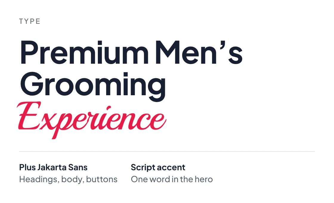
The look had to stay warm while feeling premium. Dark barbershop photos and one script word carry the mood in the hero, and calm cream sections keep the rest easy to read.
"Every page leads to one thing: a booked chair."
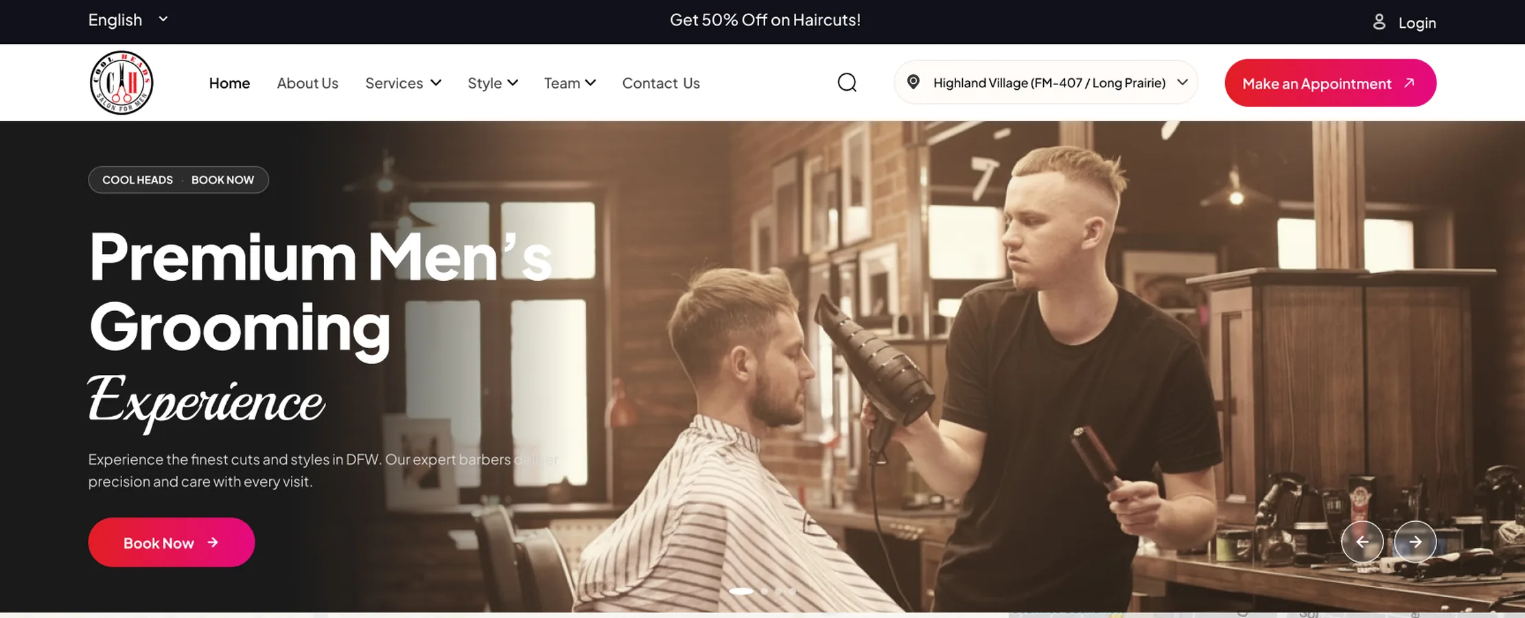
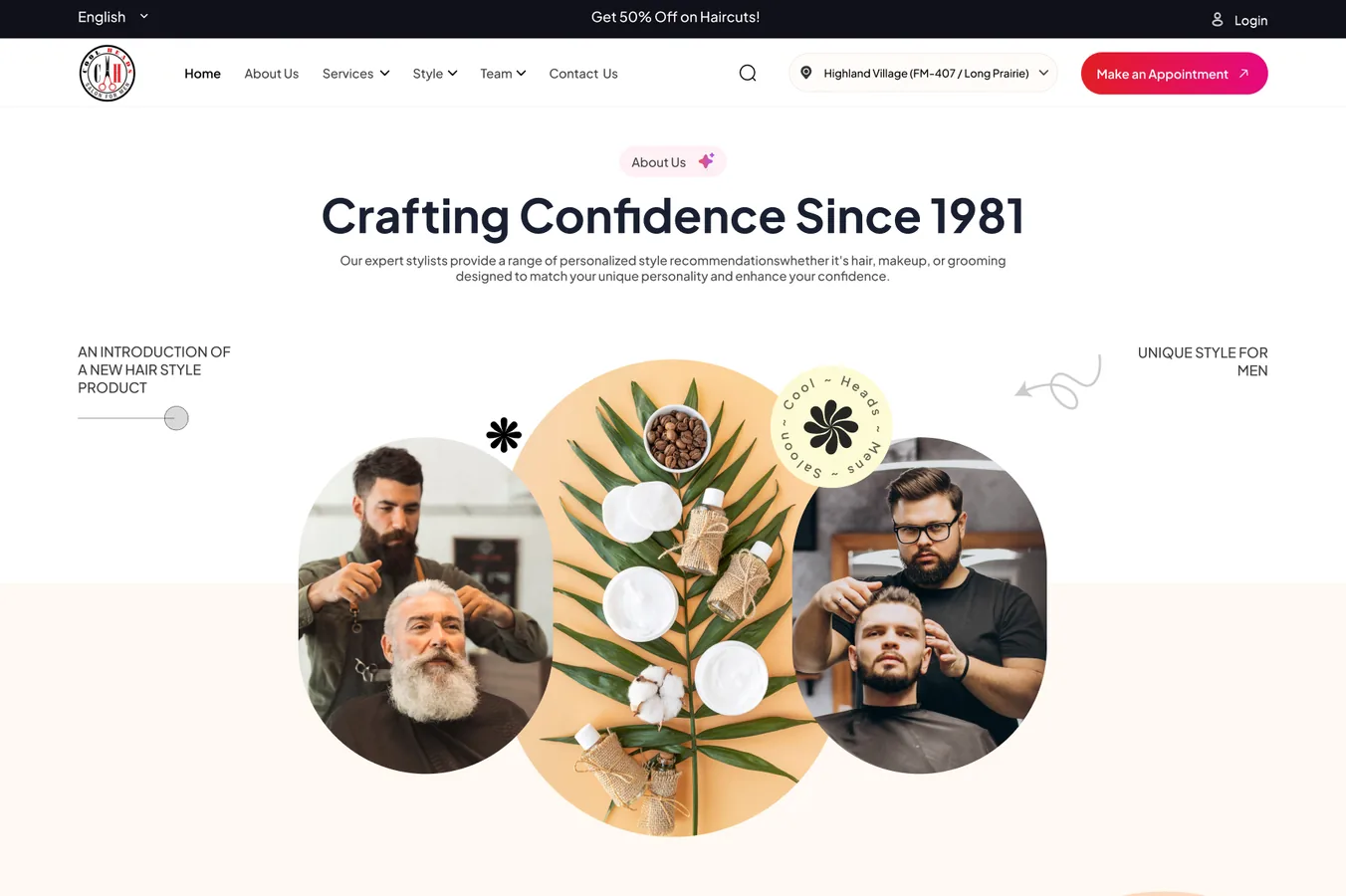
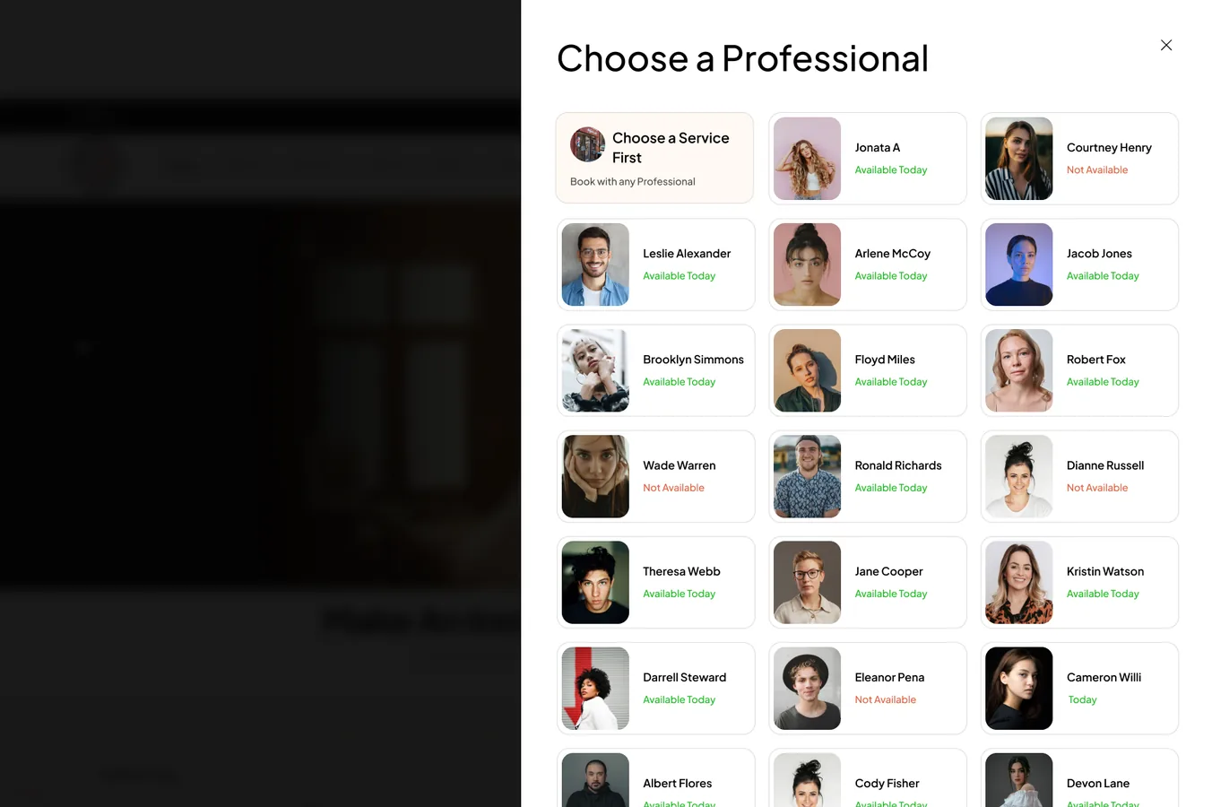
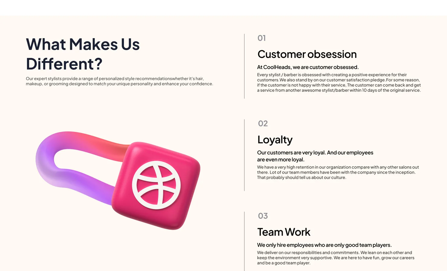
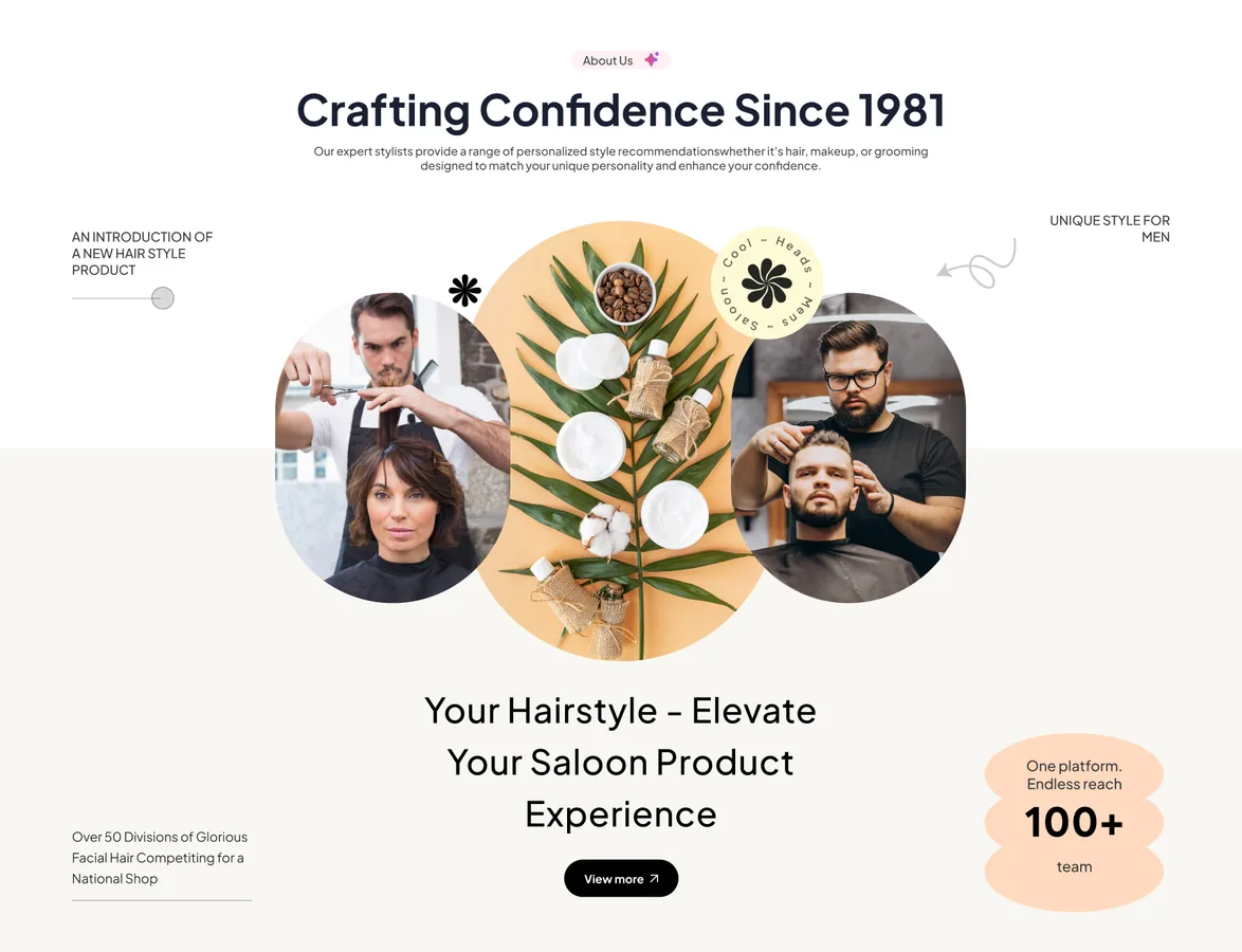
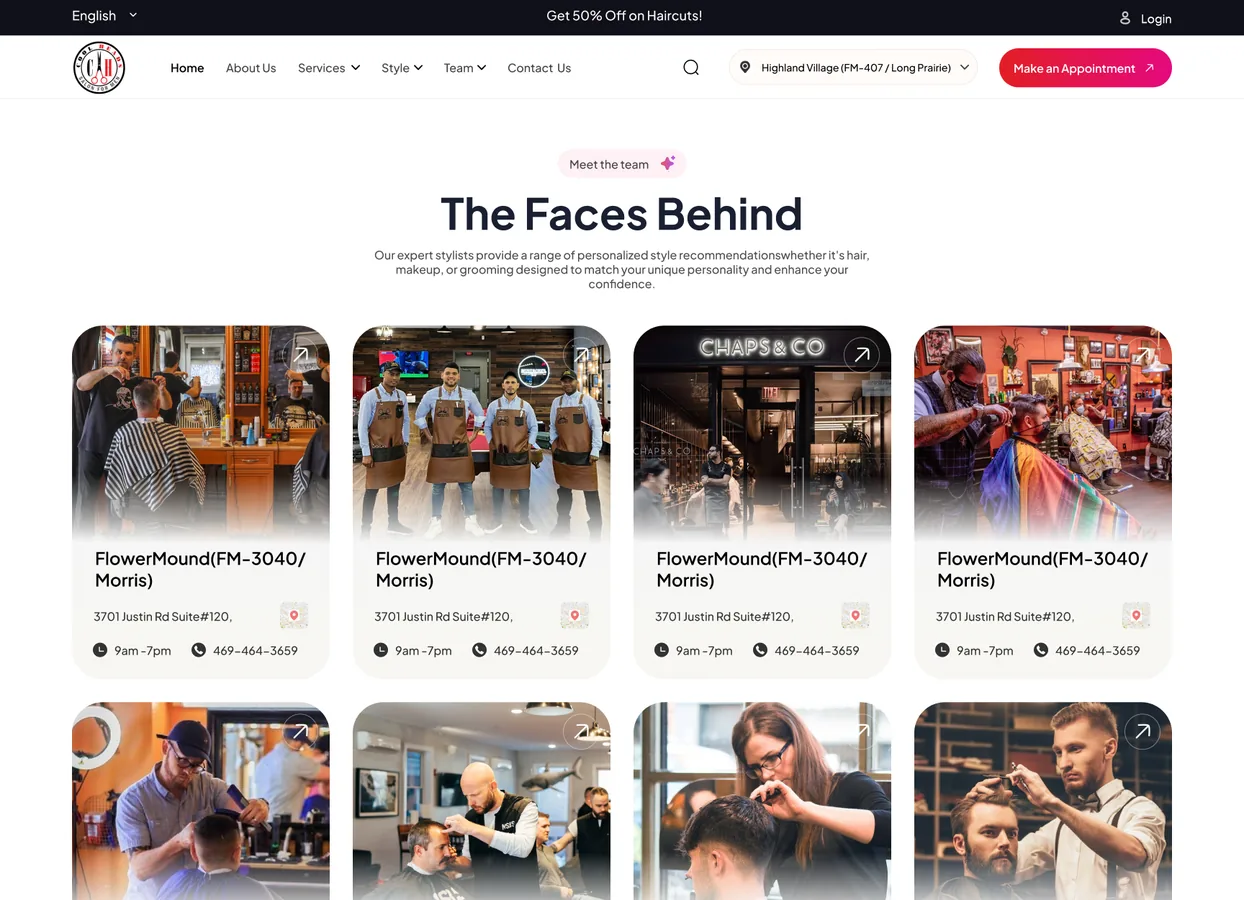
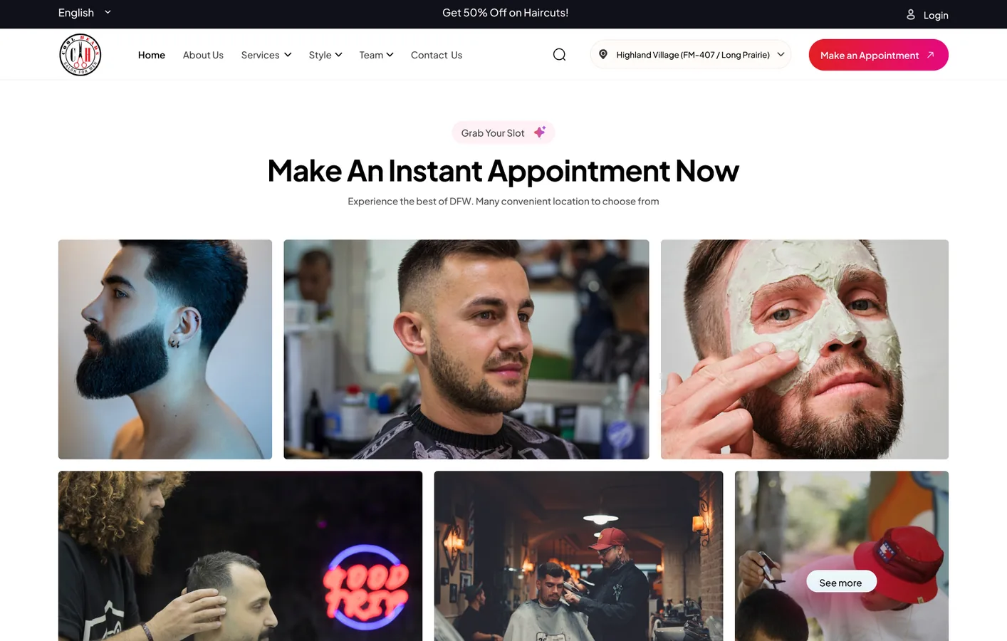
Each page started as a grey wireframe to settle the content and order. The final design added the photos, the brand and the location finder. Drag the line to compare them.
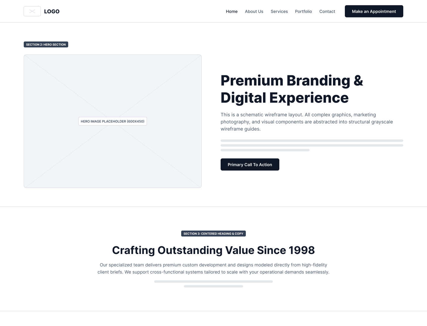 WireframeFinal design
"Make an Appointment" lives in the header, and every shop card and hero ends in a booking action.
An area list, shop cards and a map sit side by side, with the waiting time on each card.
Moody barbershop photos and a script word set the tone. Cream sections keep reading easy.
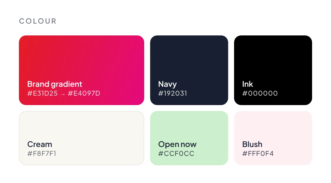
The brand gradient is kept for buttons, so red always means book or act.
The Figma file has Wireframe, Final and Components pages. Colours and text use styles: 21 colour styles and 15 text styles in Plus Jakarta Sans. More than 20 components, from shop and review cards to the nav bar and footer, build all nine pages.

The client chose this design from more than 480 entries sent in by designers worldwide. The final file holds nine desktop pages, a matching wireframe for each and the component library.
or write directly: vasudevsra1995@gmail.com