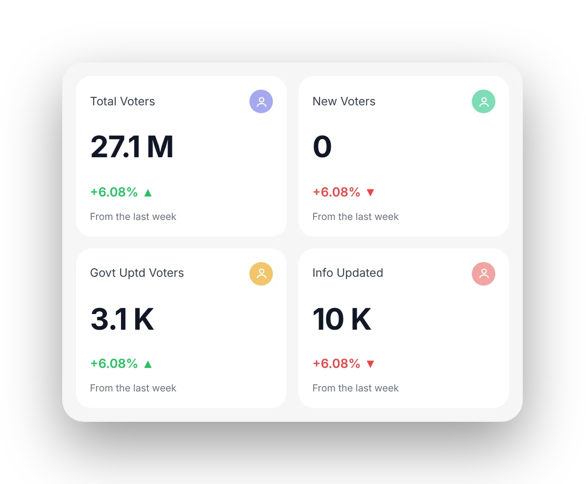
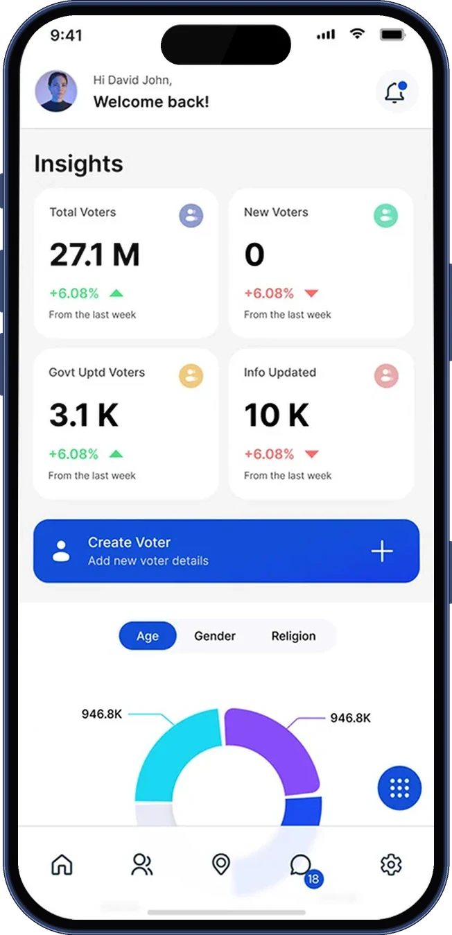
Insight cards show the four numbers admins check first
Component 01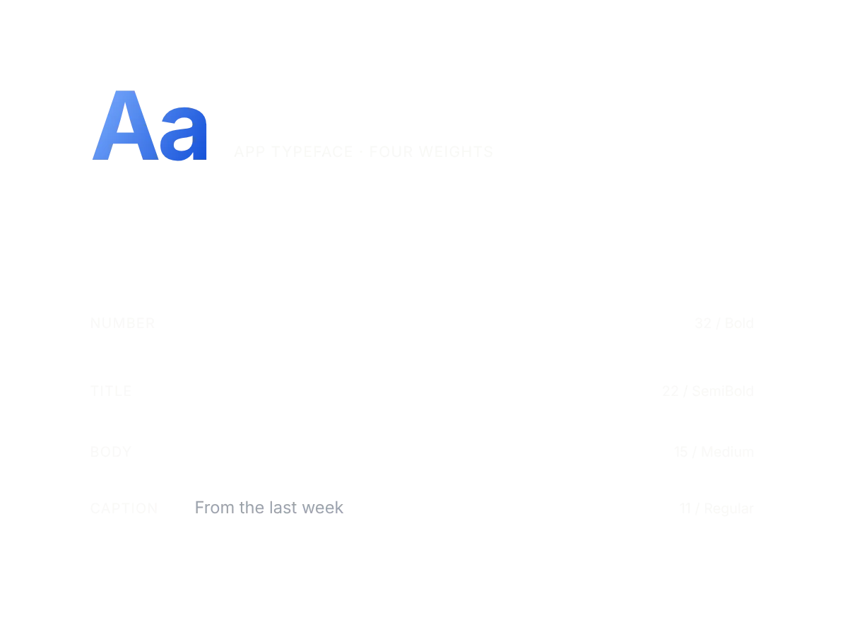
V-Data is a SaaS data-management app for election teams. Admins check what changed, find and contact voters, browse districts down to polling stations, and manage users, roles and elections from a phone. I designed the UX and UI, from the information architecture to the component library.
V-Data holds voter records across a deep hierarchy: districts, taluks, constituencies, local bodies, wards and polling stations. Admins open it to see what changed, find a voter, update a record or reach someone, often on the move.
Data dashboards fail when they display everything and explain nothing. I organised the product around the decisions users actually make: what changed, what needs action, and what can wait behind a tap.
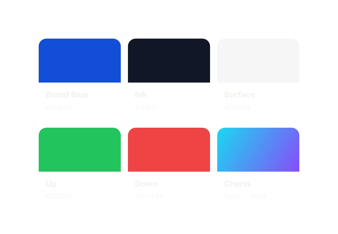
A restrained interface: neutrals for structure, one blue for primary actions, and green and red kept for change. Cards summarise before they detail, and every component comes from a documented library, so new screens ship consistent by default.
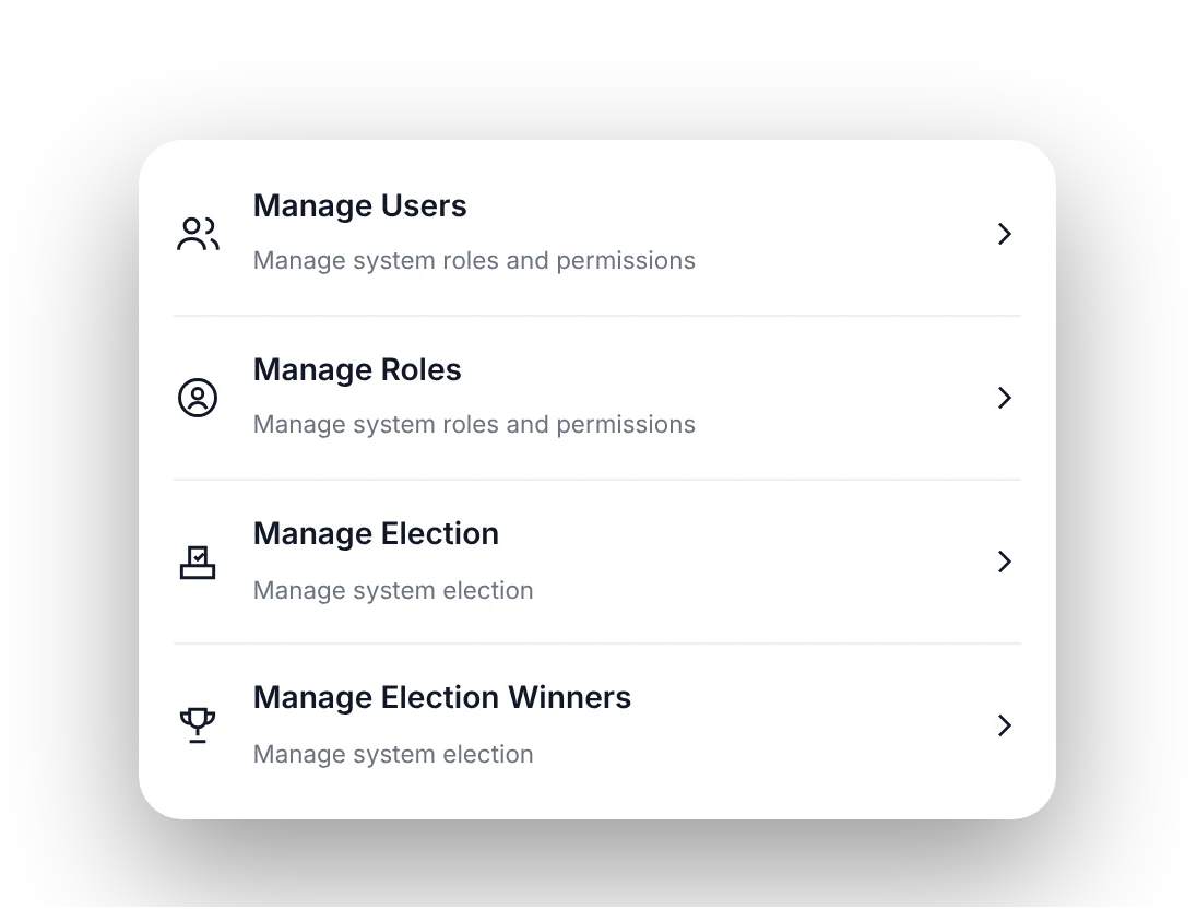
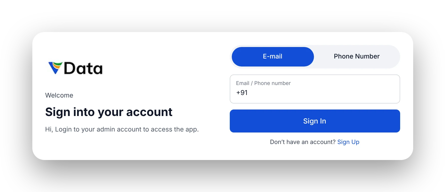
The cards below are components from the Figma library, shown as they appear in the app.
Users need to know what changed, what needs action and what can wait. Auditing comparable SaaS tools showed the same trap everywhere: dashboards that display everything and prioritise nothing.
On a phone the problem gets worse. A table with a dozen columns doesn't fit, so every screen has to decide what one record looks like at a glance, and what waits for a tap.
Lives in the product, values speed and notices every inconsistency. Needs dense but ordered screens that reward familiarity.
Drops in weekly for status and numbers. Needs summaries and trends without relearning the interface each visit.
Admins come to V-Data with one of three questions: what changed, who is this voter, or what is happening in this place. Each question has its own path, and settings sit outside them in one list.
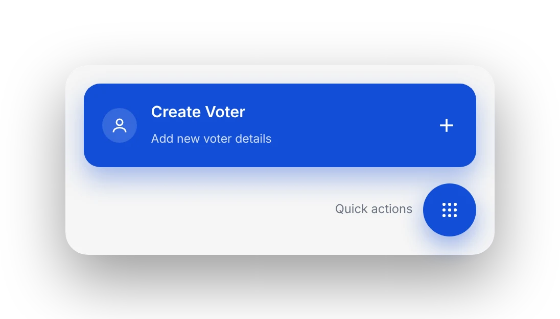
Four stat cards show totals and the change from last week, with the one primary action, Create Voter, right below. Charts come after.
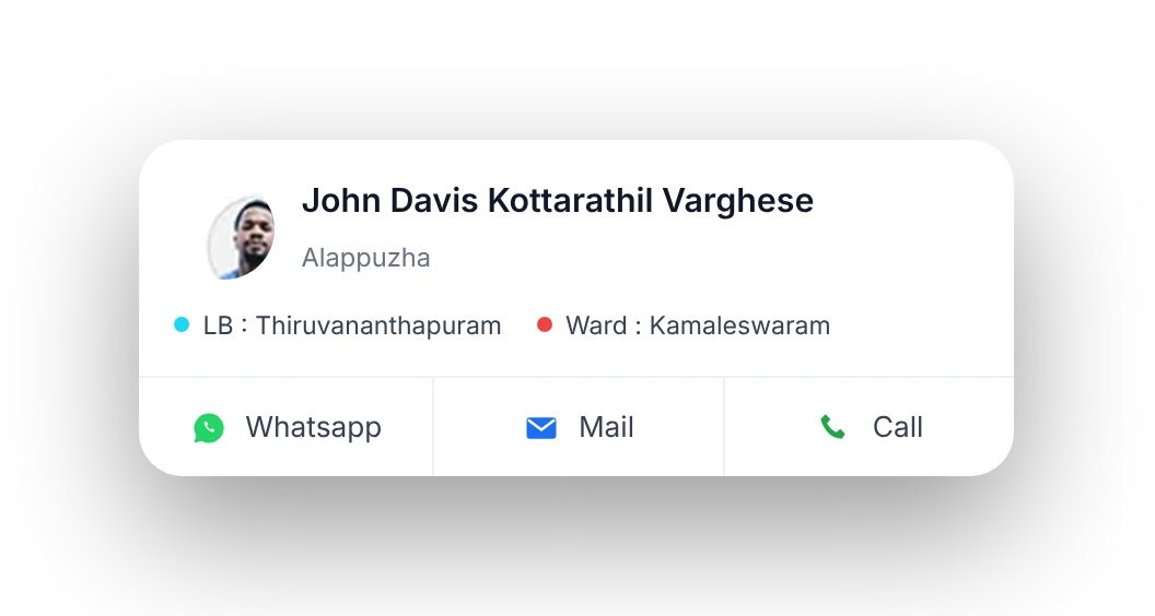
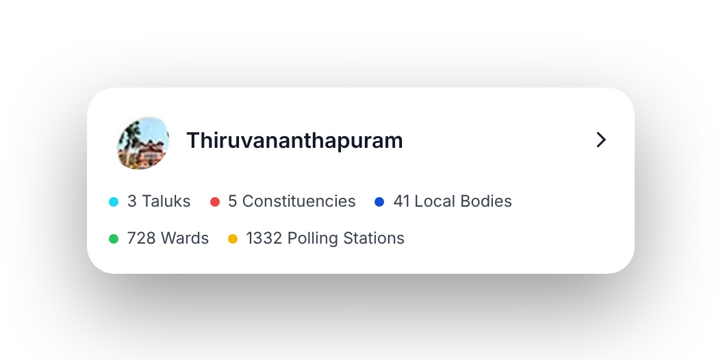
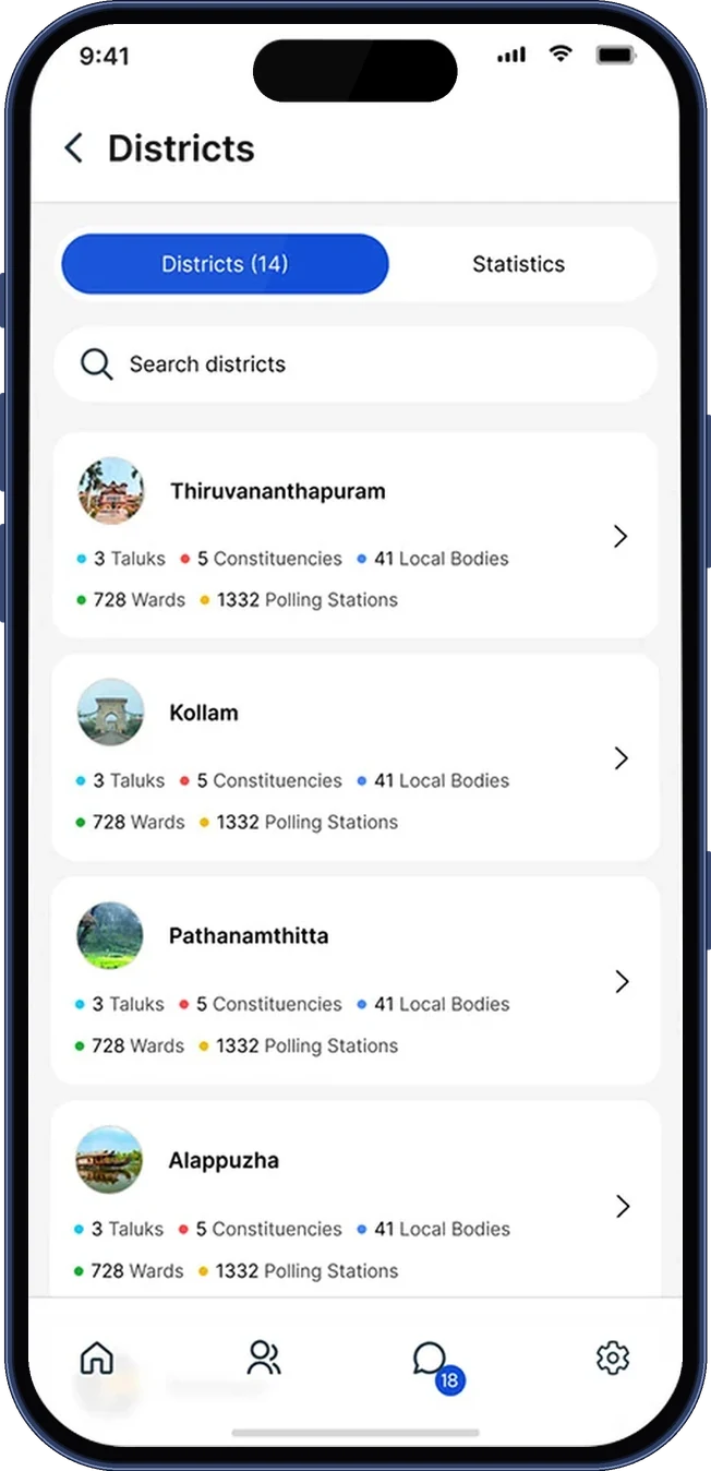
Each voter or district is a card with the few fields people scan for. Everything else is one tap away, so the list stays fast to read.
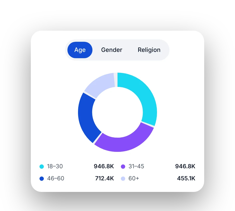
Age, gender and religion share one donut with a switch above it, instead of three charts competing for the same screen.
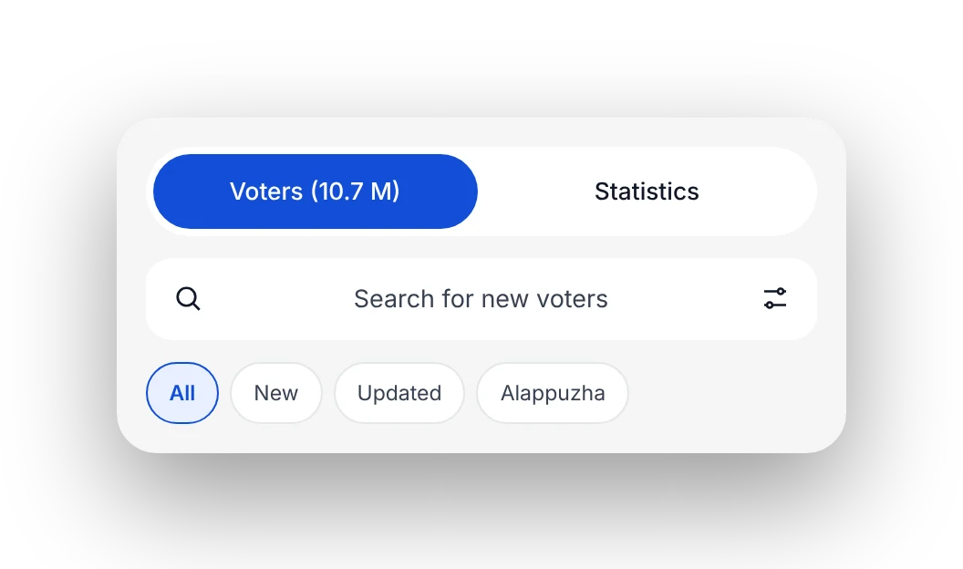
Voters and districts both open on tabs, a search field and a filter, so any record is reachable without scrolling.
Every screen is built from the same parts: stat cards, tabs, search, list cards, rows and buttons. Below is a selection from across the app.
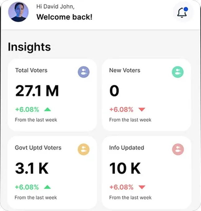

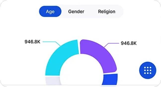
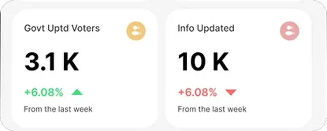
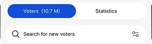
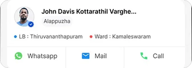
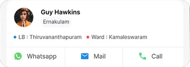

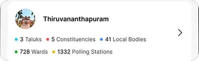
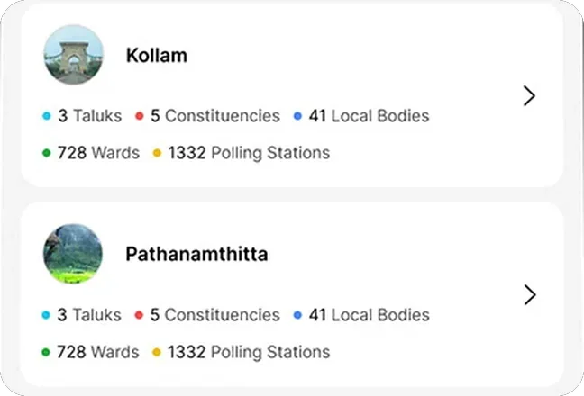
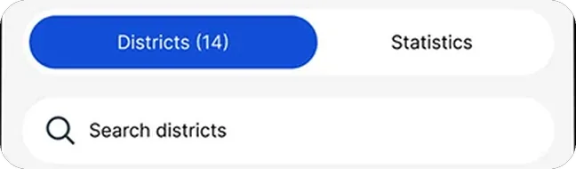
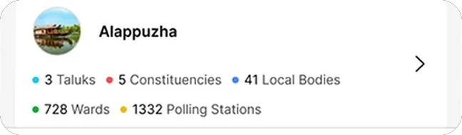

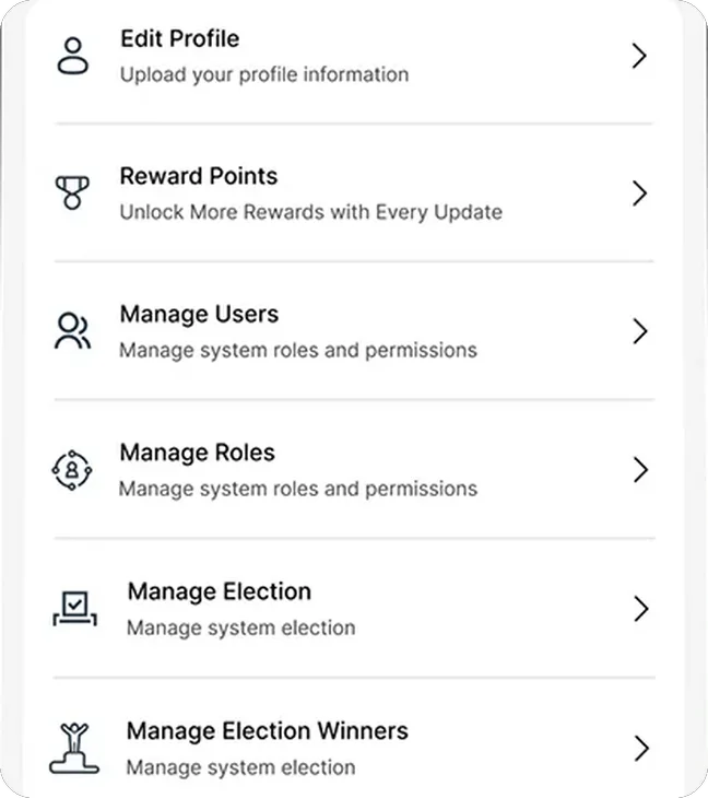

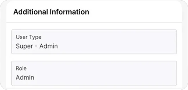
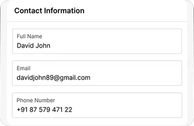
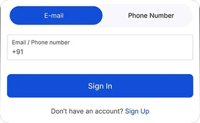

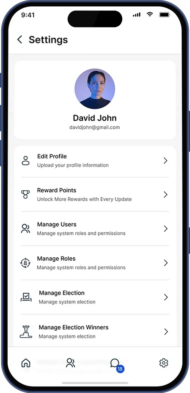
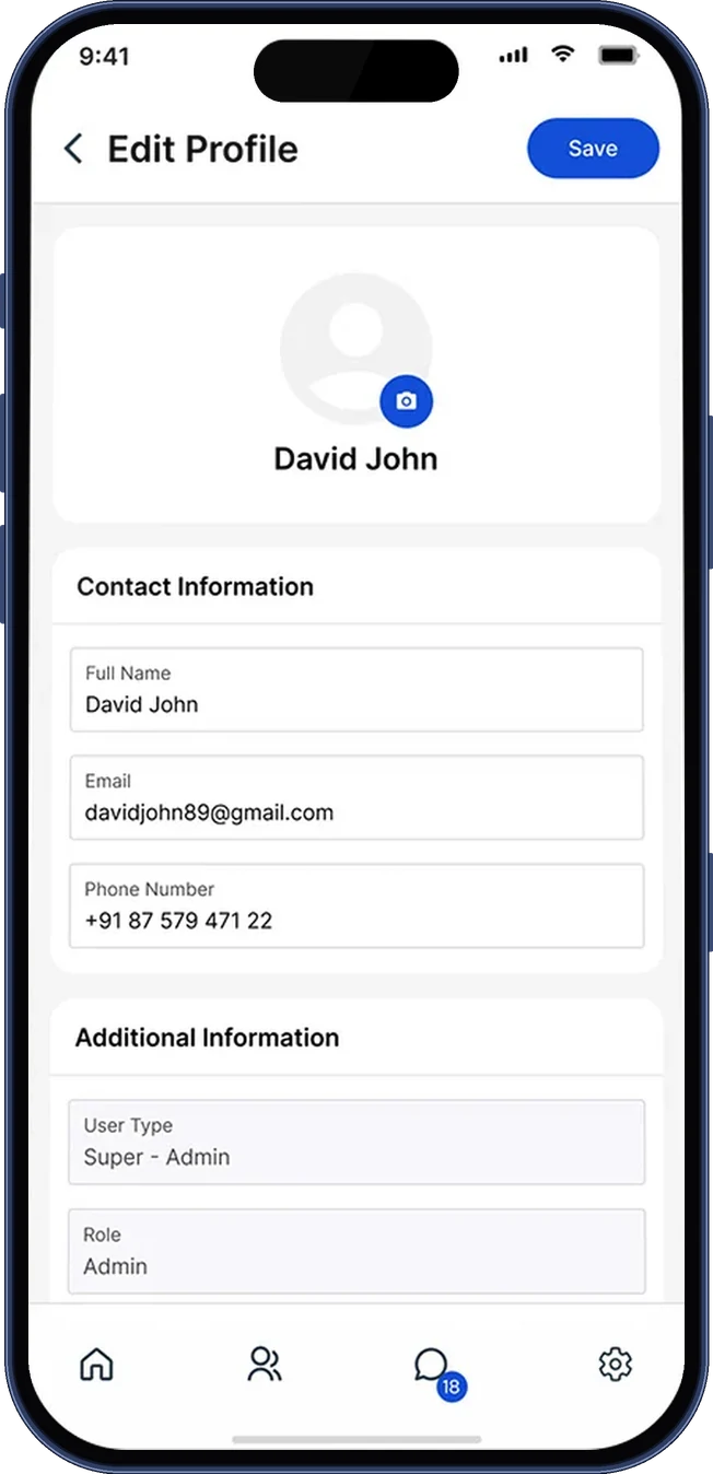
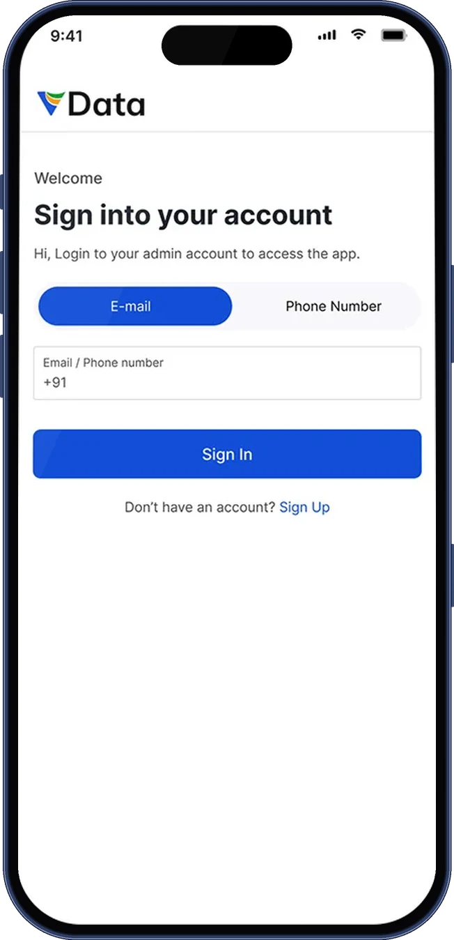
Lists open on the same tabs and search, records are cards with the same anatomy, and management lives in one settings list. Once you know one screen, you know the rest.
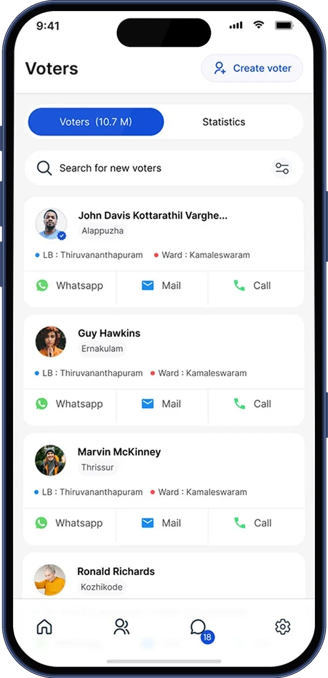
Prototypes were tested against realistic data: hundreds of rows, awkward edge cases and long names, because SaaS designs that demo well often collapse under real data. The voter card, for example, keeps a long name like "John Davis Kottarathil Varghese" on one line and lets it truncate.
Iterations tightened the empty, loading and error states, the three screens teams usually forget.
or write directly: vasudevsra1995@gmail.com