Case study / 14 — Dashboard · B2B

Running a parts business at a glance.

The seller back-office for AUTOMARTO — the workspace where auto-parts dealers, workshops and distributors manage catalog, inventory, tiered pricing and orders across the marketplace's B2B side.

Role
UI/UX Designer
Platform
Web · Dashboard
Users
Dealers · Workshops · Distributors
Type
B2B Seller Dashboard
0
Core modules
0
Process phases
0
Key decisions
0
Research insights

OVERVIEWThe B2B back-office

This is the seller side of AUTOMARTO — the workspace B2B vendors live in. Dealers, workshops and distributors manage catalog, inventory, tiered pricing and orders here, so the fast, data-driven B2B buying experience on the front end has a fast, data-driven back end to match.

THE PROBLEMOperators, not analysts

Marketplace sellers are busy operators, not analysts. Poor inventory visibility, inconsistent pricing and clunky bulk-order handling cost them real money — and every unnecessary click compounds across hundreds of daily actions.

MY ROLEOwning the workspace

I owned dashboard IA, catalog and inventory flows, tiered-pricing and bulk-order management, order and performance views, and the table/card system underneath — kept consistent with the buyer-side design system.

DESIGN PROCESSResearch to iteration

01 Seller research & interviews
02 Task & workflow mapping
03 Dashboard IA
04 Inventory & catalog flows
05 Pricing tiers & bulk ops
06 Orders & performance views
07 Usability testing & iteration

METHODThe workflow, end to end

01
Step 01
Seller research & interviews
02
Step 02
Task & workflow mapping
03
Step 03
Dashboard IA
04
Step 04
Inventory & catalog flows
05
Step 05
Pricing tiers & bulk ops
06
Step 06
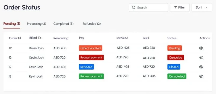
Orders & performance views
07
Step 07
Usability testing & iteration

KEY DECISIONSWhat made it work

📦

Inventory at a glance

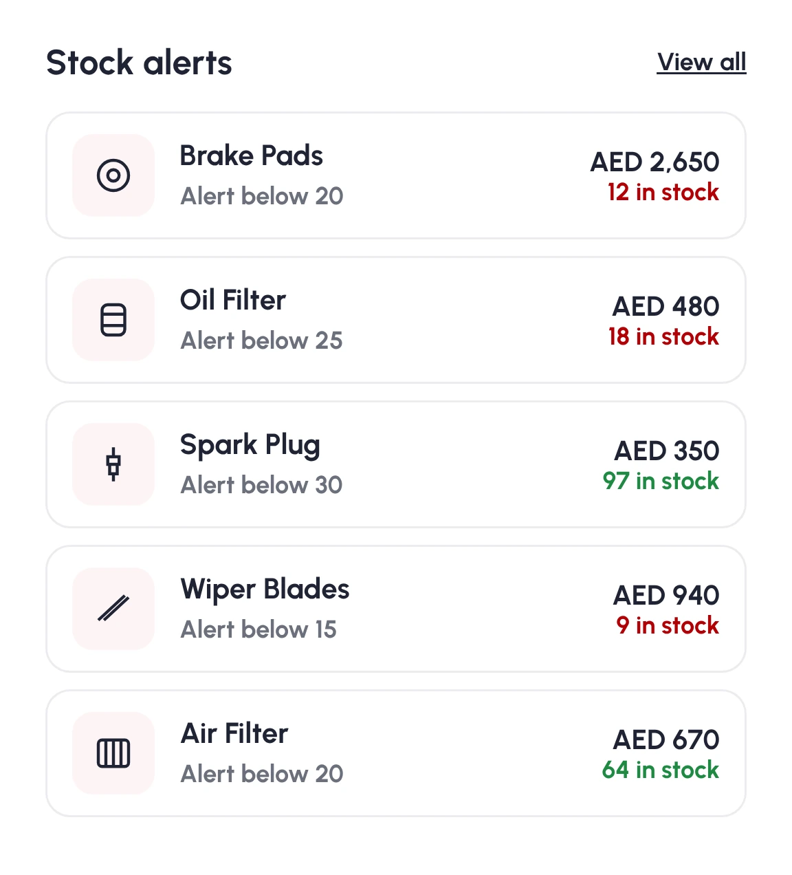
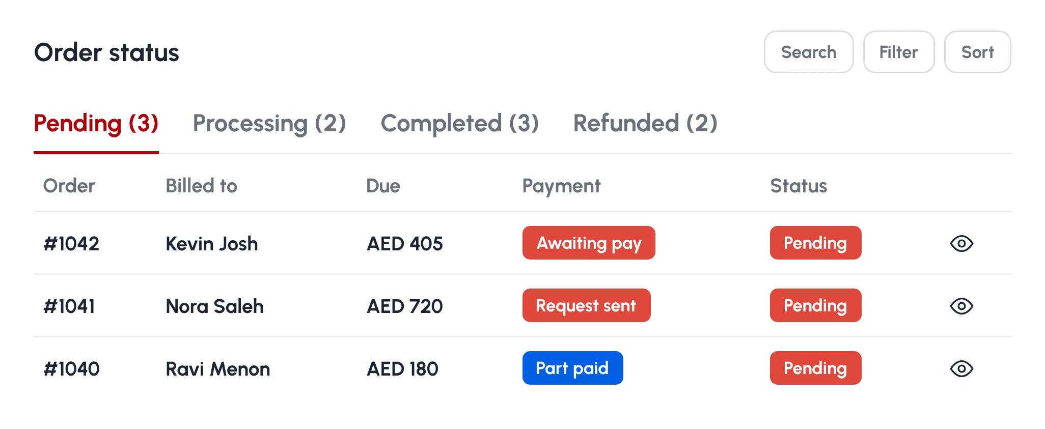
Stock, compatibility and status in one scannable table, so sellers always know what needs restocking.

🏷️

Tiered pricing, built in

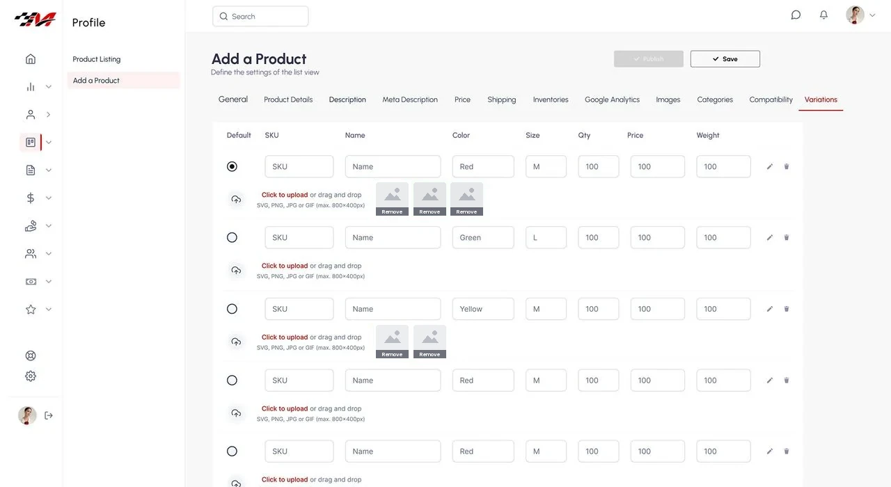
Pricing tiers and bulk rules are first-class — matching how B2B buyers actually order.

🔔

Exception-first alerts

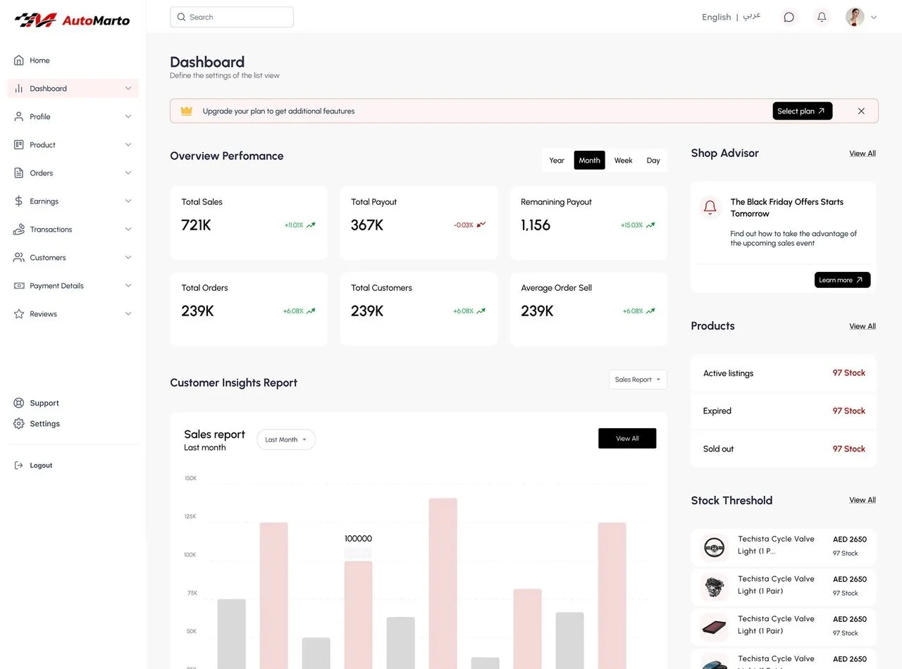
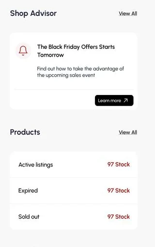
The dashboard surfaces only what needs action — low stock, new orders, pricing conflicts.

💰

Revenue clarity

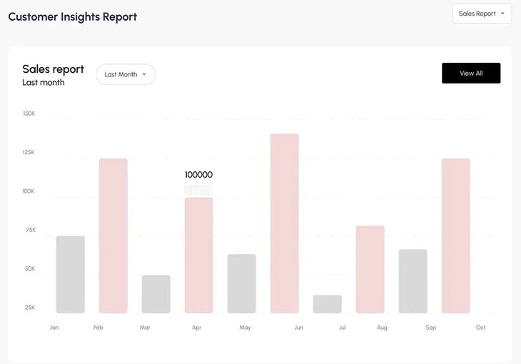
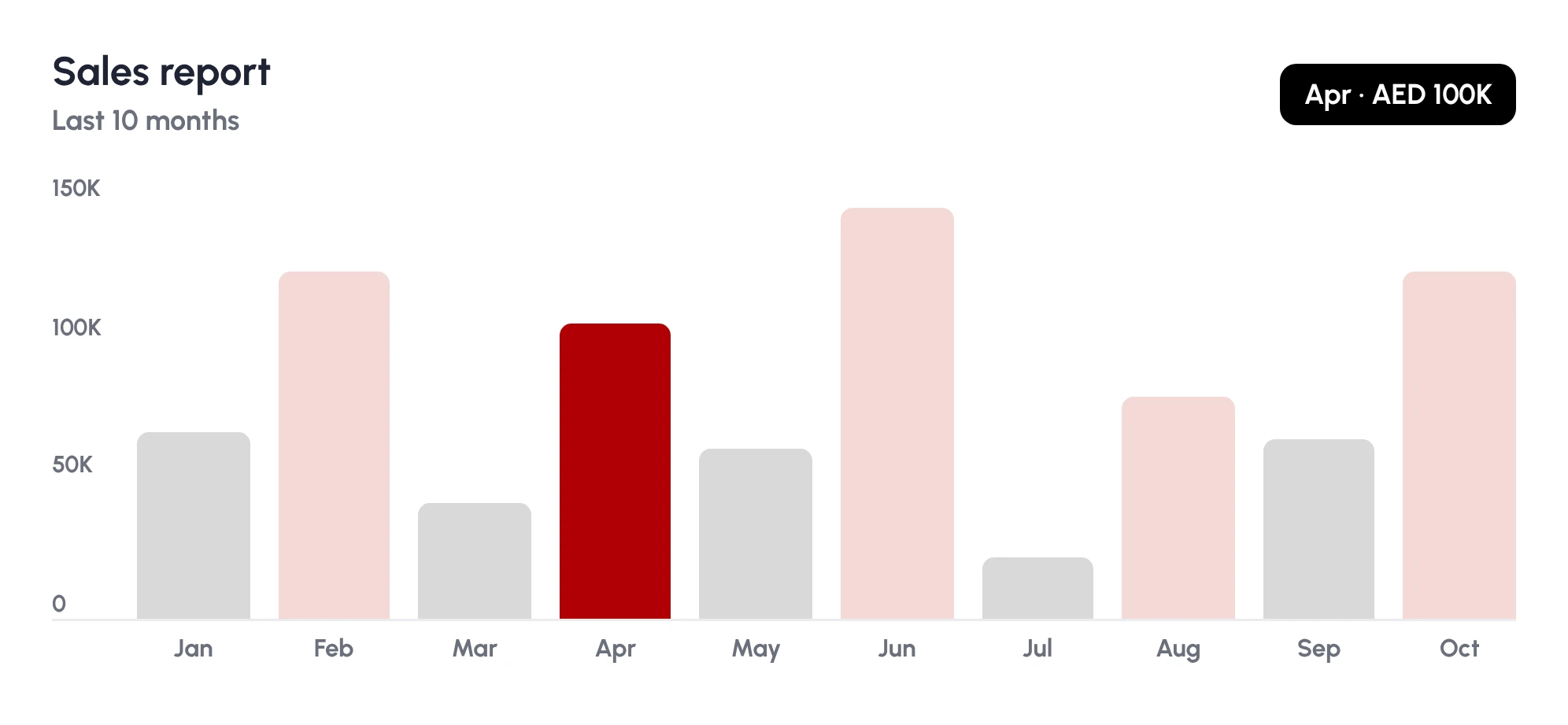
Earnings, fees and order value explained without exporting to a spreadsheet.

RESEARCH & INSIGHTSWhat shaped the direction

Discovery focused on the jobs B2B sellers hire the dashboard for: what decision does this screen serve, what action follows, what can wait behind a click. Interviews with dealers and workshop managers — the same B2B users on the buyer side — showed inventory visibility and pricing clarity mattered most.

🚦

Action first, data second

Sellers open the product to do something. The landing view must answer “what needs me today?” before showing anything else.

🏷️

Pricing clarity sells

Sellers lose deals and trust when tiers are opaque; the back-office had to make tiered and bulk pricing obvious.

🧭

Predictability is speed

In daily-use tools, users get fast by building muscle memory; consistent patterns are a performance feature.

WHO IT'S FORDesigning for real people

PRIMARYThe dealer / workshop operator

Lives in the dashboard, processes orders and updates stock all day. Values speed, keyboard-friendly flows and dense-but-ordered screens that reward familiarity.

SECONDARYThe distributor / owner

Drops in for performance, pricing strategy and numbers. Needs summaries, trends and export — without relearning the interface each visit.

DESIGN LANGUAGEThe visual system

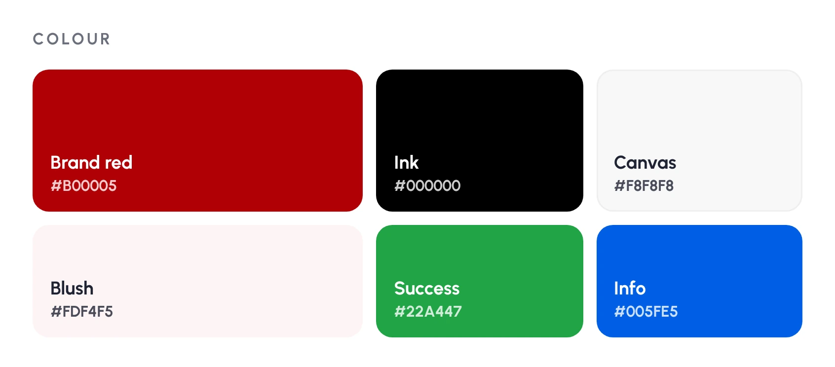
A restrained interface where colour means something: neutrals for structure, one accent for primary actions, and semantic colour reserved for status. Tables use progressive disclosure, cards summarise before they detail, and every component comes from a documented library so new screens ship consistent by default.

Semantic colour only
Progressive-disclosure tables
Summary-then-detail cards
Documented component library
Keyboard-friendly flows

TESTING & ITERATIONPressure-testing the design

Prototypes were tested against realistic data volumes — hundreds of rows, awkward edge cases, long names — because SaaS designs that demo well often collapse under real data. Iterations tightened empty states, loading states and error states, the three screens teams usually forget.

PROJECT SCREENSInside the design

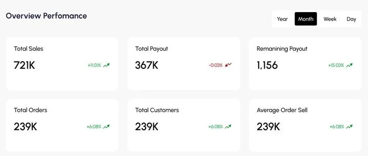
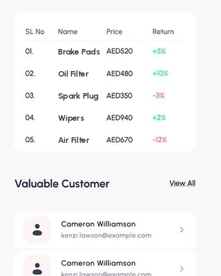
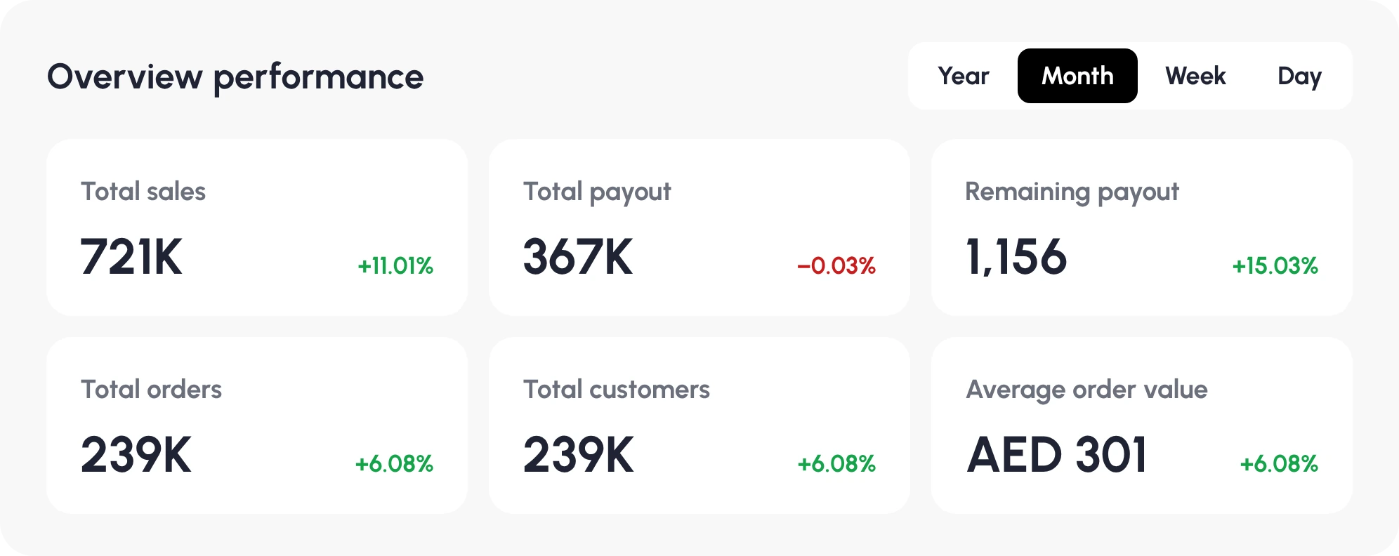
Seller dashboard — overview
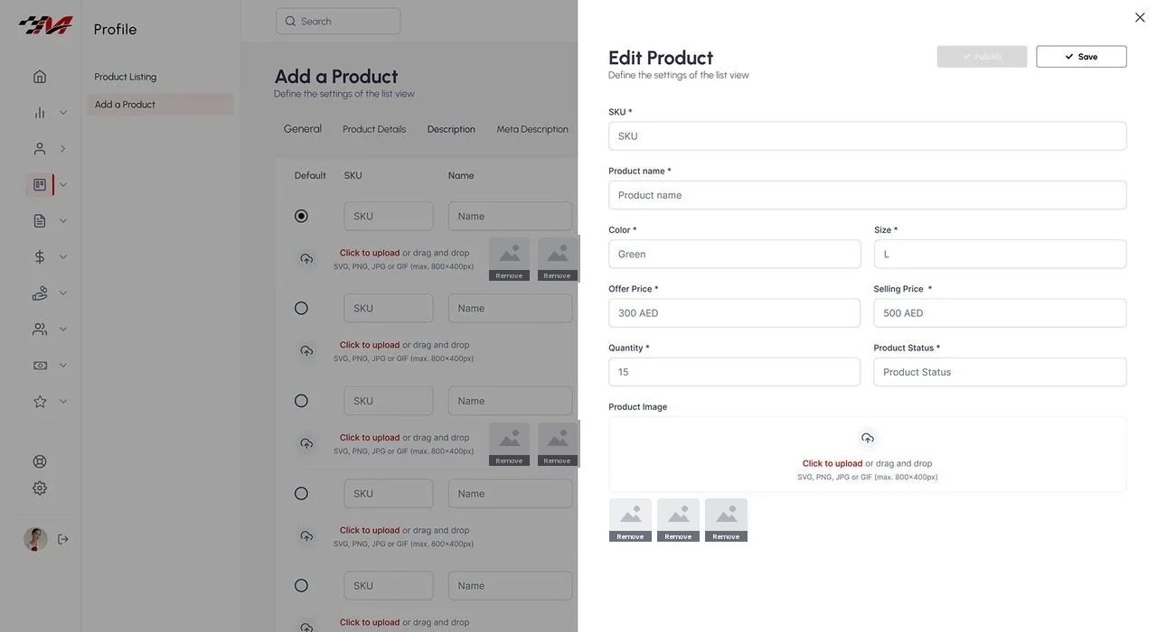
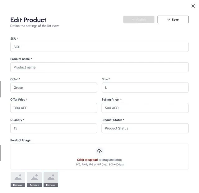
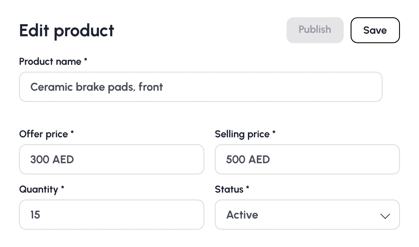
Seller dashboard — edit product
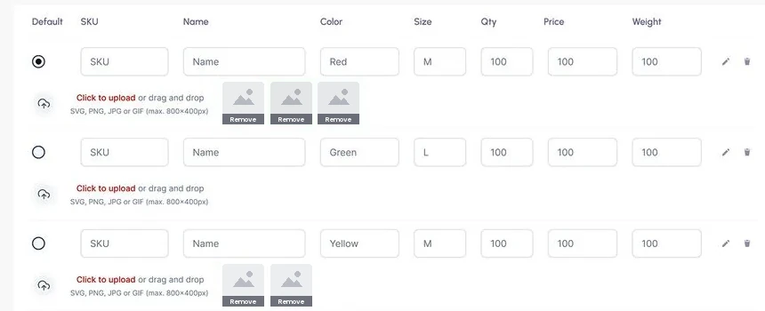
Seller dashboard — product variations
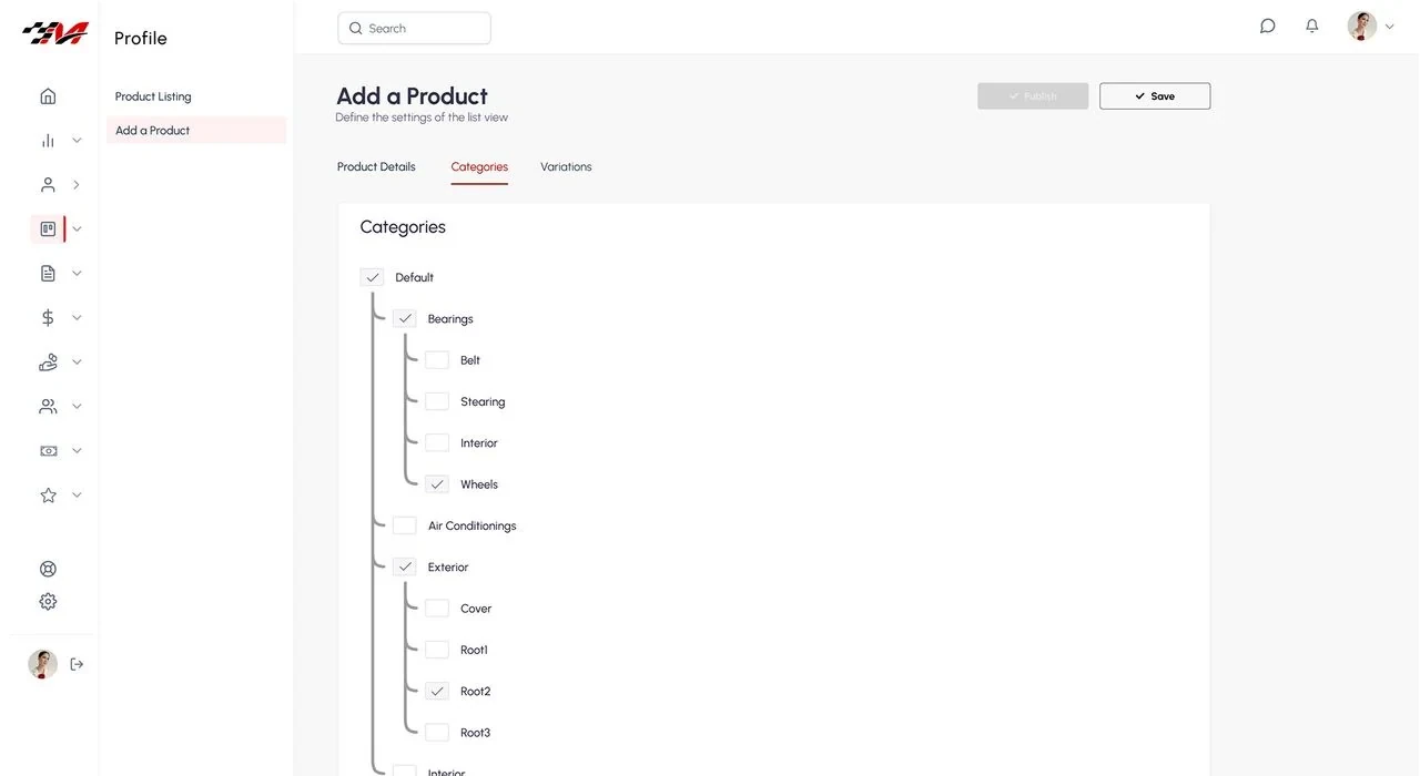
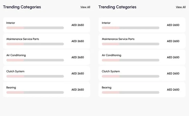
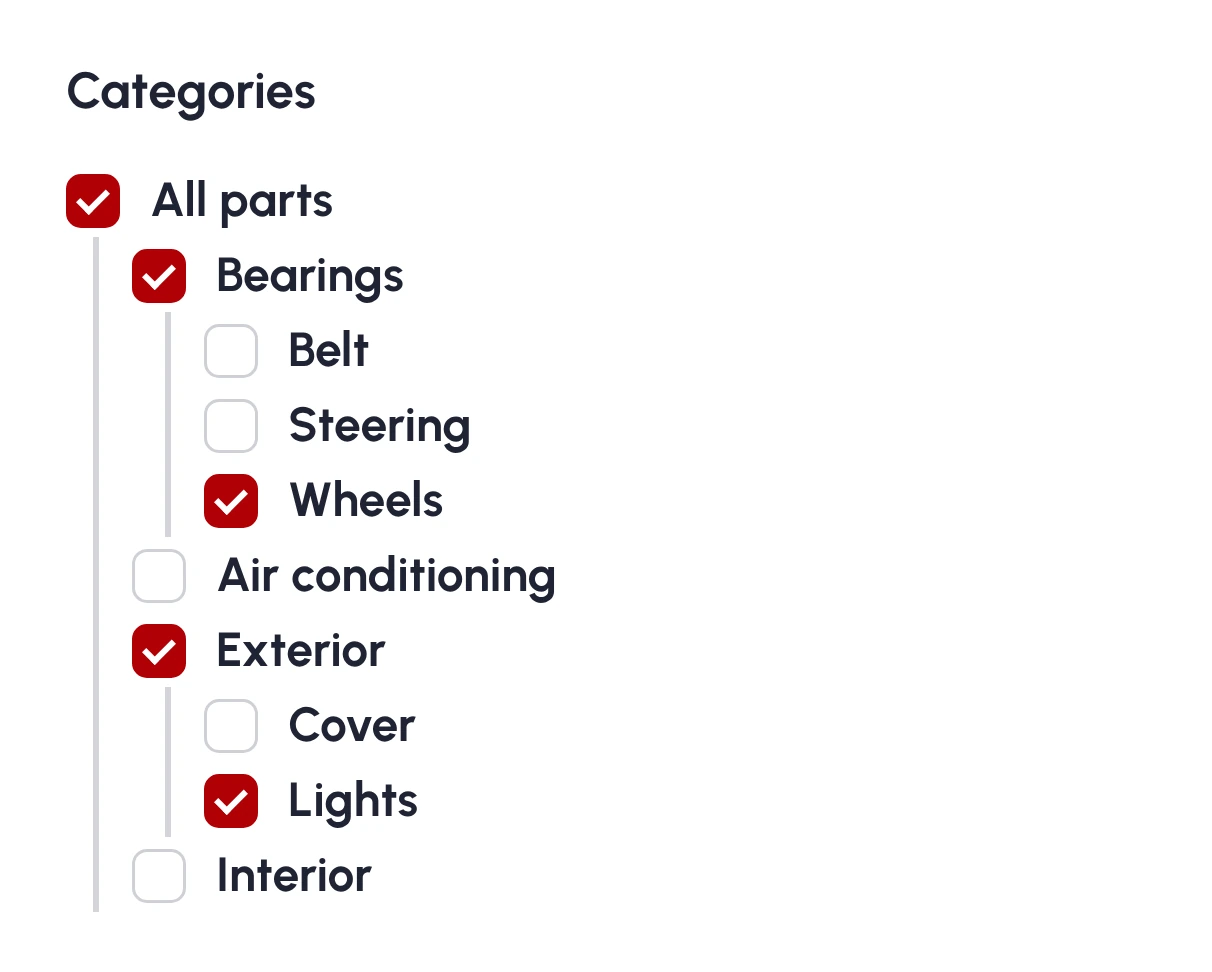
Seller dashboard — categories

Each screen auto-scrolls — hover to pause

OUTCOMEThe result

A seller hub that runs a parts business at a glance — the B2B back-office companion to the Automarto app and marketplace website.

View full project on Behance

KEY LEARNINGSWhat I'd carry forward

01 Design with real data volumes from day one; lorem ipsum lies.
02 Empty, loading and error states are where products feel professional — or don’t.
03 A dashboard’s job is decisions per minute, not charts per screen.
← Previous
Corporate Website